Travel Super Market
Design System & Product Transformation
My Role - Creative Direction, Design Direction, Design, UX
Overview
Travel Supermarket consolidates flights, hotels, package holidays, and car hire deals from diverse providers. Users can quickly search, find the best deals, and seamlessly book on the provider's site.
This project marked a substantial overhaul encompassing redesign, re-platforming, and brand refresh. The existing site, built on outdated technology, prompted the need for a comprehensive transformation.
A critical focus was placed on optimising the platform, particularly for mobile devices, ensuring a significant enhancement in accessibility and user experience.

Brief
Design a fully responsive website with a focus on improved UX and contemporary design principles.
Redesign the hotel search feature from scratch and implement a cohesive re-skinning of other channels for a unified visual experience.
Undertake the task of lifting and shifting 6000 pages of existing content, ensuring alignment with the new design and not effecting SEO.
Improve conversions across all channels
Improve customer loyalty
Improve partner experience
Post Delivery Results
100% increase in unique visitors
2.4 mil 2014 old site
4.8 mil 2015 new site
Improved conversion across all channels
4 X higher value customer on ‘My Suitcase’
Post Transformation Conversion Funnel

1 - Audit
Existing Site Audit
Before initiating any transformative efforts within the TSM (TravelSupermarket) realm, a comprehensive audit of existing elements became a prerequisite.
Prior to the official kickoff, collaboration with the Managing Director and Head of Product involved crafting proposals aimed at securing capital expenditure from MoneySupermarket for the envisioned transformation.
With funding in place, the focus shifted to a more comprehensive and thorough examination, ensuring a well-informed and strategic approach to the transformation process.
This marked the transition from initial proposal discussions to the substantive groundwork required for a substantial and effective transformation of the TSM platform.

Content Audit
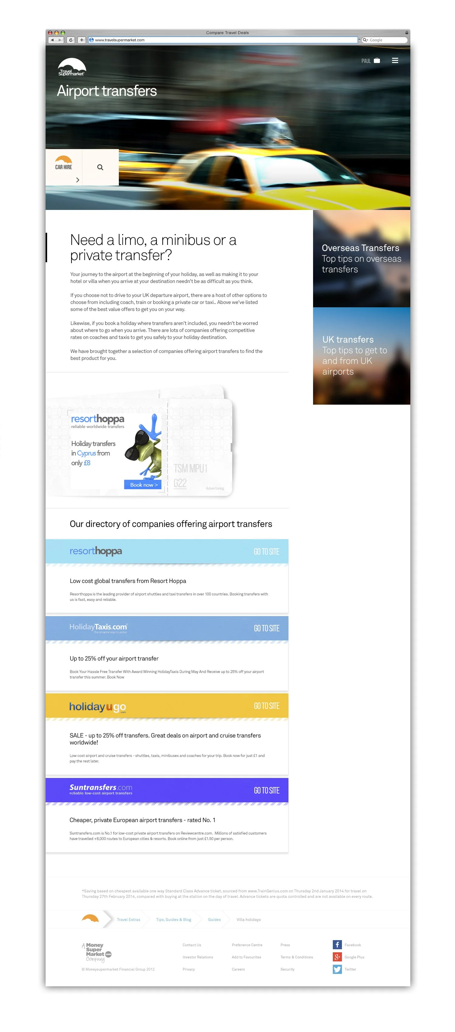
The initial state of the existing site presented a daunting challenge, characterised by over 20 disparate content layouts that were poorly structured and challenging to read. In response, I successfully rationalised this chaotic landscape, streamlining it into a cohesive and user-friendly experience.
The transformation involved consolidating the diverse layouts into a single, responsive design. This unified approach incorporated a set of modular components tailored to accommodate various content types, ensuring a consistent and structured presentation throughout the website.
The outcome was a more organized and visually cohesive platform, markedly improving the readability and overall user experience.




2 - Strategy
Business Model
TravelSupermarket earn a commission on each click, or when the customer makes a booking. Revenue is dependent on high traffic volumes, and the business model relies heavily on attracting visitors through organic search. TravelSupermarket.com comprises literally thousands of pages of SEO holiday-related content.
Shop
Super Search
Earn Customer Loyalty
Preferred Partner
Partner Insight & Buyer Data
Customer Insight Programme & Data Science

SEO content strategy
The content strategy revolved around the substantial task of lifting and shifting 6000 pages of existing content while simultaneously generating new content for the updated website.
This extensive effort included the creation of over 6000 hero images, strategically designed to enhance the performance of each page. The challenge extended to ensuring that each image seamlessly accommodated both mobile and desktop platforms across all breakpoints, maintaining optimal visual appeal throughout the user experience.
This comprehensive content strategy aimed to not only retain the essence of the existing content but also elevate the website's overall quality and performance.

Partner Strategy
In addition to managing a vast array of images, our content strategy faced the challenge of handling hundreds of logos, which were in disarray on the previous site.
The complexity lay in maintaining brand recognisability; a straightforward monotone approach wasn't sufficient. With a mix of white and full-color logos, we strategically navigated this diversity. The goal was to harmonize the logos, ensuring each brand remained distinctive while adhering to a cohesive visual theme.
This meticulous approach not only preserved brand identity but also contributed to a more polished and professional aesthetic on the updated website.

TSM Brand Stratagy
The project encompassed a re-platforming, brand refresh, and the creation of a fully responsive site with enhanced user experience and contemporary design. The scope of this massive undertaking aimed at providing a modern and user-friendly platform for travel enthusiasts.

3 - Ideation

Sketching
The cornerstone of my idea generation process involves the humble sketchbook—filled with low-level sketches, almost like scribbles or doodles. It's the rapid extraction of ideas from my mind onto paper, allowing thoughts to materialise swiftly. In this unrefined state, ideas converge and take shape seemingly from nothing. The amalgamation of creative and analytical thinking organically organises these raw sketches into more coherent and efficient formations, unveiling innovative possibilities born from the simplicity of pen meeting paper.

4 - Design
Colour
Travel Supermarket's Revamped Palette: Accessible Elegance
In our exploration of travel brands, we noted a trend favouring sky and nature-inspired colours. For Travel Supermarket's revamp, we chose a distinctive orange and purple pairing. Inspired by sunsets and the sun's radiance, these aspirational shades aim to enhance the brand's allure in every interaction.
Strategic Harmony: The orange and purple hues, chosen for both aesthetics and complementary color theory, offer a visually pleasing and cohesive experience. This intentional pairing ensures a unique, memorable brand identity without compromising accessibility.
Inclusive Design: Prioritising accessibility, the palette was carefully crafted with the website as the starting point. Beyond visual appeal, it guarantees a user-friendly experience that resonates with a diverse audience.
Home
A Clean Home
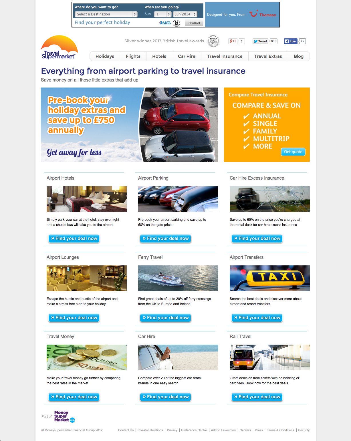
The key distinction between the old and new site lies in its decluttered essence.
The new design represents a departure from ads, eliminating distractions and enhancing user focus.
The primary goal was to integrate seamlessly into search results, aligning with a novel business model centred around deriving revenue from results, not advertising.
This strategic shift underscores a commitment to user-centricity approach.
Search
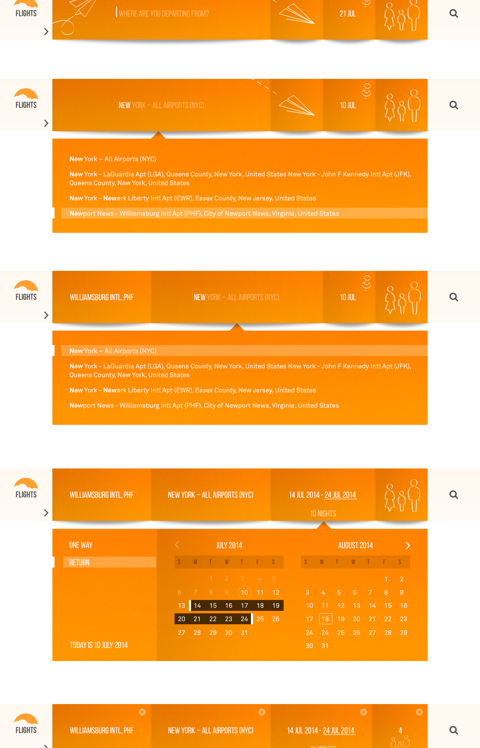
UI Design Approach
The Travel Supermarket (TSM) user interface is grounded in a modular framework featuring a cohesive set of components and uniform design patterns.
A particular focus was placed on search results, which are meticulously represented as cards. Extensive effort was dedicated to the design of these search result cards, aiming for a seamless and consistent visual language across all search channels.
The result is a UI that not only embraces modularity for efficiency but also prioritizes a unified and visually pleasing experience, ensuring coherence and user familiarity across various interactions on the platform.
Animated Testing
Search 1 vs Search 2
The initial designs, while visually appealing, didn't perform as effectively in testing compared to the more traditional UI. Users were able to navigate the UI, but not as swiftly, leading to the perception that the visual enhancements didn't outweigh the importance of meeting user needs efficiently.
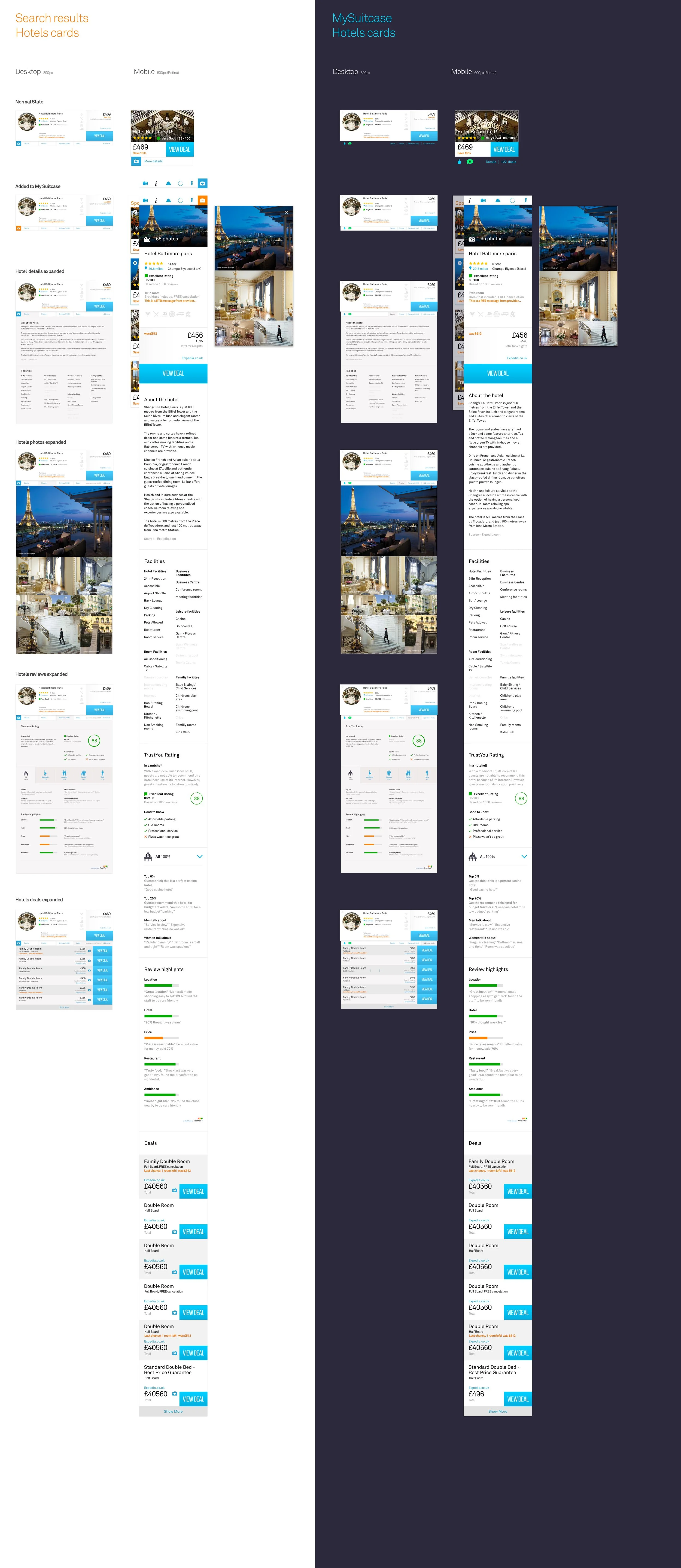
Result Cards
UI Design Approach
The Travel Supermarket (TSM) user interface is grounded in a modular framework featuring a cohesive set of components and uniform design patterns. A particular focus was placed on search results, which are meticulously represented as cards.
Extensive effort was dedicated to the design of these search result cards, aiming for a seamless and consistent visual language across all search channels.
The result is a UI that not only embraces modularity for efficiency but also prioritizes a unified and visually pleasing experience, ensuring coherence and user familiarity across various interactions on the platform.
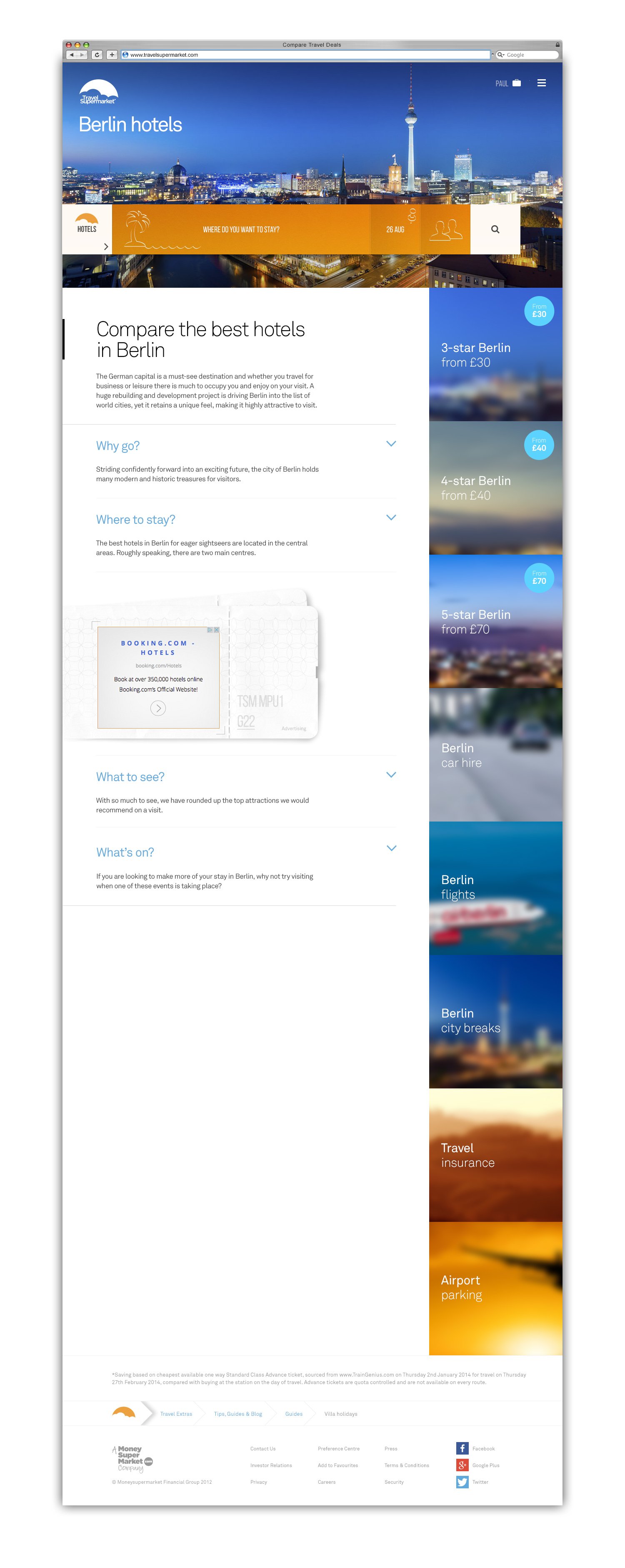
SEO Content
UI Design Approach
The Travel Supermarket (TSM) user interface is grounded in a modular framework featuring a cohesive set of components and uniform design patterns.
A particular focus was placed on search results, which are meticulously represented as cards. Extensive effort was dedicated to the design of these search result cards, aiming for a seamless and consistent visual language across all search channels.
The result is a UI that not only embraces modularity for efficiency but also prioritises a unified and visually pleasing experience, ensuring coherence and user familiarity across various interactions on the platform.
6000+ Hero Images
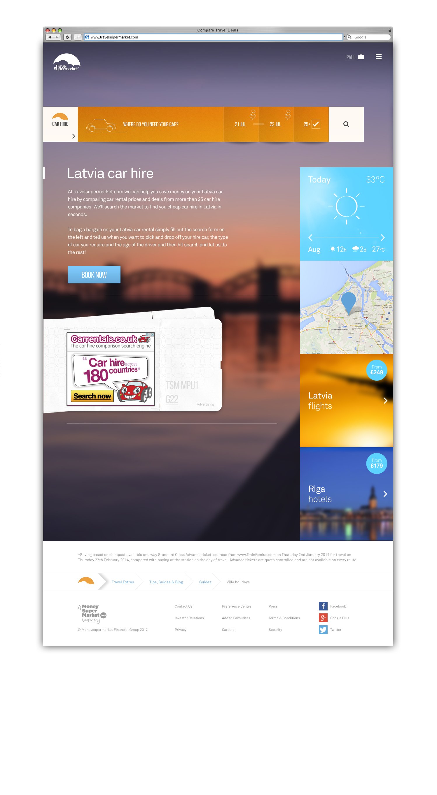
Full Page Fallback Grads
The sky gradients are fall-backs using css for pages with full page background images.
They can also be added when a large image has to load in.
The gradients are made using 3 layers. 1 solid layer and 2 tarnsparent gradients coming from the two top corners.
Templates
The design includes two layout systems.
1. A single main column equally sub-divided where necessary. This allows content to span the width of the page.
2. An asymmetric two column layout. The comprises a wide primary content column to the left, and a narrow sidebar to the right for secondary, related or supporting content.
Both systems can co-exist on the same page.
Advertising
Ads
Advertising on the site generated substantial revenue. While it can be annoying, it's the reason we could offer better rates. The design challenge was to minimise this annoyance and disrupt the user journey as little as possible.
Home Takeover
By creating a full-page home takeover, we provided our brands with a unique advertising opportunity. My designs aimed to integrate the takeover seamlessly into the homepage layout. The content was meticulously crafted to avoid disrupting the overall design.

5 - My Suitcase
My Suitcase
My Suitcase was a bookmarking tool that allowed users to package their own holidays together and share them with friends.

6 - User Testing
Research Approach:
The research objectives were achieved through a series of 12 one-to-one lab-based sessions. Each session lasted up to 60 minutes. The structured sessions commenced with a brief opening interview, followed by core tasks, and concluded with a short closing interview to summarise the participants' experiences. To ensure balance, the order of site presentations was counterbalanced, with half the participants using the new site first and the other half starting with the existing site.
Moderation Style:
Participants were initially prompted to conduct a holiday search on TravelSupermarket, sharing their thought processes aloud. Emphasis was placed on not spending excessive time on third-party websites, allowing for a natural flow of the user's experience. Once participants found a suitable holiday, they were guided back to the search and results pages to test key functions aligning with the research objectives, such as filters.


