Travel Super Market
Branding
My Role - Creative Direction, Design Direction, Design, Branding

Brief
The redesign of TravelSupermarket.com, a prominent travel search and comparison site in the UK. The project encompassed a re-platforming, brand refresh, and the creation of a fully responsive site with enhanced user experience and contemporary design. The scope of this massive undertaking aimed at providing a modern and user-friendly platform for travel enthusiasts.
Research
I conducted research into worldwide travel brands and consumer reach, collaborating with agencies to ensure that all my design decisions were informed by data and market trends.
This approach allowed me to create designs that were not only visually appealing but also aligned with the preferences and behaviors of the target audience.
Brand Tone Of Voice
Fun
Family
Colourful yet sophisticated
Action / People doing things
Attainable yet aspirational
Capture the spirit of a holiday

Digital Transformation
My team revitalised an outdated digital platform while preserving SEO performance.
The web product's redesign yielded impressive results from design alone, boasting a remarkable 13% surge in unique visitors, while conversions witnessed improvements across all channels.
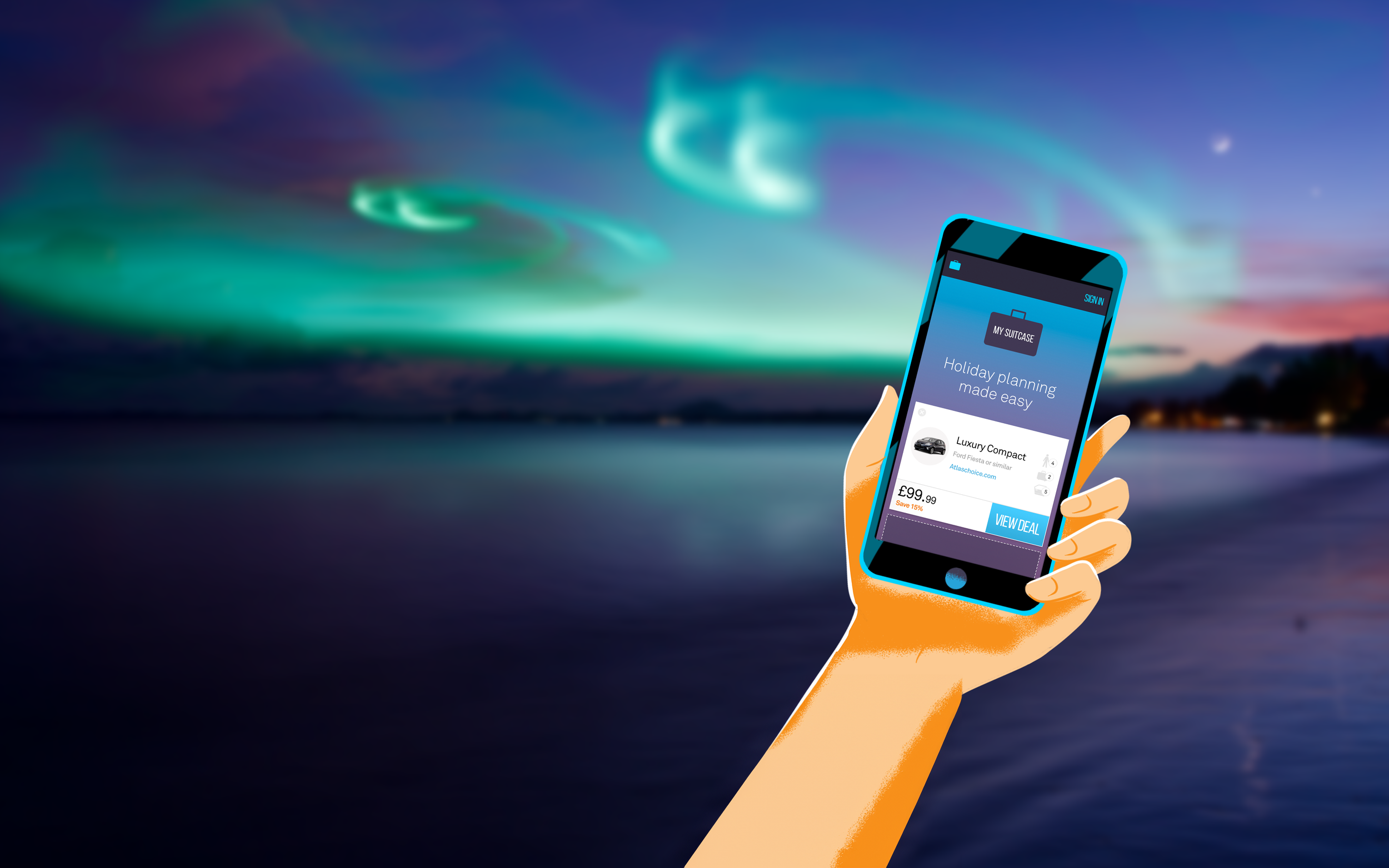
Within a broader CRM initiative aimed at fostering customer loyalty, we created "My Suitcase".

Logo Evolution
The refreshed logo employs a modern typeface, effectively harmonising the brand's visual identity.
The logo's modernisation includes a transition to a sleek flat colour, departing from the outdated gradient style - this design change offered enhanced adaptability across print, digital platforms, and TV, bolstering its accessibility.
Colour Me Happy!
During our exploration of travel brands, a striking pattern emerged: the majority of these brands lean towards colors associated with the sky or nature.
In the case of the revamped Travel Supermarket, we opted for a distinctive colour pairing within the travel industry—orange and purple. This palette draws inspiration from the radiant sun and sunsets, which hold a special place in every holiday experience.

My Suitcase Branding
The My Suitcase brand and colour palette served as a seamless continuation of the Travel Supermarket rebrand. Drawing inspiration from the sky once more, the colours incorporate shades of purple, pinks, and blues reminiscent of the twilight sky.
An electric blue hue was introduced to evoke a feeling of technology, a driving force behind the functionality of the My Suitcase tool.
Illustration Style
Incorporating illustration into our brand's palette played a pivotal role in communicating intricate ideas. It facilitated the assimilation of concepts in an enjoyable, approachable, and uncomplicated fashion.

Inspirational Clicks Not Clichés
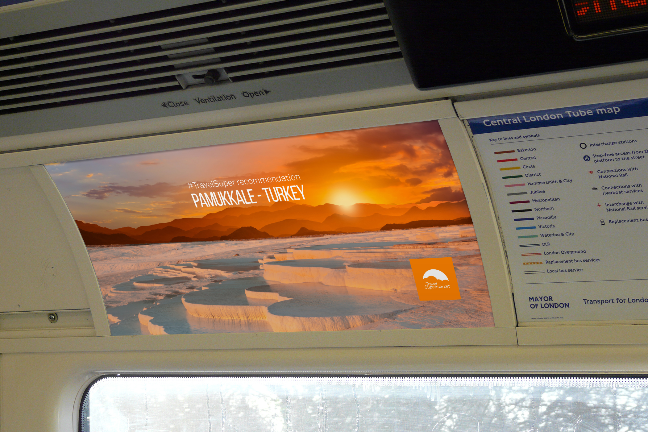
To enhance the brand and focus on selling the destination a move towards beautiful landscape photography was needed. Avoiding the obvious silhouettes and cheesy smiles, and instead focusing on something elegant and inspirational. We wanted to own the sky in our branding.
SEO Creative Campaigns
As part of my role, I elevated the quality of all brand and creative touchpoints, with a particular focus on campaigns aimed at significantly boosting SEO impact. The emphasis was on developing creative strategies that not only enhanced the brand's image but also contributed meaningfully to the site's search engine optimization.

Office Space
Having embarked on Travel Supermarket's branding journey, our London offices underwent a transformation. The walls were adorned with travel-themed vinyls and the gleaming new surfboards couldn't be missed—an ode to the exhilarating waves of possibilities that lay ahead.

The Stationary Had Wings
I designed stationary that had the blue prints (orange prints) for building fantastic paper aeroplanes. I wanted everything to travel better, even our mail!


