

Sage
Design Language System
My Role - Project Lead, Creative Direction, UX Direction, Design

The Brief (Self Initiated)
Create a company wide design language system, so that we build a more-robust experience which can be future-proofed, provides more detailed reporting and enables ongoing optimisation - across all touch points from North to South and East To West.
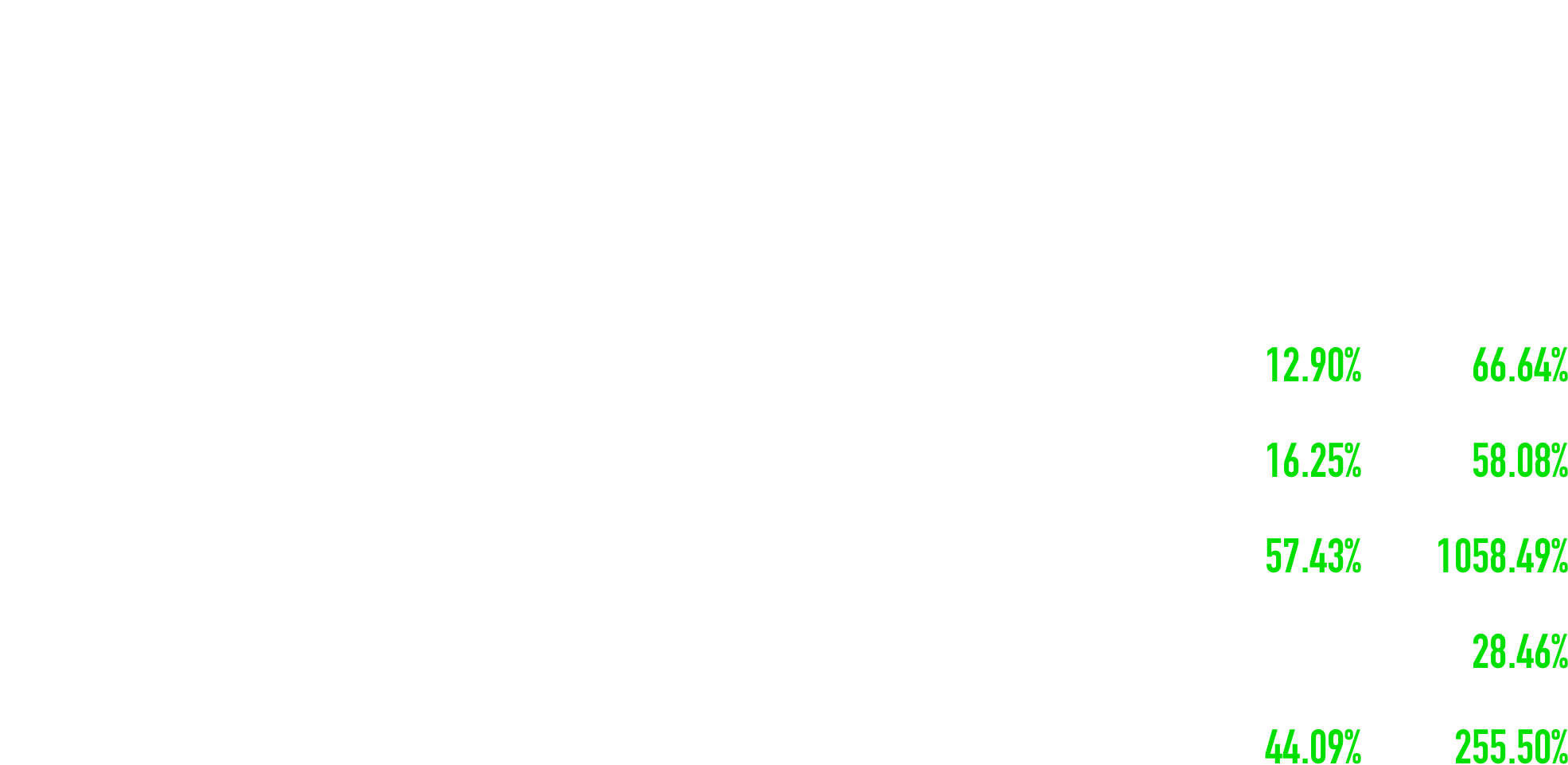
The Results For .com Post DLS Launch
Project & Design Context
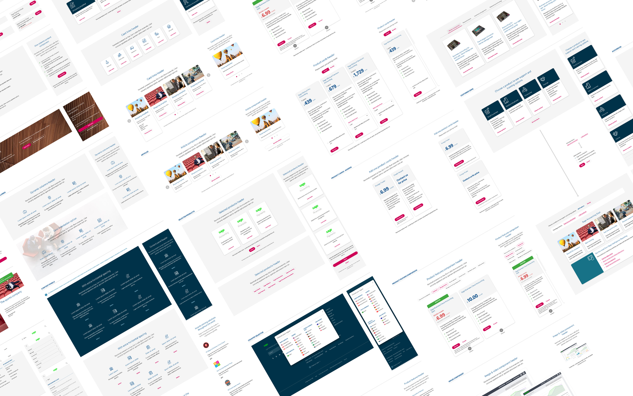
Fractured Design Resource
Before my arrival, a new website design had been initiated, deviating from the company's established brand - but without the brand team onboard.
All functions and teams were operating in isolated silos, each pursuing their objectives independently. Product, Brand, Marketing, Customer Experience.
The results created a fractured brand with deviating assets. Even the colour palettes and logos didn’t match!
Navigating Complexity
This transformative project at Sage spanned my entire three-year tenure and presented a significant learning opportunity.
It underwent various iterations, navigating internal complexities and adapting to changing strategic directions influenced by new C-Suite members.
Each phase necessitated the integration of different departments, gradually unifying our efforts.
Although it posed one of the most intricate challenges of my career, the experience instilled valuable lessons, primarily in navigating and managing complex organisational dynamics.
Collaborative Design Dynamics
The invaluable contributions from diverse departments during the design process were crucial, although, at times, they inadvertently led to a design-by-committee approach, which, in my view, diluted the quality and impacted the overall design direction.
Some team members lacked the necessary experience and were entrenched in Sage's traditional ways of operating, hindering the embrace of innovative practices.
However, despite these challenges, the journey revealed moments of exceptional design brilliance, even though certain groundbreaking concepts failed to gain traction, underscoring the untapped potential for innovation at Sage.
Despite the challenges substantial progress was made and the results and data demonstrated this.
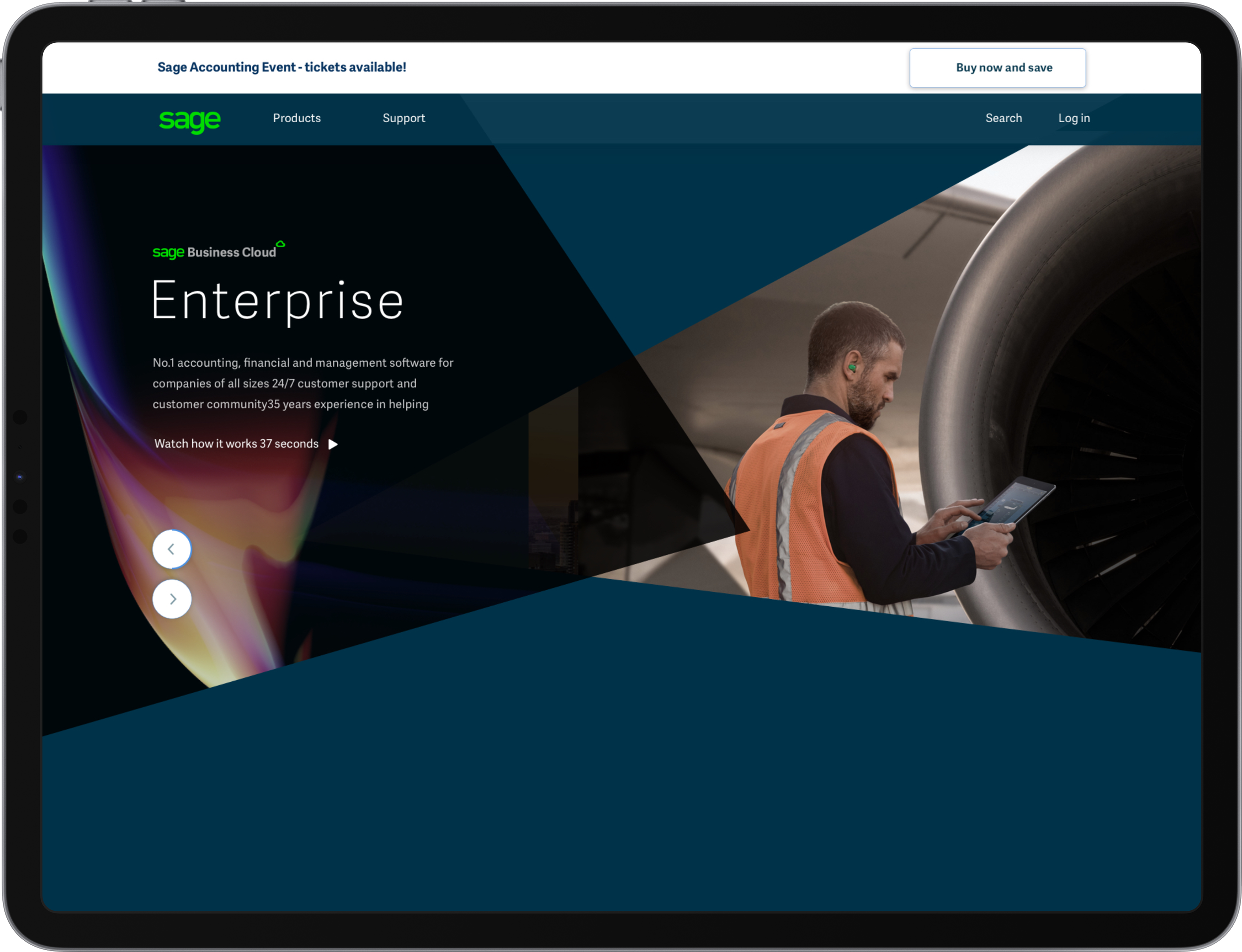
1 - .COM Clean Up
The 1st phase was about cleaning up the existing website while improving components from an atomic level and get it functioning on Sitecore ready for the future - it applied the current brand look & feel.
2 - Need For DLS
It was clear to me that consistency was never going to happen unless one design system existed company wide. The brand also felt dated and in need of some love.
The Sage Design Eco System

Animation Colour Iconography Illustration Layout Photography Sonic Typography
Benefits of a Design System
The building blocks needed to design experiences users love.
Delivers a seamless and consistent experience throughout a journey from external touchpoint to website and product.
Faster scaling by speeding up design and development; less re-work since everyone speaks the same language
Can ensure meets accessibility standards
Shifts design resource from replicating standard components, to the cutting edge.
3 - London Kick Off
During this phase, the primary focus was to align the brand team with my vision by presenting options for a new and exciting look and feel.
This stage was pivotal in establishing a cohesive, company-wide design direction that resonated effectively in today's SaaS market landscape.
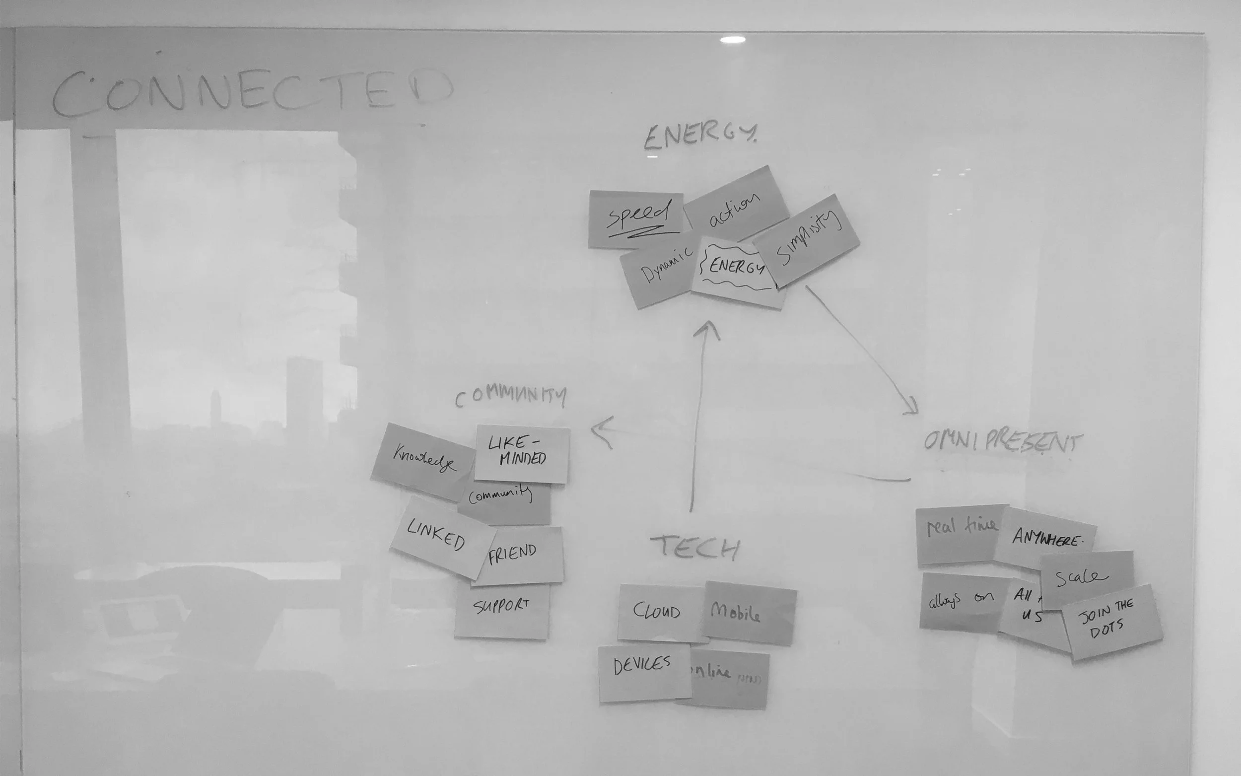
Shaping Sage's Design System with Semiotics
As the project lead I kicked off a series of engaging discovery workshops for the DLS project within our London-based team of UX, Design, and Tech, I aimed to establish a solid foundation of ideas before involving the broader company.
My personal fascination with semiotics and its profound ability to shape design through symbols that deeply connect with users on a subconscious level was a driving force.
I held a strong desire for Sage's design system to be deeply rooted in these principles right from the beginning, emphasising an approach that transcends fleeting trends and is deep routed in psychology.


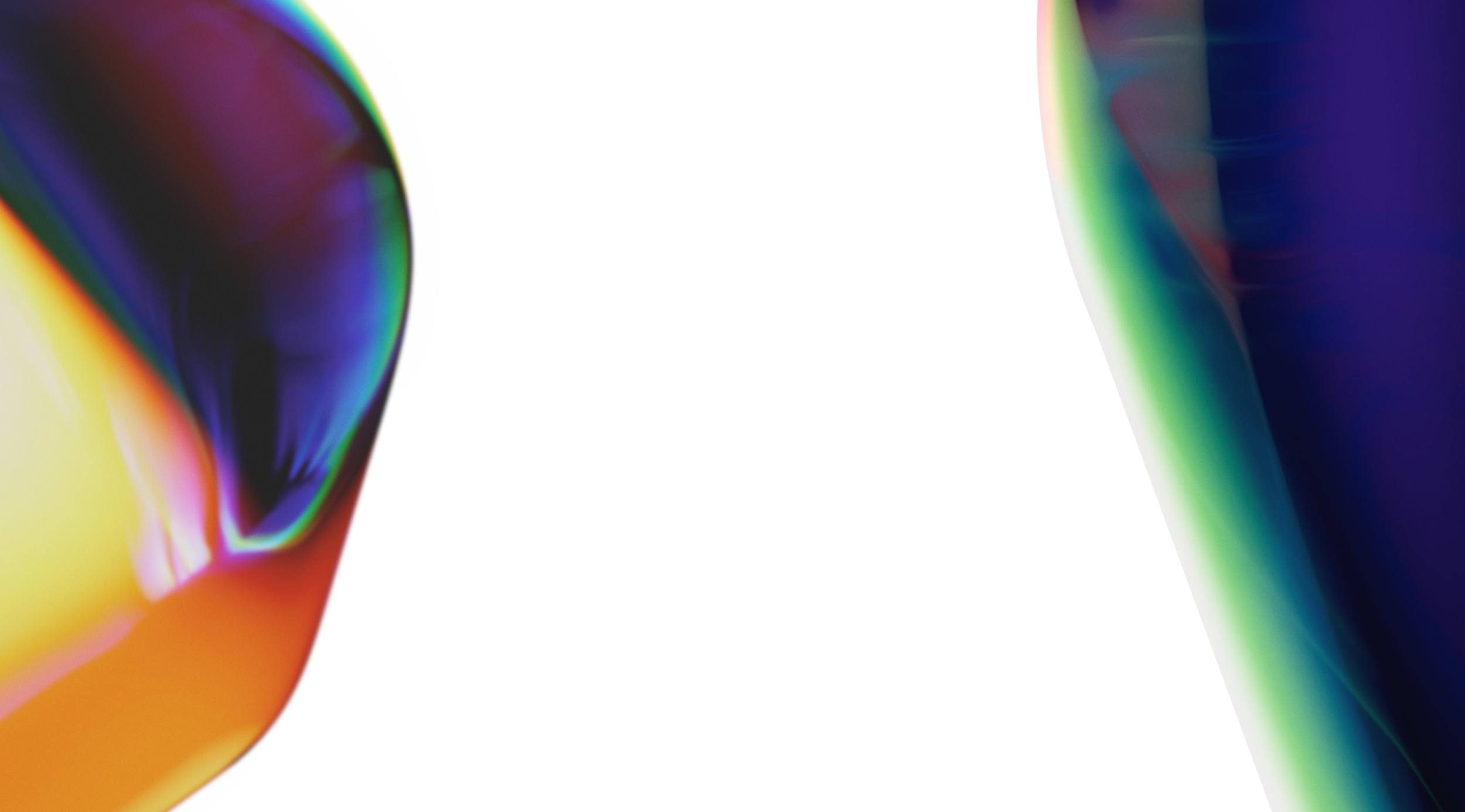
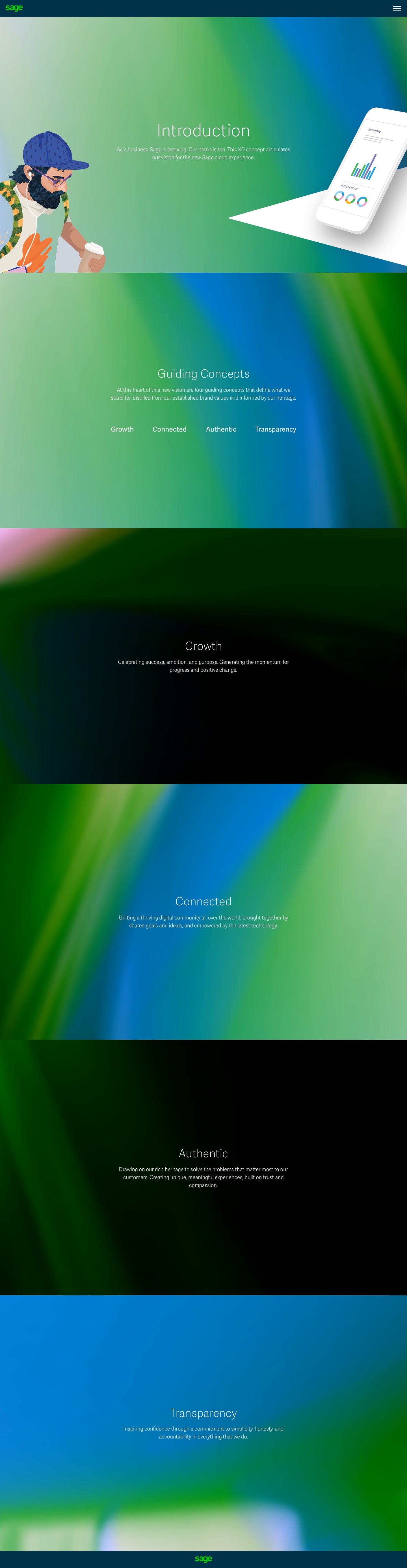
Connected Gradients
I delved into experimenting with gradients, igniting a fresh and exhilarating direction for Sage. It was about pioneering directions rather than conforming to the prevailing trends.
The allure of these gradients extended beyond mere aesthetics; they were deeply rooted in the semantic associations cultivated during our exercises in semiotics.
These gradients symbolised the flow of energy, the transmission of data through the cloud, and the essence of connectivity. They exuded a modern flair, brimming with vitality, yet remained friendly and accessible in their form.
The underlying concept was to assign distinct colours and gradients to different products, each unique in palette.
B2C approach to B2C
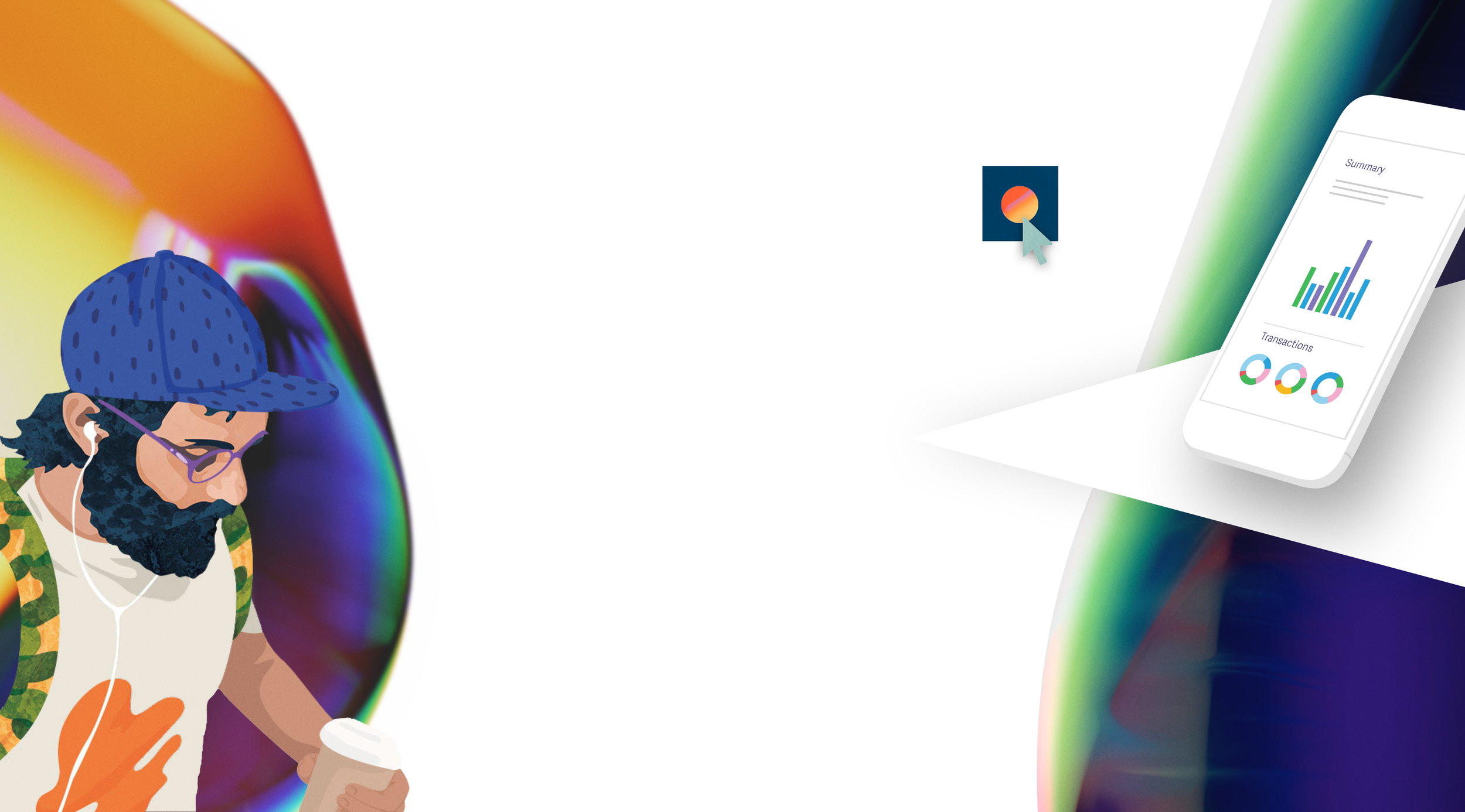
While Sage primarily operates in the B2B realm, our research indicated that small businesses resonated more with a B2C approach. With this insight in mind, I envisioned a distinct look and feel for our brand.
Rather than relying on mundane stock photography or poorly lit images from the brand library, I proposed utilising illustrations that capture the essence of our customers, infusing our brand with freshness and excitement. This approach aimed to break through the clutter of advertising noise and resonate more effectively with our target audience.
We sought to extend this approach to our UI design as well, infusing it with vibrant colors and streamlining its complexity. Furthermore, we aimed to present this cohesive style across various devices, ensuring a consistent and engaging user experience.
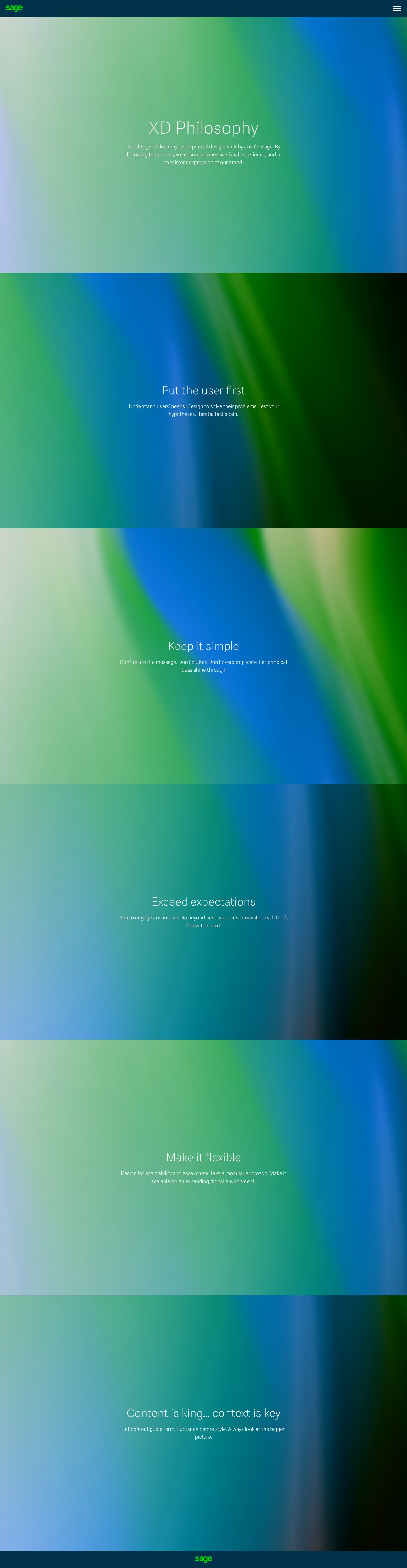
Design Exploration
Early designs felt modern, new and innovative. They were heading to an unexplored destination within the financial SaaS market.


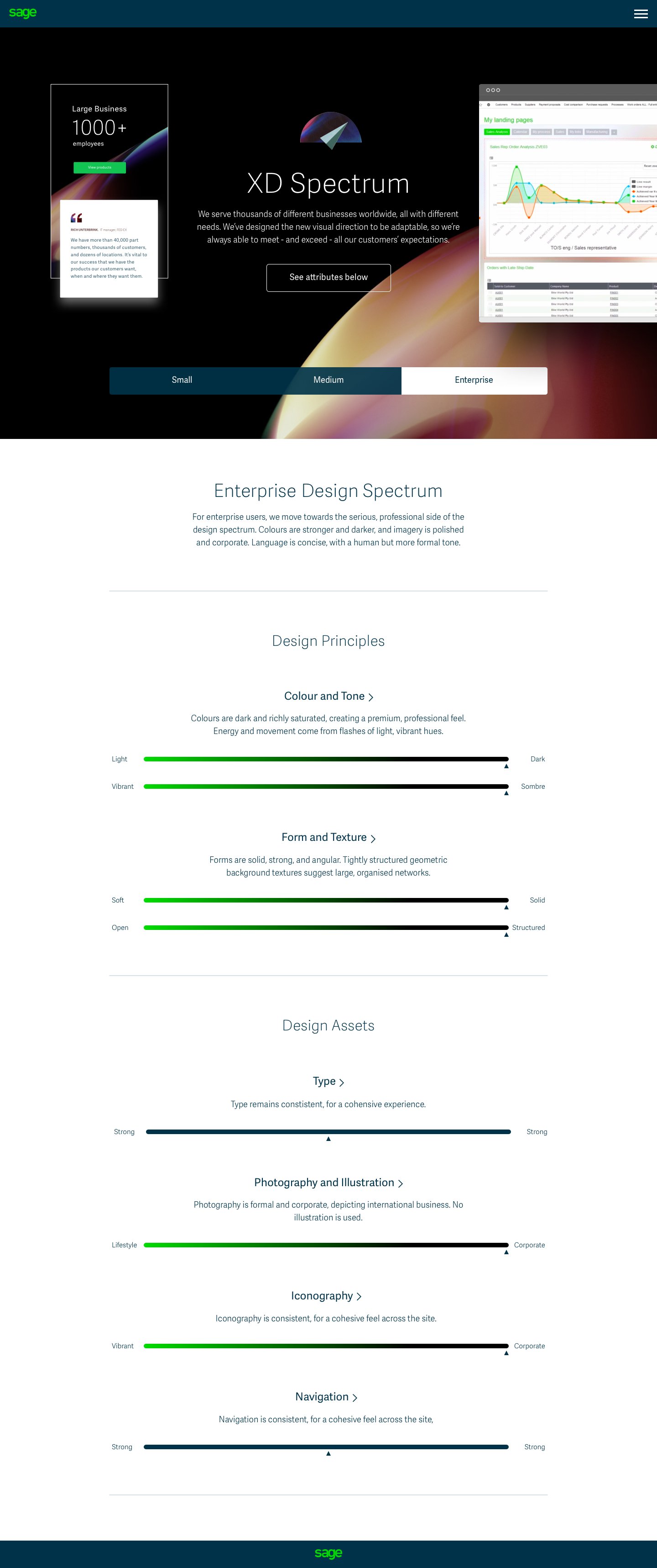
DLS Guides
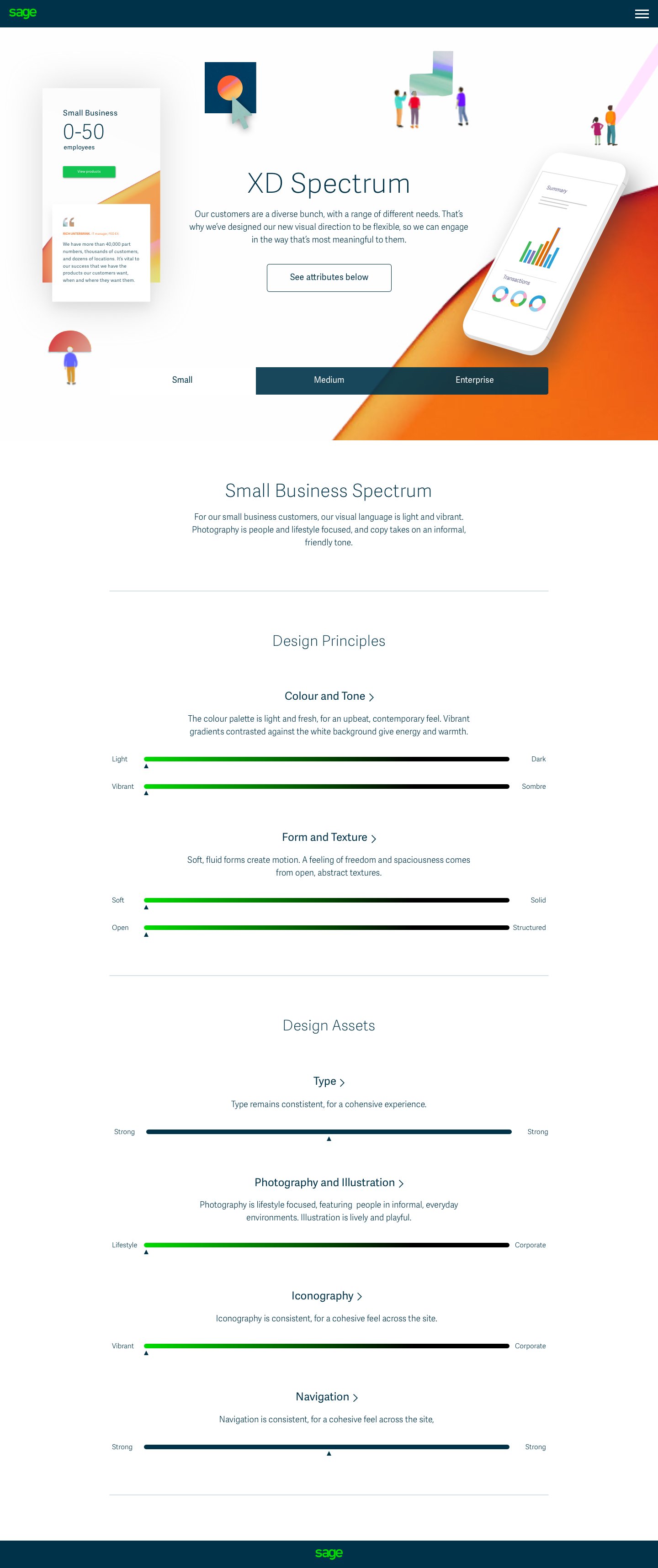
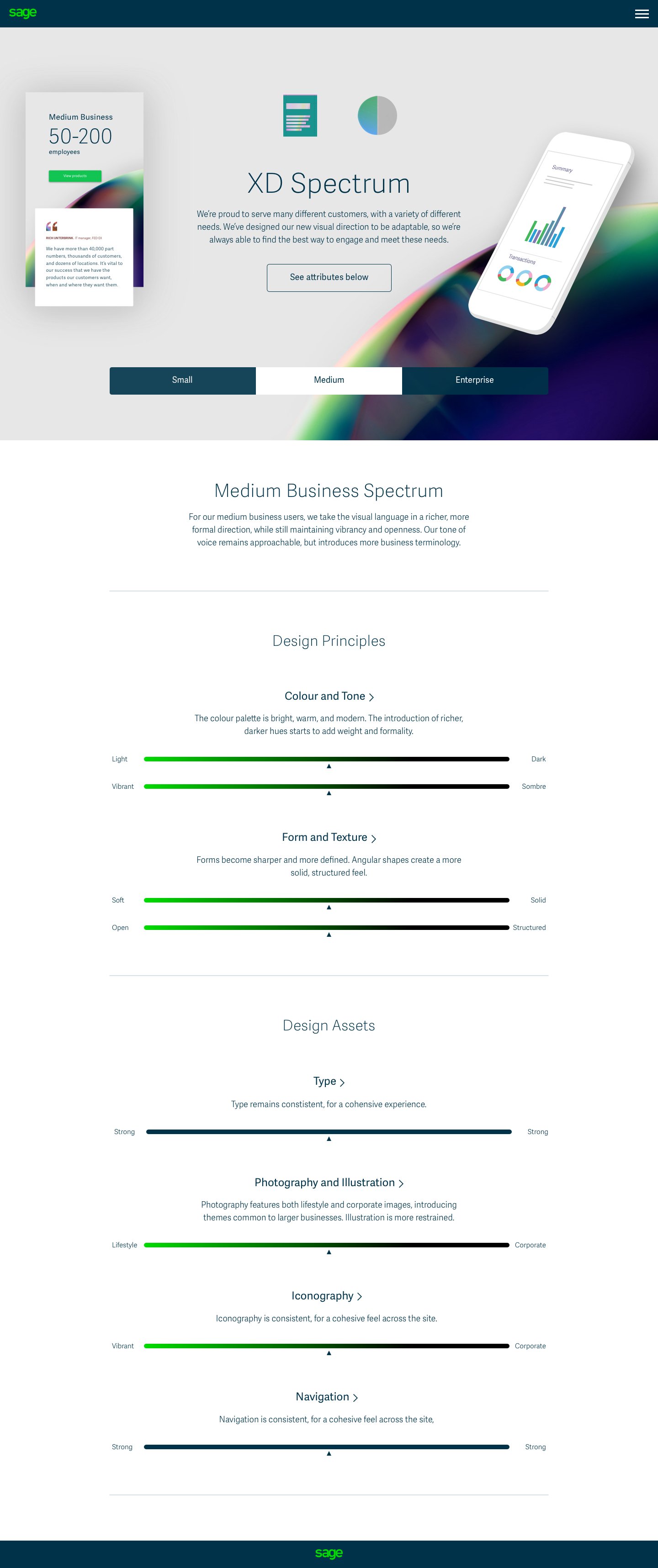
During the exploration of initial concepts, I delved directly into envisioning how the presentation of these ideas could be seamlessly integrated across the company. Additionally, I aimed to investigate how this presentation might dynamically adapt based on variables such as business size, thereby altering its color schemes and brightness levels accordingly.
My focus was on creating versatile DLS guides that could flexibly cater to the diverse needs and characteristics of our clientele. Whether it's a small startup or a large enterprise, the visual representation would adjust to reflect their unique identity, ensuring consistency while accommodating variations in size and other parameters. This approach not only enhances the brand's adaptability but also ensures a tailored and engaging experience for all users.


Logo
I set out to design a logo that captures Sage's identity as a collective of brands forming the Sage Business Cloud.
The logo aimed to visually symbolise the unity and collaboration among the different brands, representing their seamless integration within the ecosystem.
Each shape within the cloud would symbolise a distinct product.
And then…start again
After presenting the designs to the brand, they expressed their enthusiasm and admiration for the work. However, they now desired to embark on a new phase with their team actively involved.
This shift in direction exemplified the dynamics at Sage for the next three years. The analogy often used was akin to maneuvering a massive ship in the vastness of the ocean – a slow and intricate process. We frequently found ourselves having to pause, pivot, and accommodate various stakeholders before proceeding on our journey to a new destination, albeit sometimes less desirable.
Despite the challenges, as we concluded the London stage, it felt as though we had arrived at a new and exhilarating place, ready to embrace the journey ahead.
4 - Company Wide
This phase was about bringing all departments together and moving forward as one team.
Breaking Silos and Unifying Global Teams through Inclusive Workshops
When I joined Sage the product design and creative departments worked in silos rather than working together.
Despite initial skepticism and claims that such cooperation had never been achieved, I remained resolute in my commitment to fostering unity and teamwork.
Establishing strong connections with department heads across various locations, including Newcastle, San Francisco, Madrid, and London, I initiated an inclusive workshop that served as a catalyst for promoting a culture of collaboration and collective progress.
It did mean going back to the drawing board…

Our initial undertaking involved establishing the principles of the design system. This process entailed gathering input from everyone regarding their perception of what defines "Sage" and sets it apart from other products.


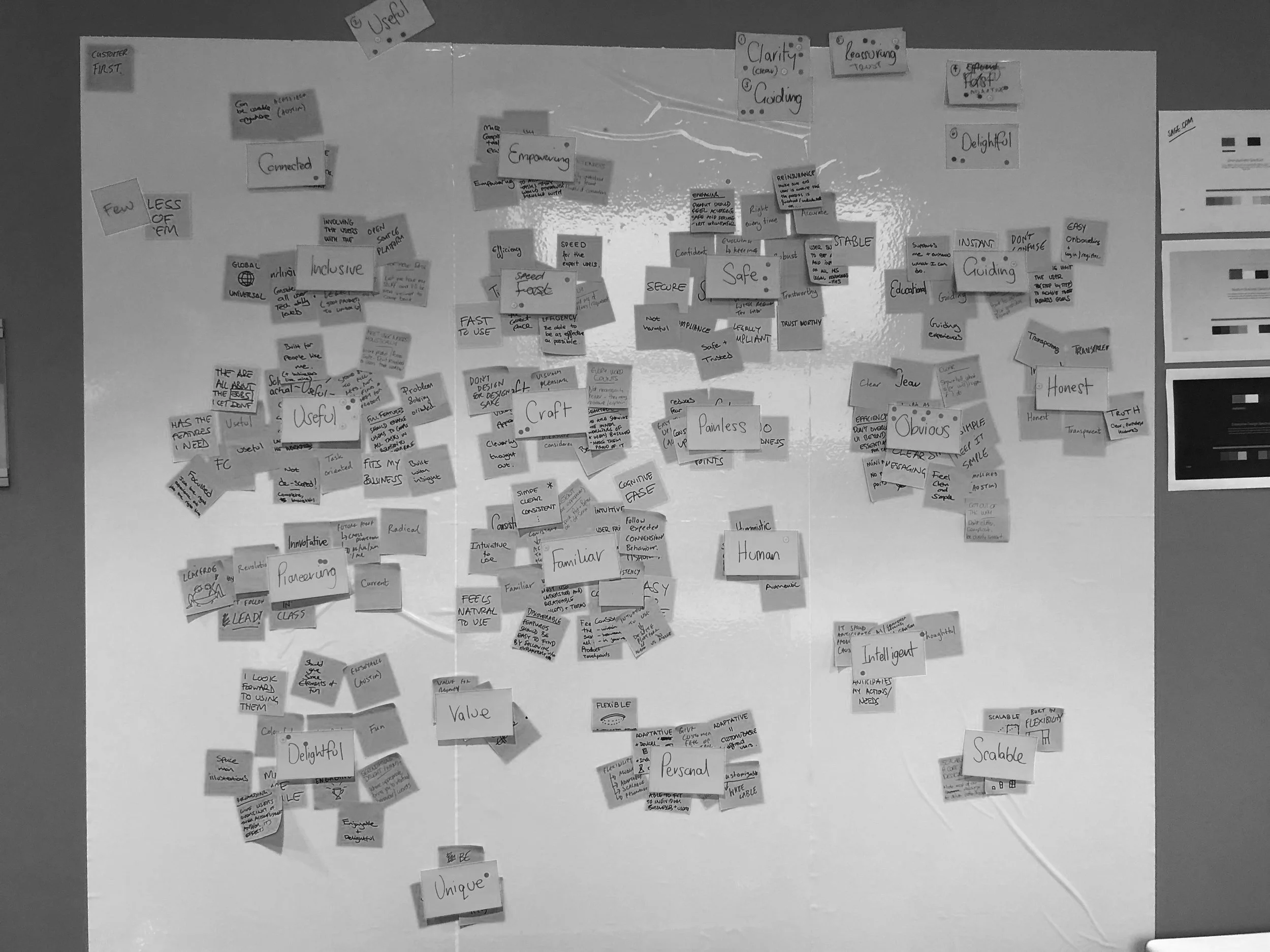

The Sage Design Principles
Clear and Guiding
Reassuring and Trustworthy
Delightful and Useful
Adaptive and Contextual

To ensure inclusivity and foster unity, we conducted sorting and voting exercises as a group.
It was vital that every team member felt heard and valued throughout this process, especially considering that this was the first instance of our entire team coming together as a cohesive unit.

One concept I was keen to “push” was the integration of a united, translucent cloud, seamlessly merging the suggested product colours and semiotics from the London Sessions.
This portrayal not only represented the company as a whole but also highlighted the individual products as an interconnected ecosystem.
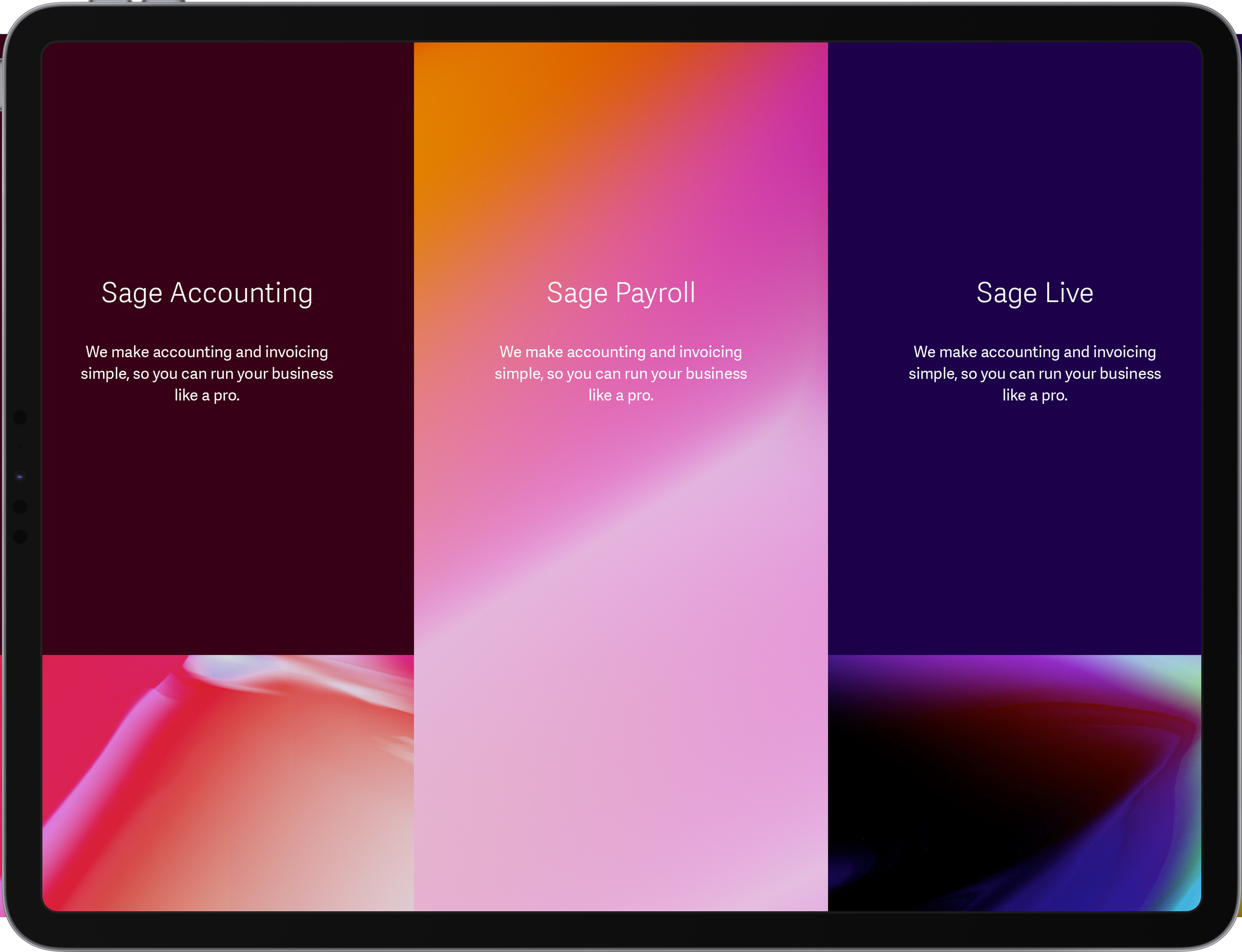
Crafting Sage's Product Spectrum
Early on, it became apparent that to effectively convey the diversity of Sage's product range, we needed to establish several key elements:
Product Naming
Product Color
Product Iconography
Before this endeavour, Sage lacked distinctive product icons, relying solely on uniform font and colour for identification. This uniformity hindered users from swiftly locating specific products, underscoring the significance of addressing these fundamental design elements.
Although Sage already boasted a robust color palette, they had yet to harness the power of color theory and apply it harmoniously. I made it a priority to rectify this. Leveraging the principles of colour psychology, we decided to designate green for more affordable products, considering its association with cost-effectiveness. On the other hand, blue and purple were reserved for higher-end offerings, aligning with their perception of premium quality. Additionally, our choice of green resonated with users familiar with Excel and Google Sheets, thereby facilitating a smoother transition for small businesses migrating to our platform.

Brand-affinity tested and performance-marketing tested with 250 customers

Design Route 1
A design that is user-focused, uncluttered, and honest. An idea to create unique, meaningful experiences, built on trust and compassion.


Design Route 2
Transparent layers overlap and merge, connecting and creating new forms. A celebration of our global community of business builders, united by shared goals and ideals.


Design Route 3
Product-focused, futuristic, dynamic. Designed to inspire. Driving success, ambition, and purpose, and generating the momentum for positive change.


Results
Preference Testing
As an integral component of the DLS workshops, we conducted small-scale preference testing with businesses.
This endeavor included conducting in-person testing sessions with 13 customers, supplemented by online testing involving 200 customers.
Through rigorous testing, clear preferences emerged: "Route 2" for the product's appearance and "Route 3" for the outdoor advertising.
These options were overwhelmingly favoured over the existing brand aesthetics.

5 - The Double Cross
Navigating Obstacles and Resilience in the Face of Opposition
In the final stages of the design process, despite collaborating closely with the brand team, our presentation to the CMO was met with unexpected adversity. The global head of the brand adamantly disowned the project, despite prior endorsement, citing concerns about a perceived deviation from the brand image despite having members of his own team actively involved.
This unforeseen rejection was a disheartening blow, compelling us to reassess our approach and find ways to move the project forward while adhering to the existing brand parameters. Despite the resistance encountered, our determination to create a unified design narrative remained steadfast.
Navigating Brand Dynamics for Unified Progress at Sage
Following discussions with the CMO, we reached a consensus that the UX team would pursue a less radical design, charting a course that balanced the earlier proposed routes. Despite research indicating the need for change, the brand continued in its own trajectory.
Undeterred, we proceeded with the development of the comprehensive Design Language System (DLS) across all digital touchpoints, aiming for a unified and seamless user experience across Sage platforms.
6 - “Compromise” DLS
During the development of the new look for the Sage website, the components were systematically integrated into the DLS Library


7 - Global DLS Launch
We successfully launched the improved design globally across 33 markets using the Sitecore legacy platform.

Leading an In-House Success Story
Under my guidance, the in-house UX team, spanning the UK, Ireland, USA, and Canada, achieved a groundbreaking milestone for Sage. Our team were the first to use the new DLS. Our concerted efforts resulted in the project being completed ahead of schedule and within budget, leading to a remarkable 42.30% surge in site conversion rates.
