Sage
Brand Development
My Role - Creative Direction, Design Direction, Design

The Brief (Self Initiated)
The self-initiated brief aimed to elevate the creative caliber and enhance the quality of design assets within Sage. The objective was clear: transition from reliance on outsourcing to nurturing internal talent to drive innovation and excellence in creative endeavours.

Global Design Language System
During my time at Sage I led the implementation and development a company-wide design language system, creating a more robust experience across all touch points, from North to South and East to West.
This system extended across all design and creative, including advertising, product design, marketing, and customer experience.
Brand & Product Colour Palette
Although Sage already had a colour palette, they had yet to harness the power of colour theory and apply it harmoniously to the entire creative eco system.
Tones and tints were treated as completely separate Pantone colour values rather than tonal variations or one colour. I prioritised rectifying this by leveraging the principles of colour theory and colour psychology when defining the product colours.

Digital Transformation
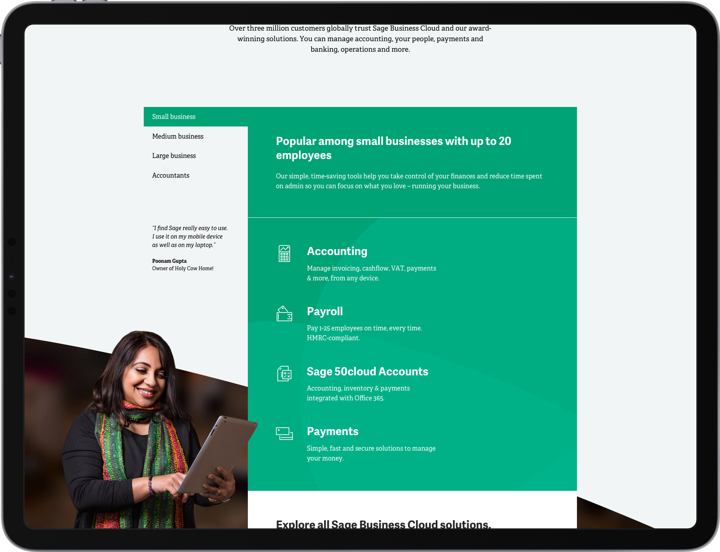
My team delivered new websites in 33 countries. Driven by a new master site design experience.
The initiative not only met the deadline but also remained within the allocated budget, culminating in an impressive 20% increase in e-commerce transactions.
Strategically enhancing both vertical and horizontal customer journeys proved instrumental in elevating user experience and satisfaction.
Connected Cloud
The Connected Cloud encapsulated the Sage product ecosystem unifying seamlessly. The colours forming the cloud were drawn from each individual product.
Although the logo did not evolve into a brand logo as initially intended, it became a significant design asset utilised across the site. This mark embodied connection, transparency, and a harmonious ecosystem of products.

Better Customer Photography
I embarked on a mission to revitalise Sage’s photography. They needed to serve as compelling narratives, capturing our customers' stories and sparking inspiration among our audience. The previous brand photography suffered from a lack of clarity, characterised by dark and cluttered spaces that left little room for text or inspiration.

A New Direction
In addition to improving our more traditional customer photography, I sought to inject new life into our imagery by leveraging our new colour palette. Accents of our product colours were used as highlights, creating a technological glow and adding a modern touch to our visuals.
Product Logos
Sage had never previously created distinct logos for each of their products, instead relying solely on typography. This approach made it difficult for users to locate products within the UI. Testing revealed how challenging it was for customers to find their product quickly on a page.
To address this, we designed unique logos for each product, incorporating graphic representations that aligned with the product's business size and colour. For example, the "A" for Accounting is inspired by an abacus, while the "E" for Enterprise Management resembles a warehouse on its side. Each of the 200 logos featured a unique creative concept and adhered to a defined grid.
As a result of these design improvements, users were able to quickly and easily identify their products.

Illustration Style, Library & Department
Incorporating illustration into our brand's palette played a pivotal role in communicating intricate ideas. It facilitated the assimilation of concepts in an enjoyable, approachable, and straightforward manner, reducing reliance on expensive photo shoots.
We developed a diverse range of illustrations, from full-page artworks to icons, benefits, and segments, ensuring consistency and clarity across all visual communications.
As an advocate for developing internal talent, I established an illustration department within Sage. This not only saved money but also allowed for greater speed and creative control.
Creative Experience Design
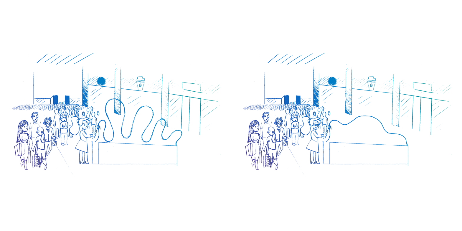
The concept on the right was part of a pitch for outdoor experiences, showcasing how Sage streamlined complex problems into simple solutions. From daunting to easy!
During my time at Sage, I inspired my global teams to consistently generate innovative ideas and think broadly. Creative and design thinking had plateaued at Sage, often relying heavily on agencies for creative heavy lifting, without exploring alternative approaches.
My objective was to motivate teams to explore new avenues for enhancing our campaigns and pushing creative boundaries to new heights.

Creative Web Experiences
Previously at Sage, concepts tended to be static and often lacked creative depth. When creative ideas were introduced, they were sometimes not fully developed.
My goal was to significantly elevate the experience design by introducing interactive experiences that are more engaging for the user.
By taking projects from start to finish, including creating all assets in-house, we were able to deliver more impactful results at a reduced cost.


