
Royal Flying Doctors
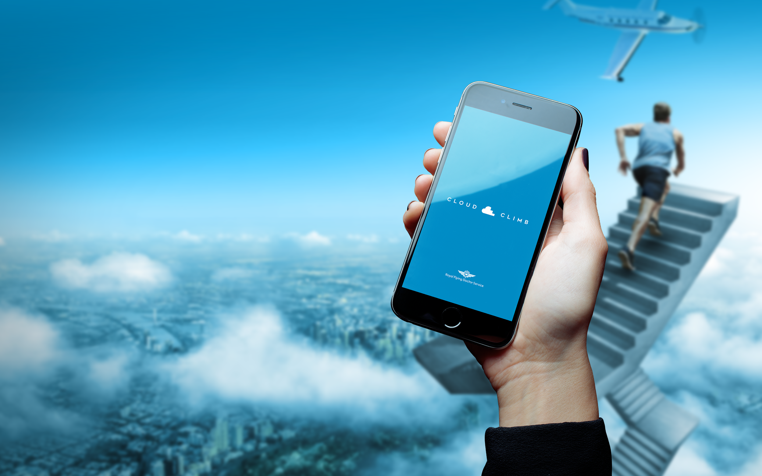
Cloud Climb App
My Role - Creative Direction, Design Direction, Design, UX

Brief
Design an app for The Royal Flying Doctors “Cloud Climb” charity activity.
Creative Solution
Given the demanding project timeline and a somewhat loose brief, I made the strategic decision to jump straight into designing the UX with high fidelity design, bypassing the wire framing stage. My experience honed over years of working under tight deadlines came in handy here. While adhering to the prevailing design trends in fitness apps, which favoured a flat design aesthetic at the time, I injected a distinctive element into the interface inspired by plane cockpits, providing a unique twist.

Login
The login process was intentionally kept simple. Users were required to enter their mobile phone number as a single-field login, ensuring a streamlined and user-friendly experience.

Dashboards
Incorporating inspiration from the cockpit design of Royal Flying Doctors' small planes, I integrated dial elements into the app's dashboard. To represent the plane's nose, I employed a subtle curve. Instead of embracing skeuomorphism, I pursued a flat design approach while juxtaposing it with a genuine sky background, creating a visually engaging interface.

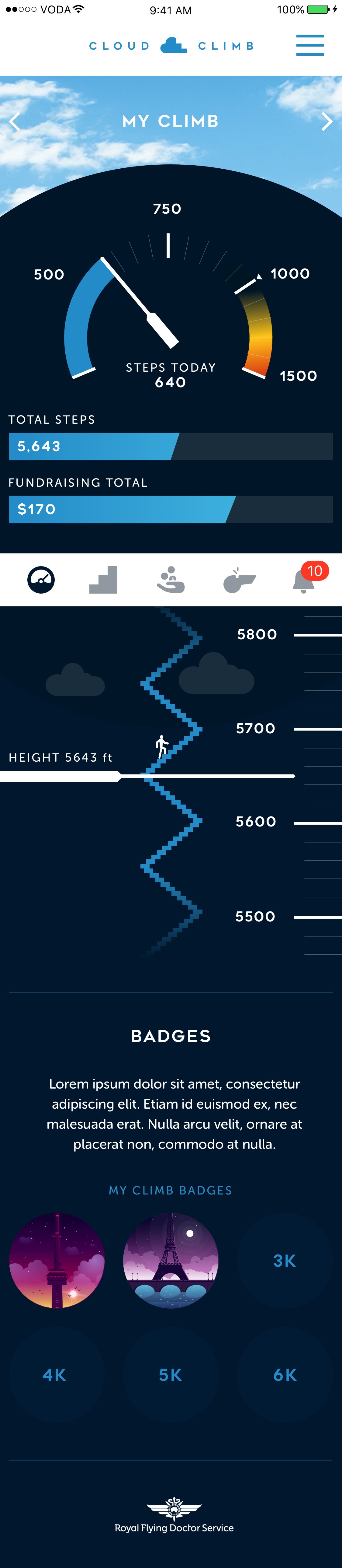

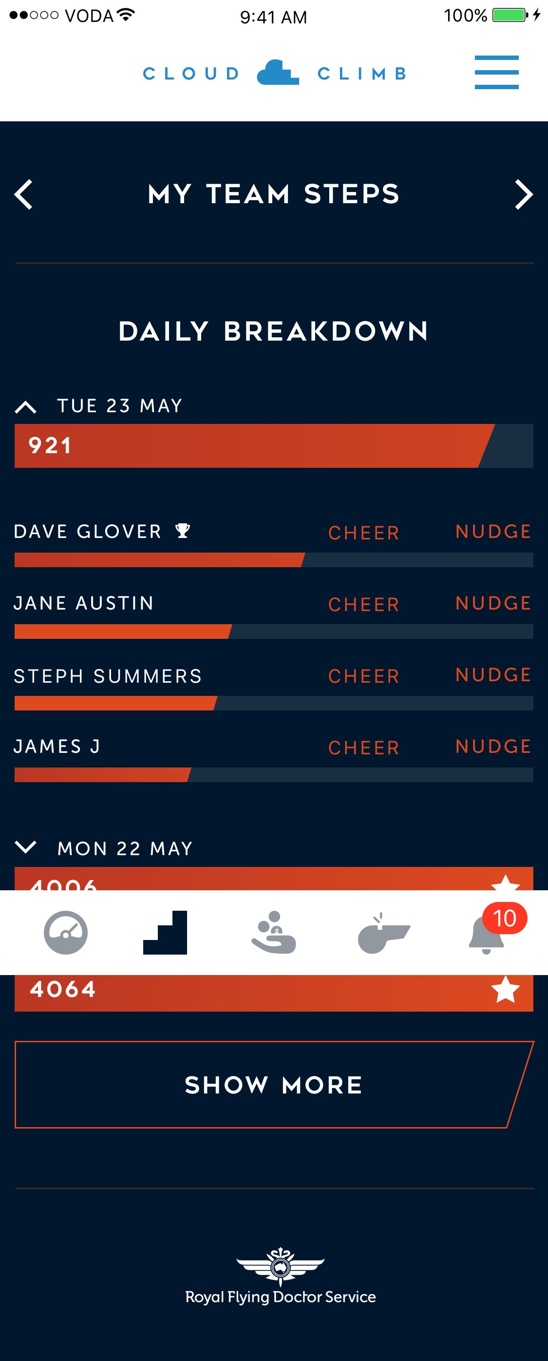
Walking In The Clouds
We tracked users' steps in various creative ways, one of which I particularly enjoyed was incorporating an altimeter to indicate how high they would have ascended if they were walking among the clouds. It added a unique and imaginative dimension to the step-tracking experience.


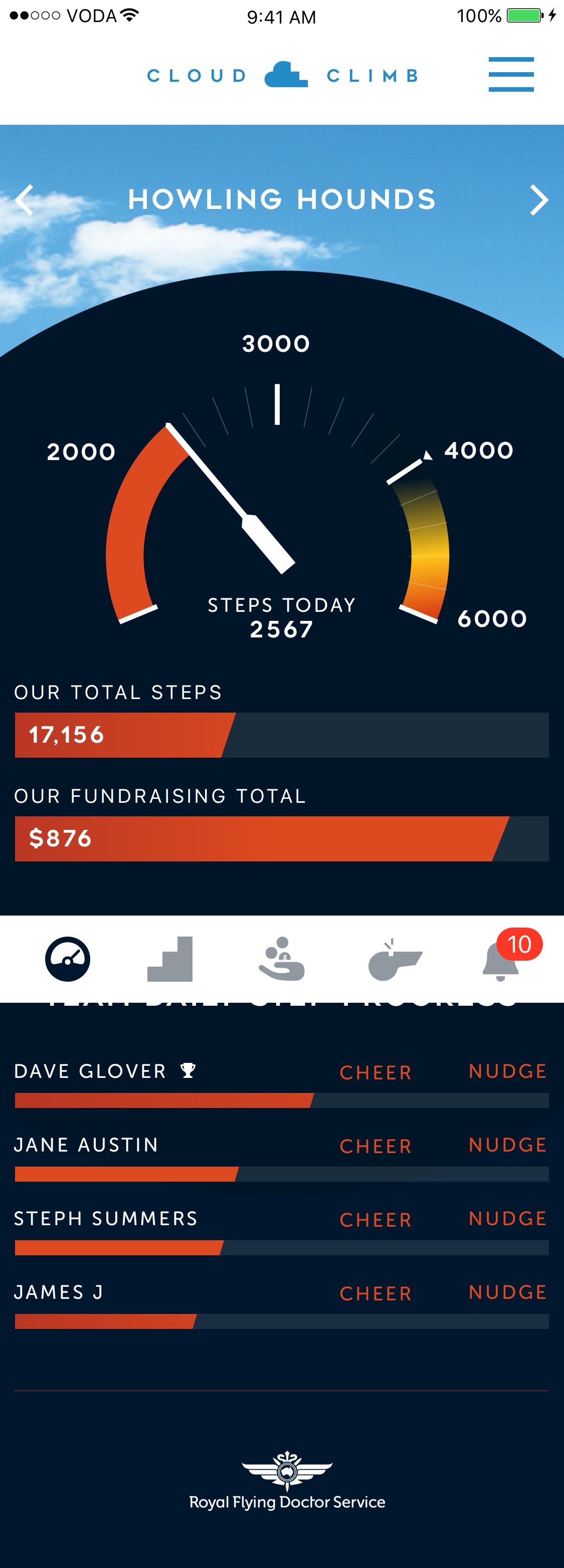
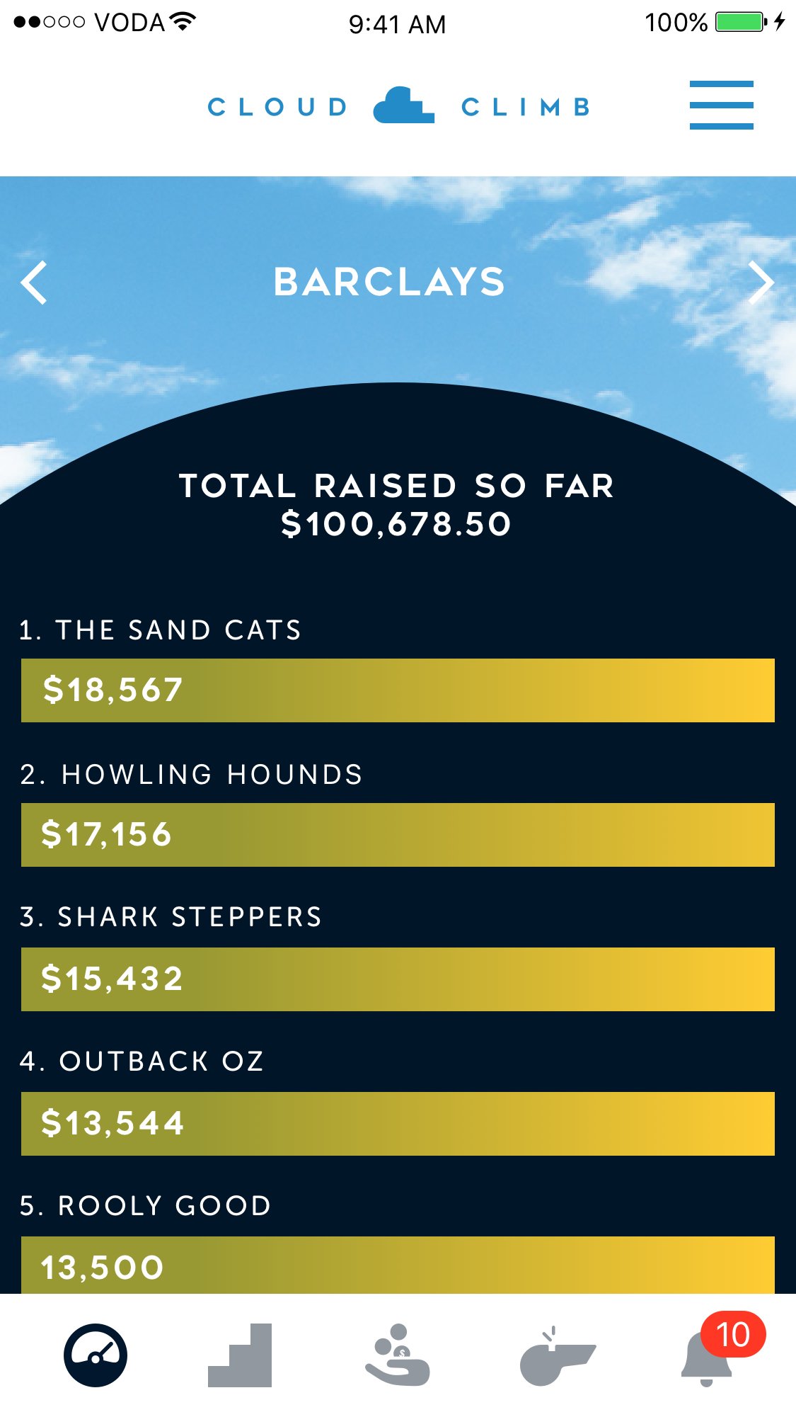
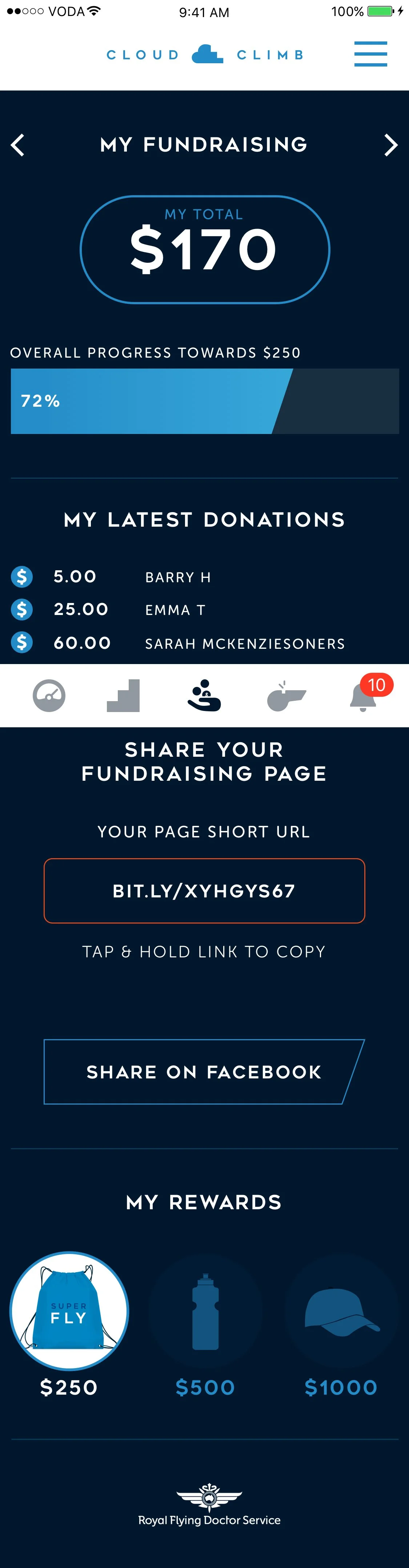
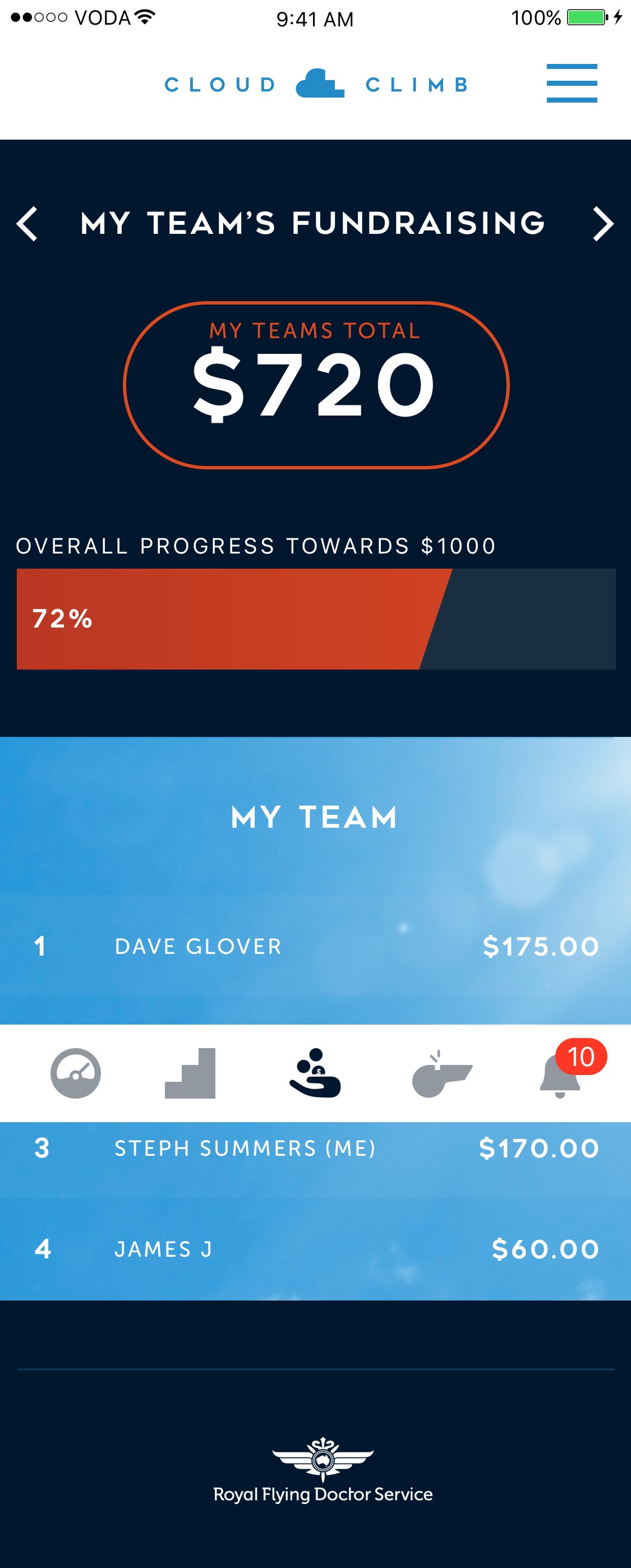
Fundraising
In the context of fundraising, the key focus is on sharing and generating awareness. The app was designed to facilitate this process as seamlessly as possible to maximize donations. Additionally, it introduced rewards for participants based on milestones achieved during their fundraising activities, adding an extra layer of motivation and engagement.

Sign Up Journey
The sign-up journey was designed to maximise the use of native features while minimising the demand on development resources.
The key principle of the design was to keep the entire journey "above the fold," eliminating the need for scrolling on each form page and ensuring a smoother sign-up experience.
In addition, the sign-up process underwent guerrilla testing with passersby on the street to identify and address any potential flaws and enhance the user experience.


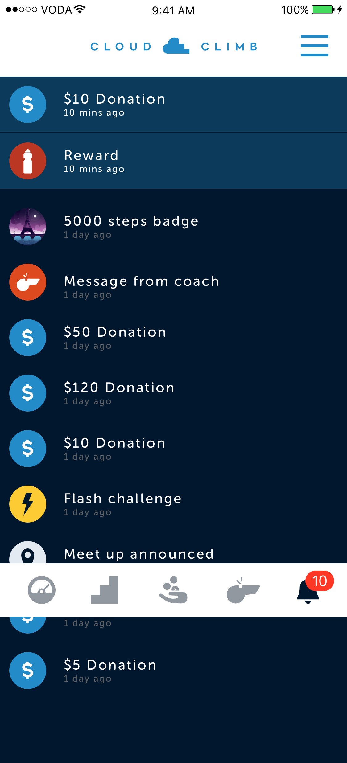
Badges & Rewards
Incentives to encourage activity and motivate fundraisers were integrated into the app, including both tangible real-world items and digital rewards. Users could track their progress and receive notifications and pop-ups upon logging back into the app to stay engaged.
The creative approach leveraged the concept of achieving great heights, focusing on iconic and seemingly insurmountable landmarks. As an example, pictured below, you can see the Eiffel Tower, which served as an inspiration within the app's design and incentive structure.


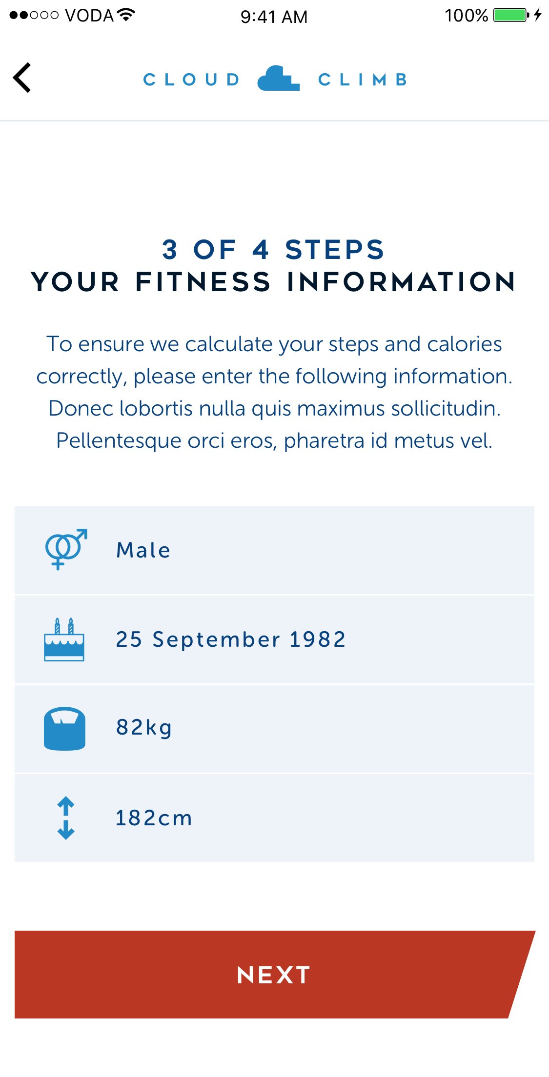
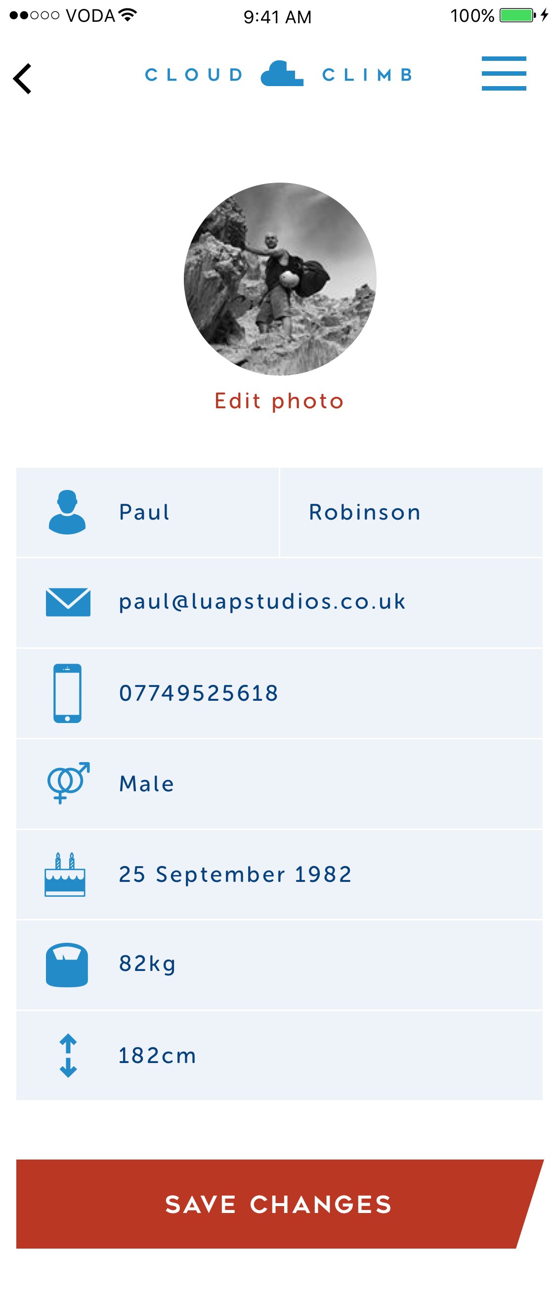
My Details & Settings
The app included a "My Details & Settings" section to manage personal information and health metrics conveniently. Updating these details was seamlessly integrated into the user experience.
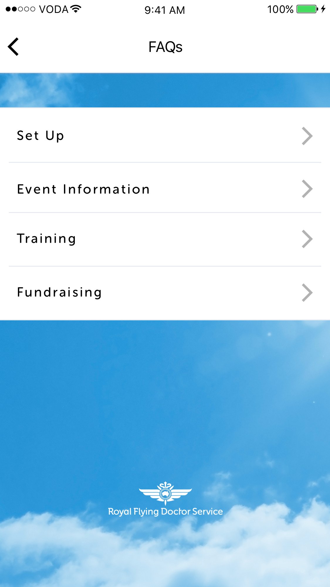
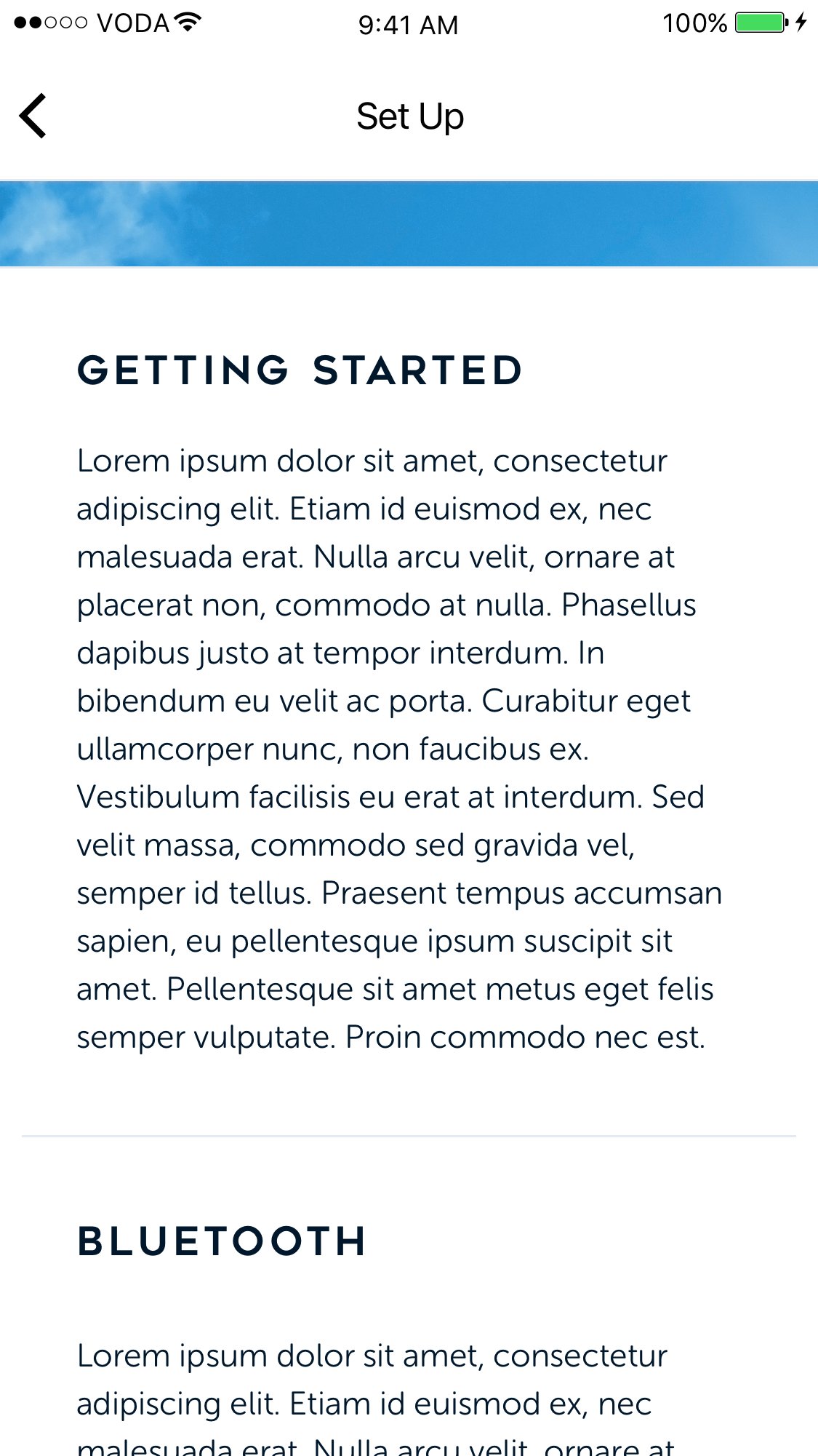
Additionally, the setup encompassed a section for frequently asked questions (FAQs) to provide users with guidance and troubleshooting solutions in case any issues arose.


Editorial Inspiration
To keep users motivated and active in both fundraising and training, we introduced an editorial section within the app. This section featured content contributed by campaigners, health experts, and athletes, providing a valuable source of inspiration and guidance to keep users engaged and motivated on their journey.


