Pay Pal
Project Robin
My Role - Project Lead, Creative Direction, Design Direction, Design, UX, Product Design

Background
PayPal, the world-leading secure payment provider, witnessed a huge rise in contactless transactions during 2015. It also noticed NGOs lagging behind the commercial sector’s innovation in 2016.
Part of this lag was attributed to device cost; part to ease of use / awareness of contactless technologies; part to concerns about claiming Gift Aid; and part to the difficulty of acquiring donor details from a swift transaction.
The cost of developing a bespoke app or solution for an individual organisation was always weighed against a contactless product’s perceived sole role as a replacement for cash at a ‘bucket collection’. PayPal asked HomeMade, an NGO sector fin-tech provider, to initially validate the user need and challenges, then craft a fitting solution which could help NGOs across the world to welcome and embrace contactless payments.

What have we found in the sector?
There have been a number of great trials of contactless payments led by PayPal, Barclays and Paytr. The sector has been lobbying BBA and Visa for changes to enable greater use of contactless.
There is a high level of interest in future use of contactless and card payments. However this type of interaction is perceived to be costly, risky and complicated due to the need for external devices / apps and PCI DSS compliance.
Current suppliers of tech often omit to support certain key contexts (mobile, community fundraising and special events) or remove / ignore donor choice. The products sometimes only support ‘chip and PIN’ OR contactless – rather than both.
They also miss an important opportunity to acquire and share donor and / or event-specific data. This data could enable a Gift Aid claim and proper donor engagement to follow a contactless transaction.
There are concerns about device cost, connectivity, access to training and support plus usability for fundraisers who are sometimes (slightly) tech-phobic volunteers.

What did we discover about context?
When we discussed their needs with our kind steering charities, it became apparent that there are three key areas where donations and payments could be enhanced with the correct application of some terrific tech:
Street or public collections (support and gradually reduce the levels of anonymous cash / change being chucked into buckets while potentially increasing average gift)
Community fundraising events (mass-participation jollies such as Race for Life, the London Marathon, the London to Brighton Ride, coffee mornings, bean-laden bathtime, sport and music events)
Special events (Gala Balls, awards and corporate dinners, auctions and raffles)

Brief
Develop an app, backend system and a physical product for both national and local charity organisations so they can take donations via PayPal here. Donations should be possible both on the street and at organised charity events. The physical product should make use of volunteers own device.
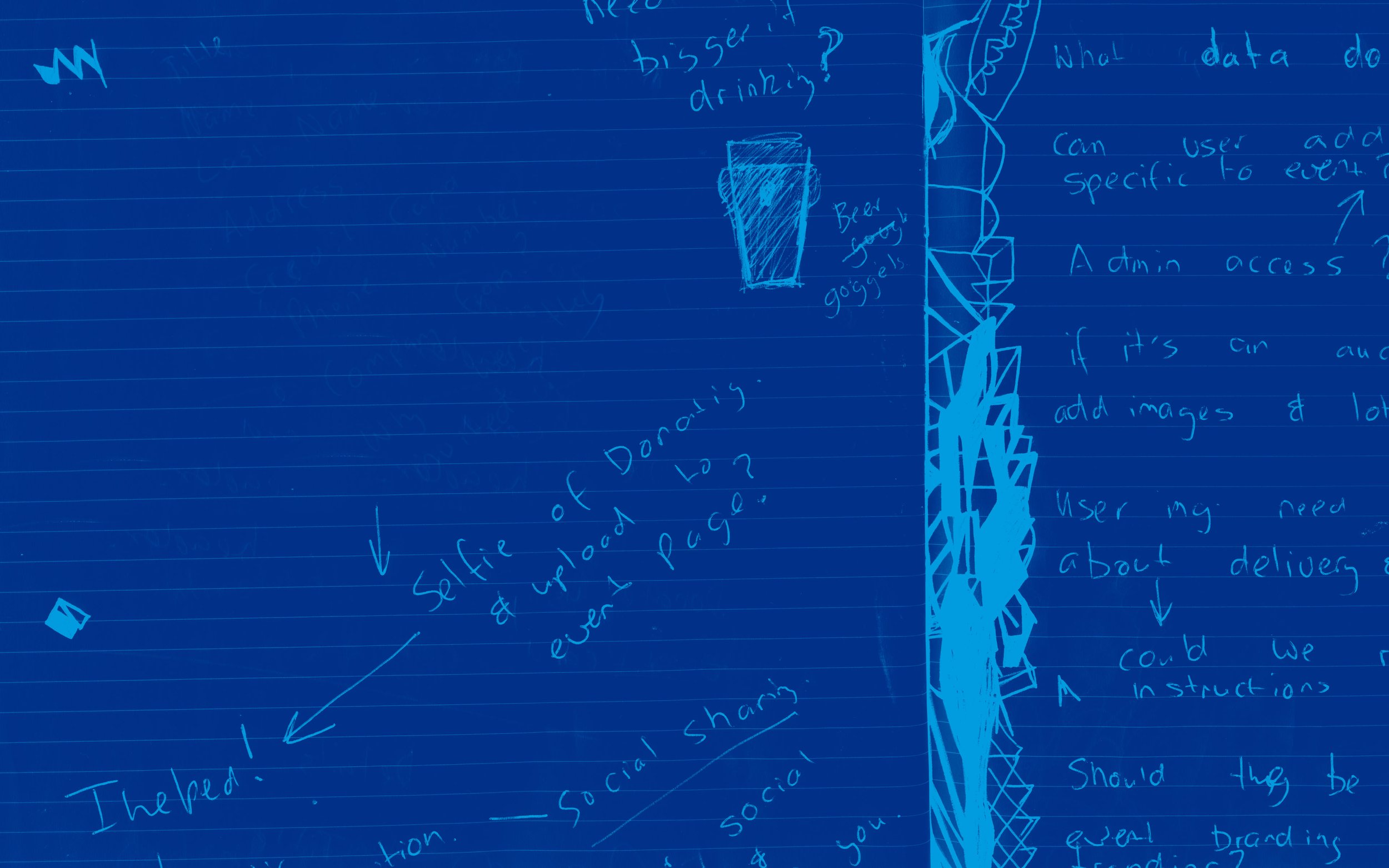
Creative UX Design Solutions
After speaking with several charities it became clear that one app solution wouldn’t fit all.
I created varying UX journeys which could be selected for different scenarios.
The design solution allowed for unique charity branding to be applied via the backend and physical branding to be applied to the product.
Unique End-to-End User Experience
I initially crafted unbranded user journeys for the app's front end and backend refining the experience.
I then designed customisable branded templates, ensuring a unique identity for the charity could be applied to the designs. This was vital for an authentic feel, crucial as the app would be used on the streets and needed to feel secure and athentic.
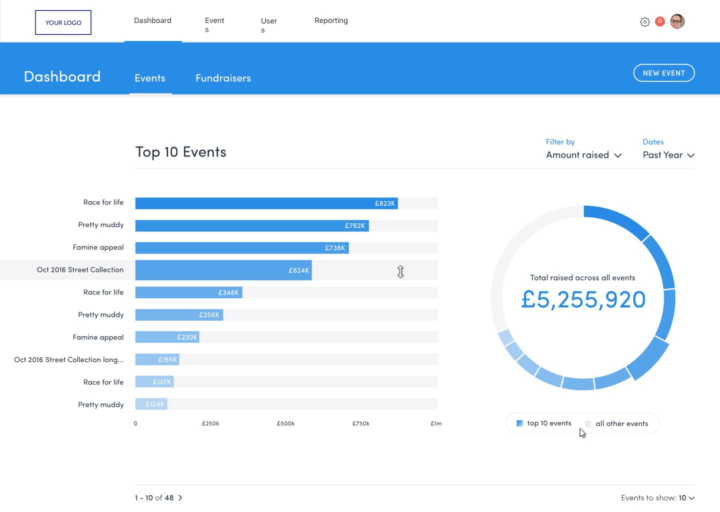
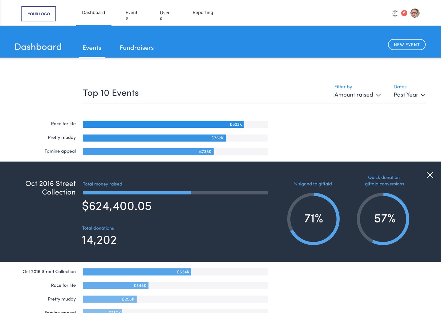
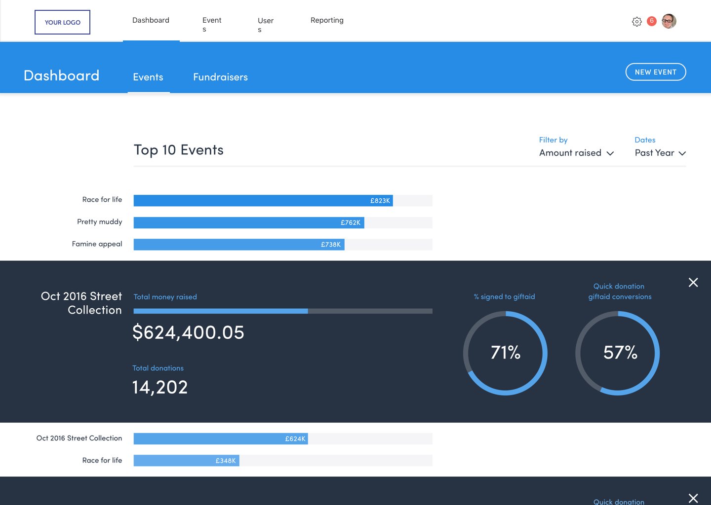
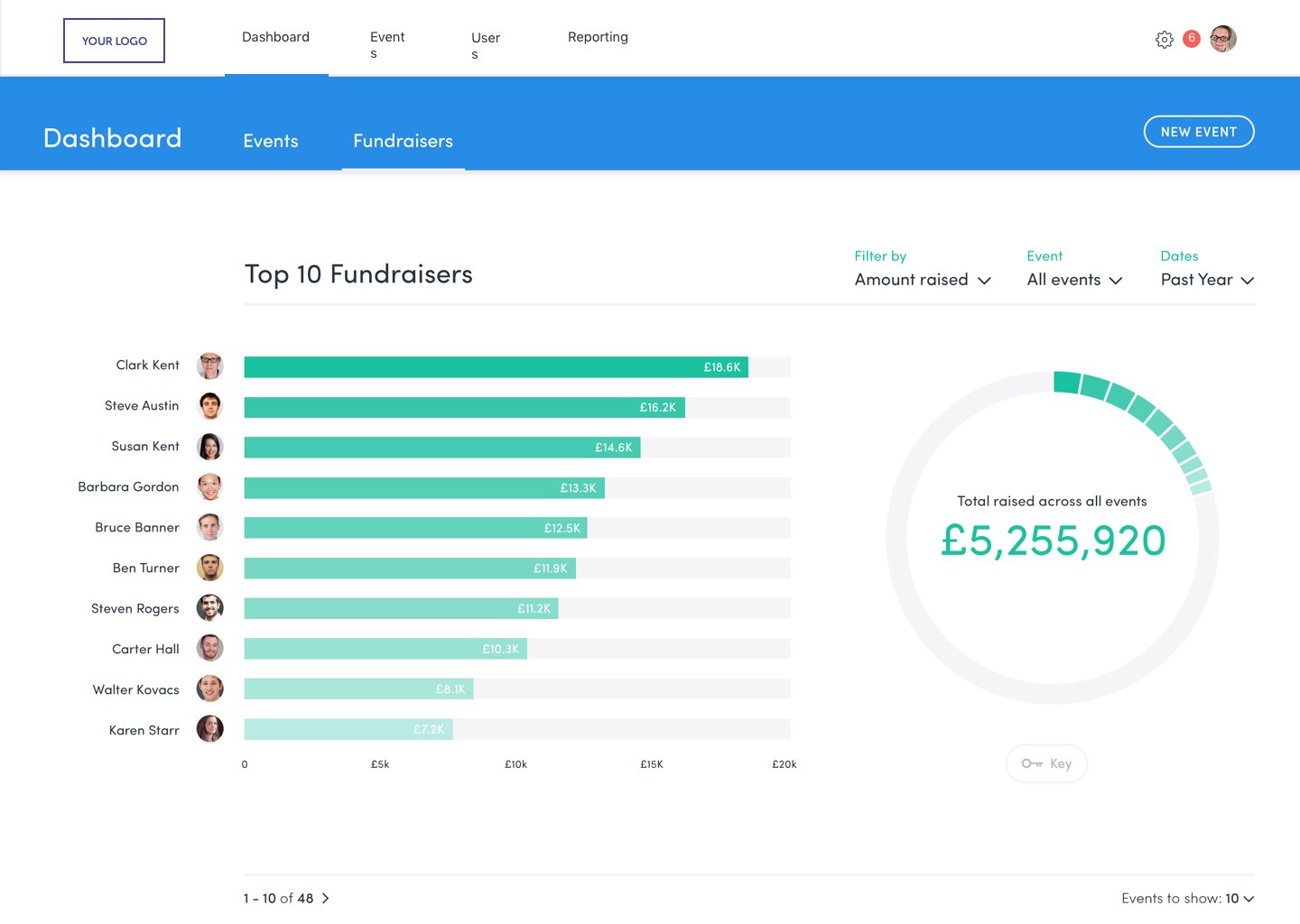
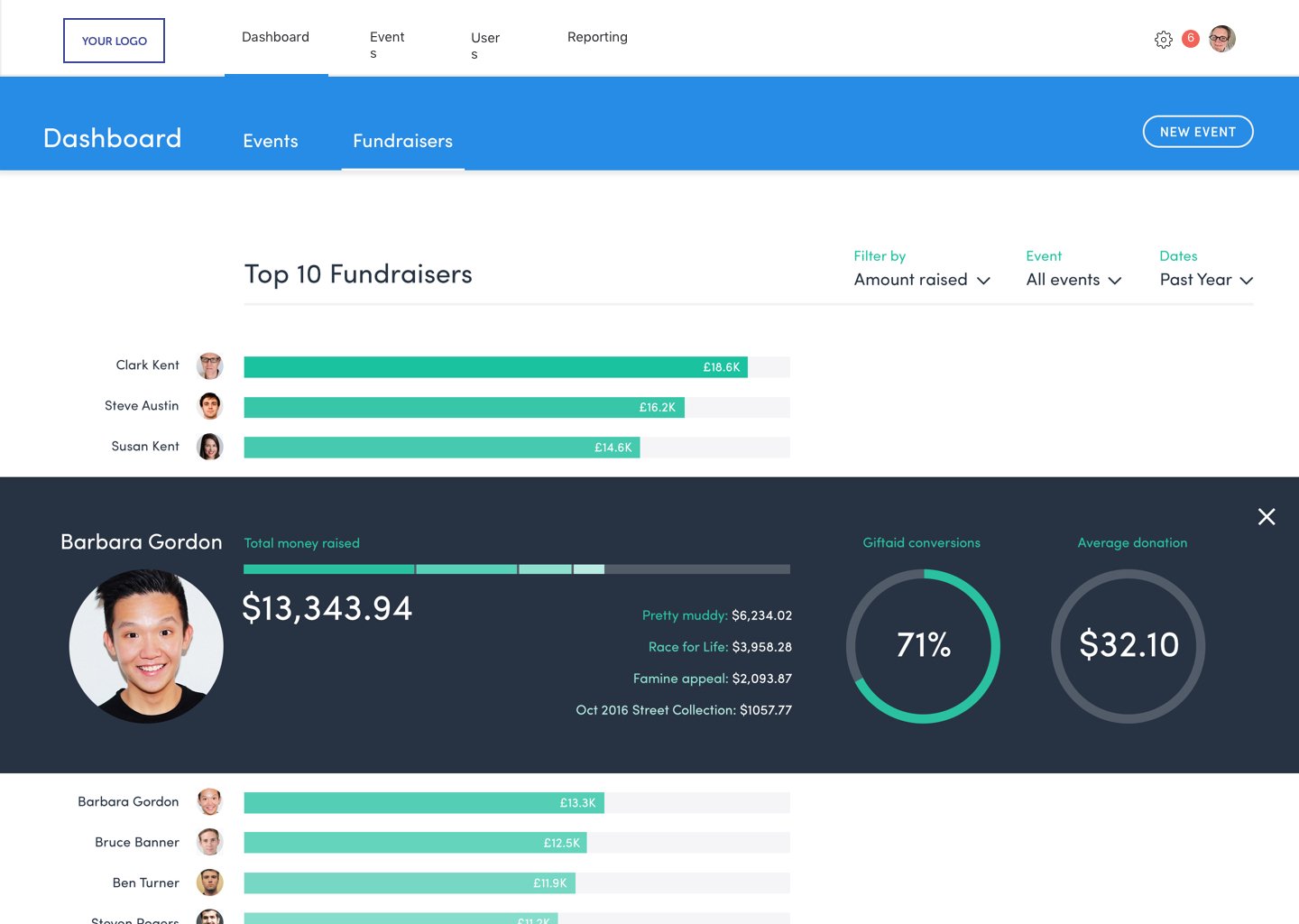
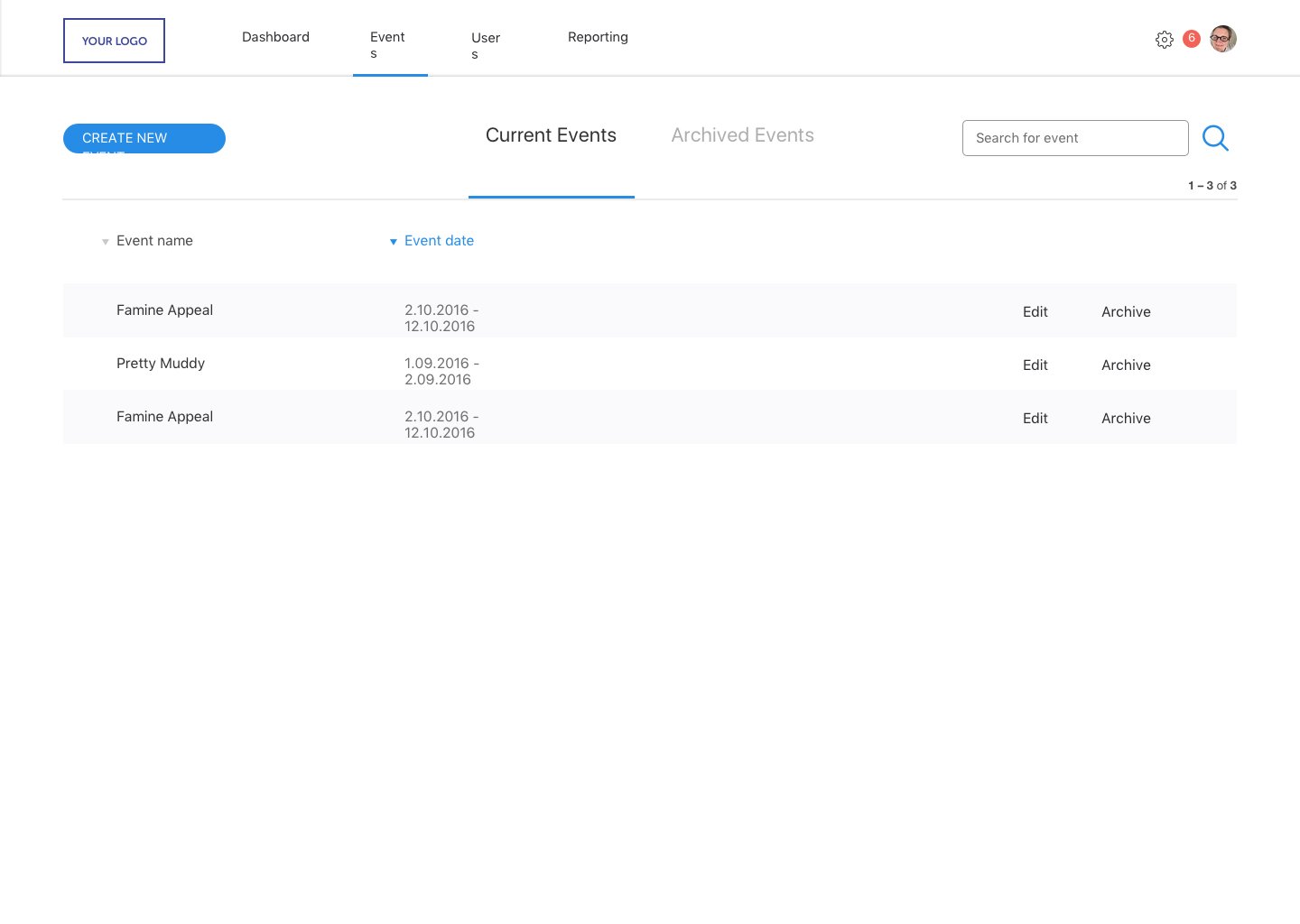
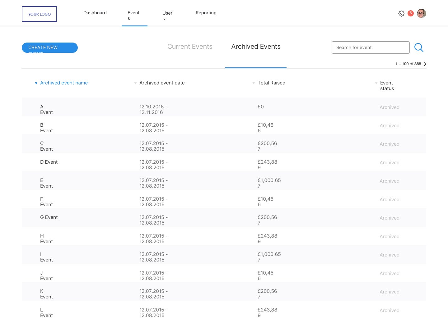
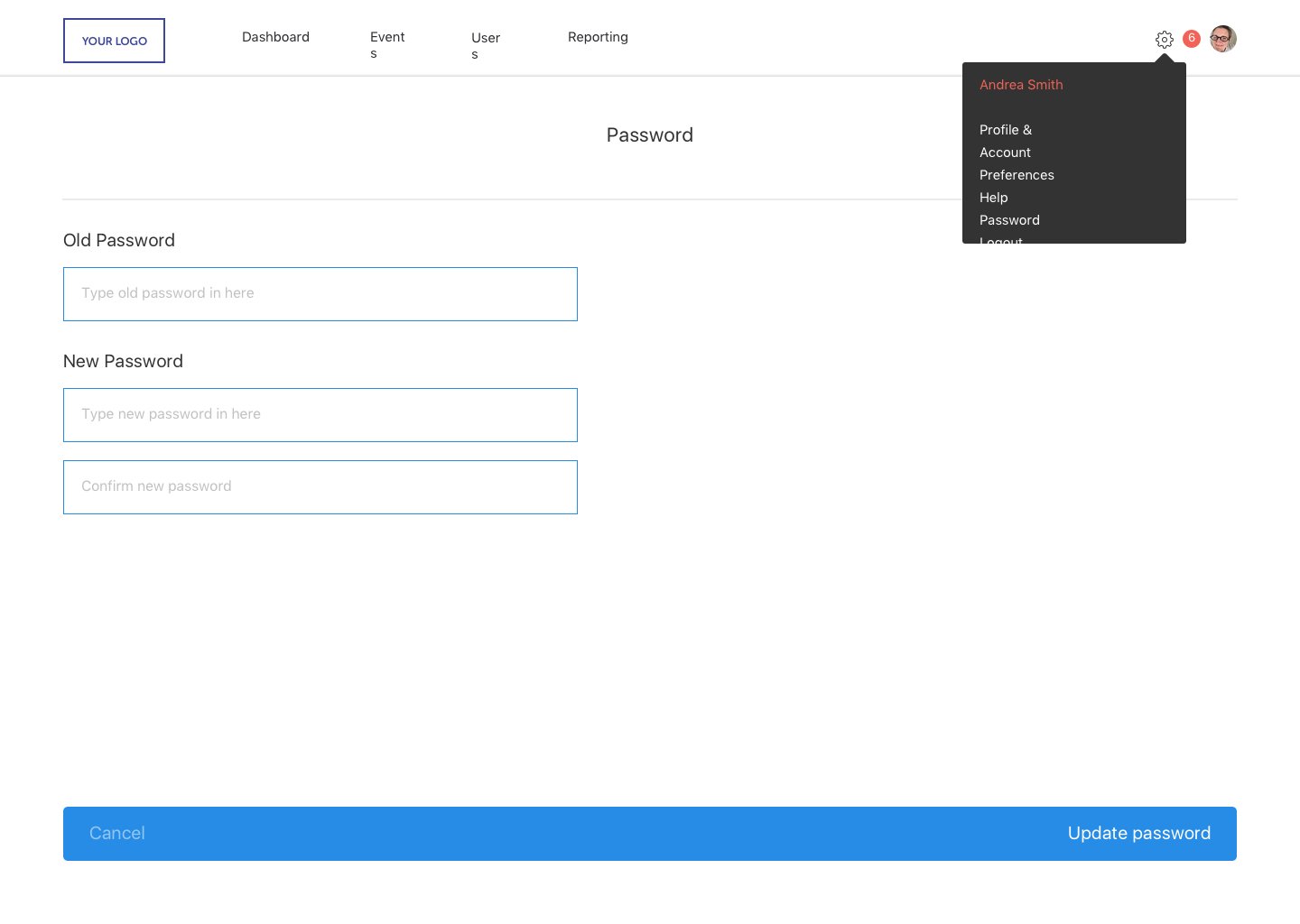
Back End Donation System - UX & Design
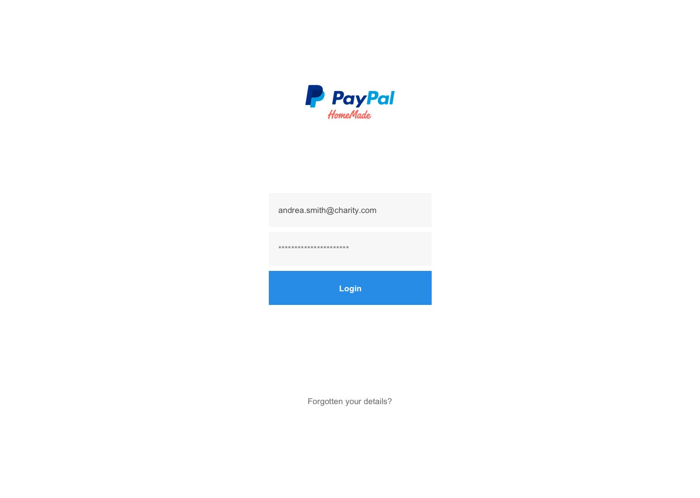
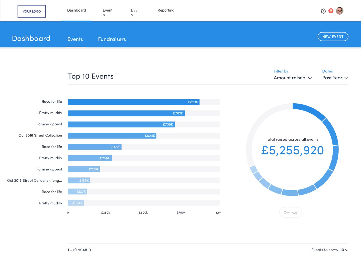



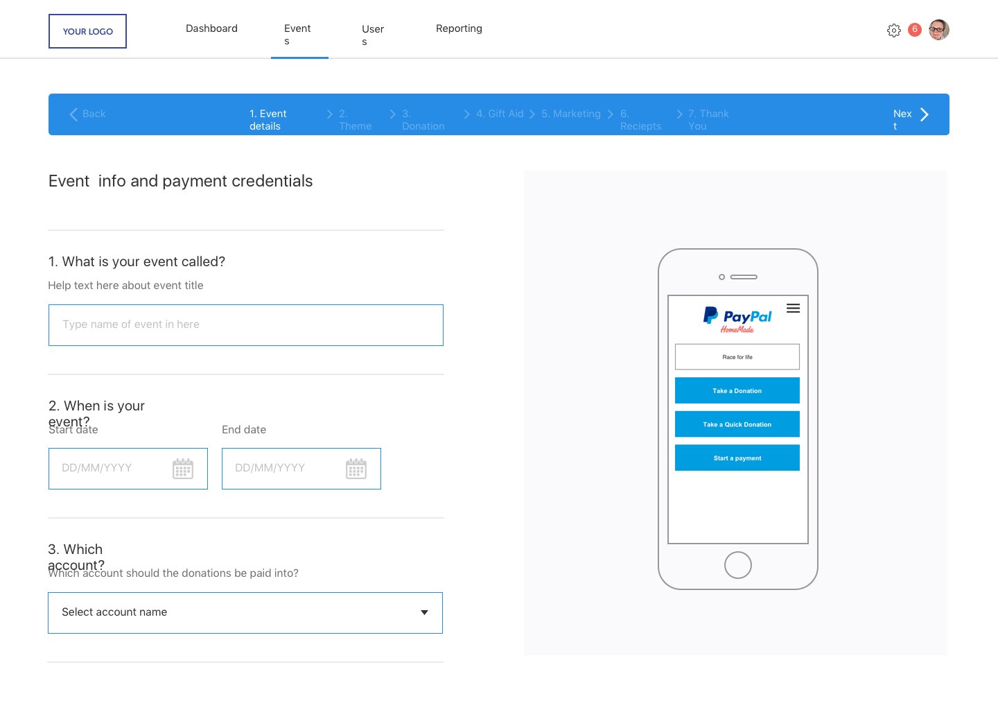
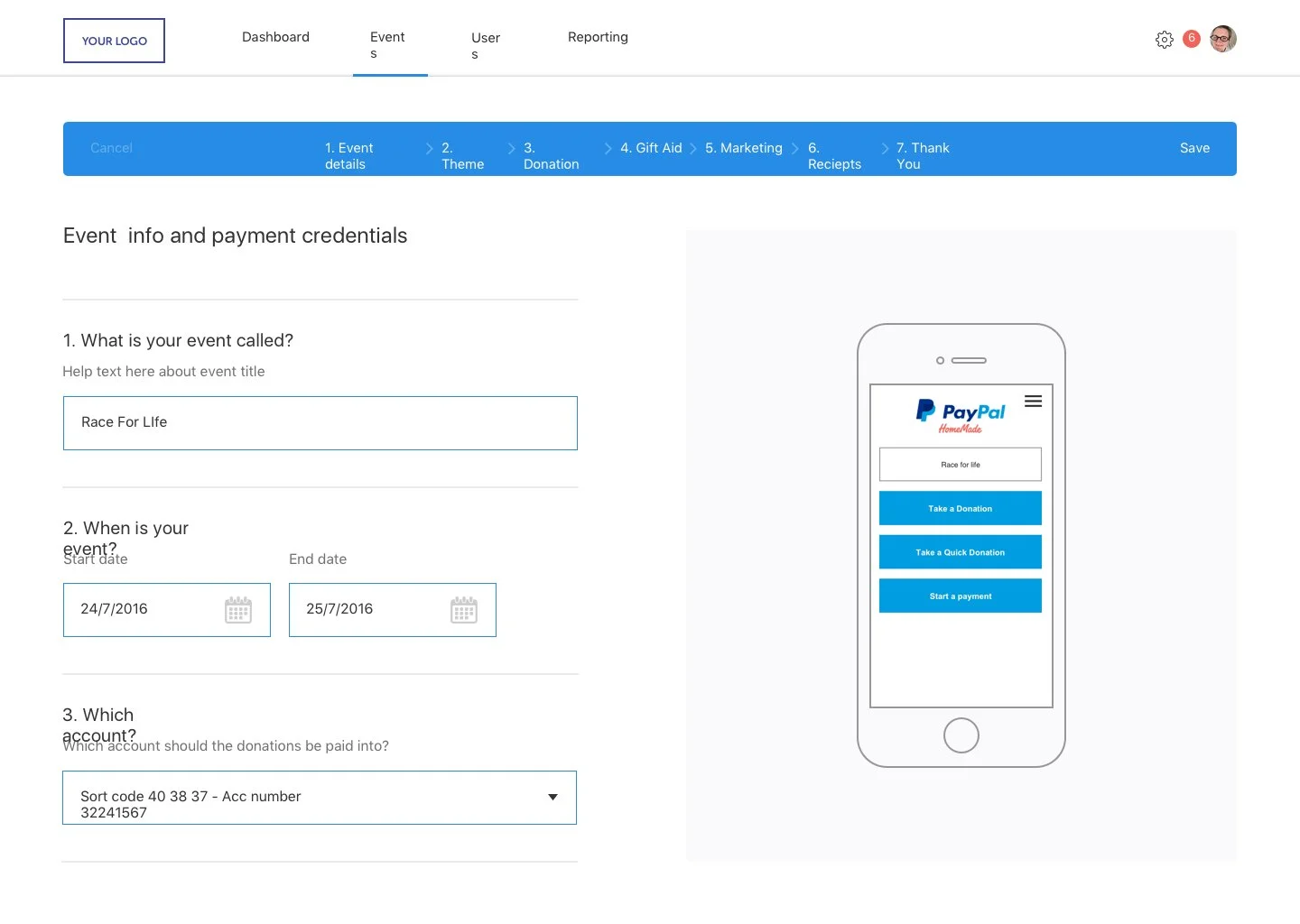
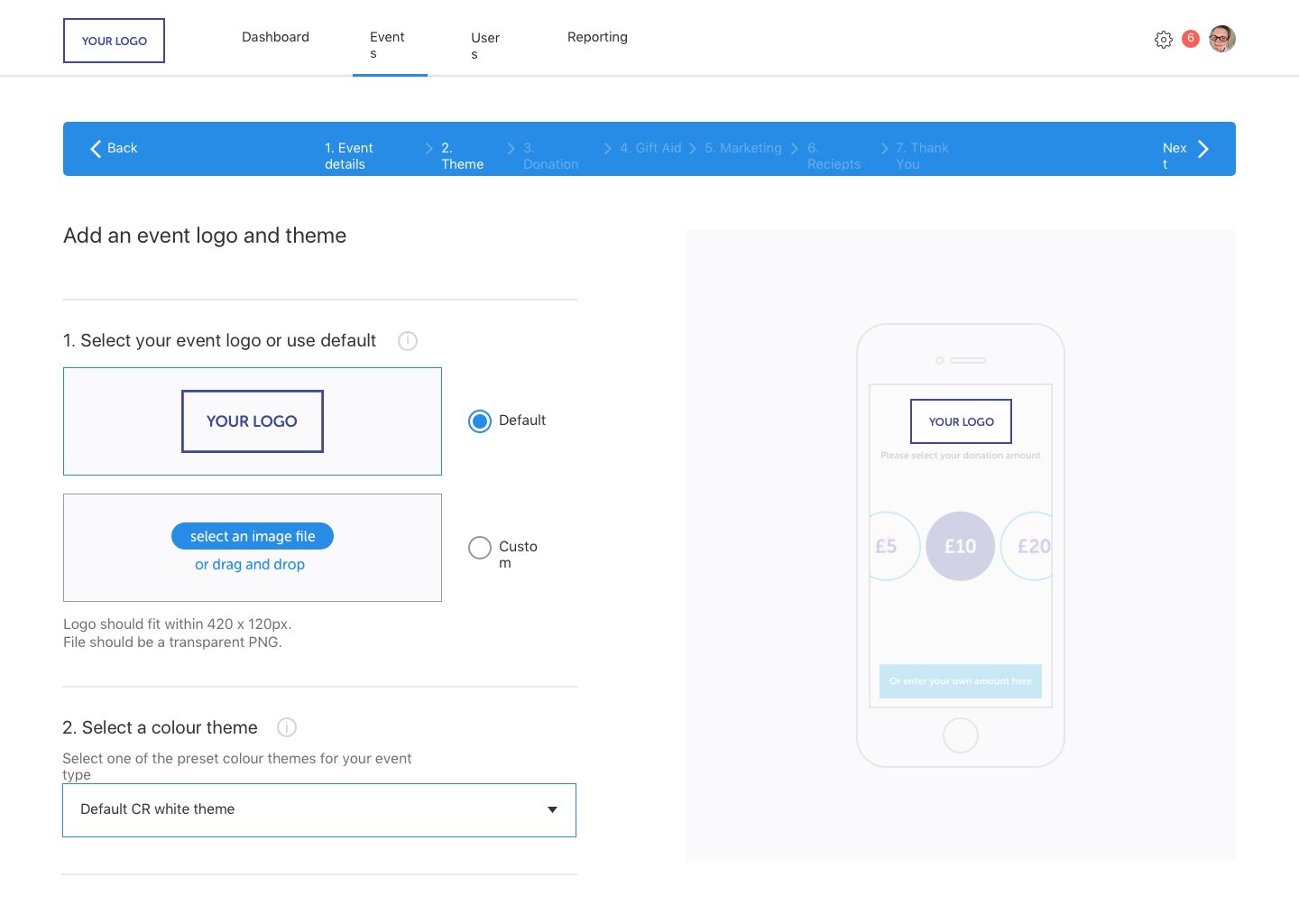


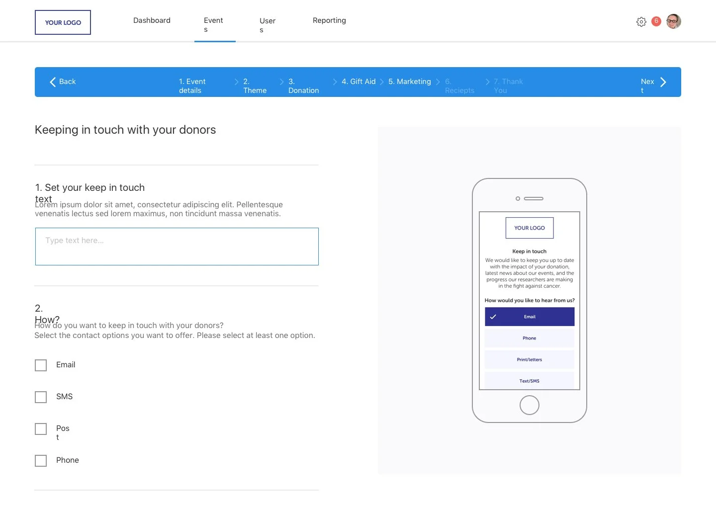
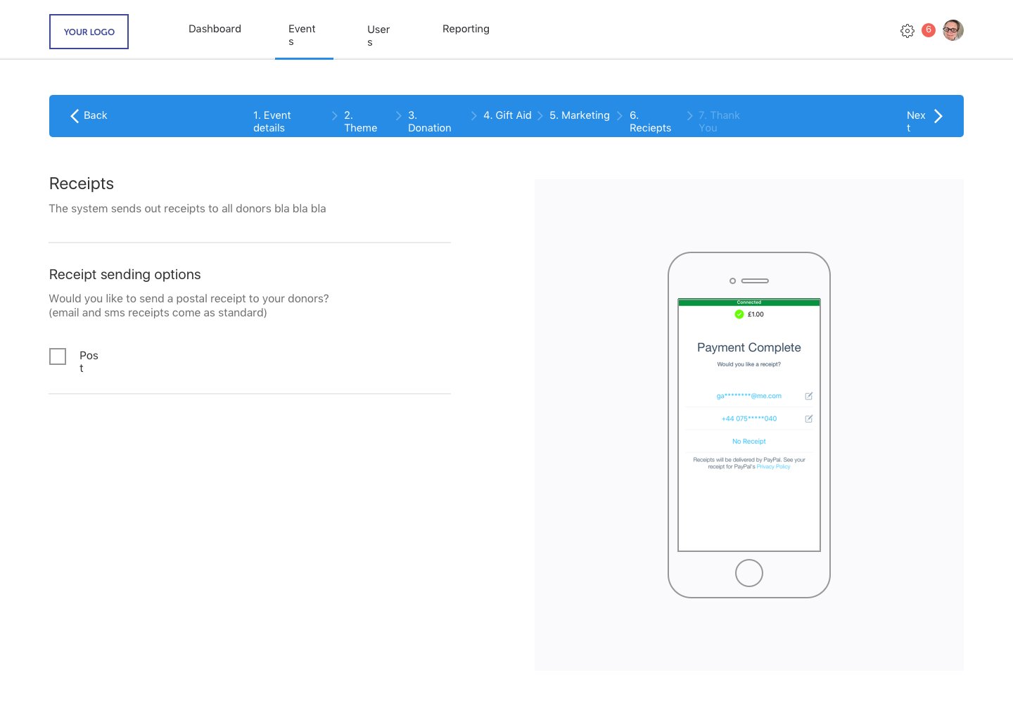
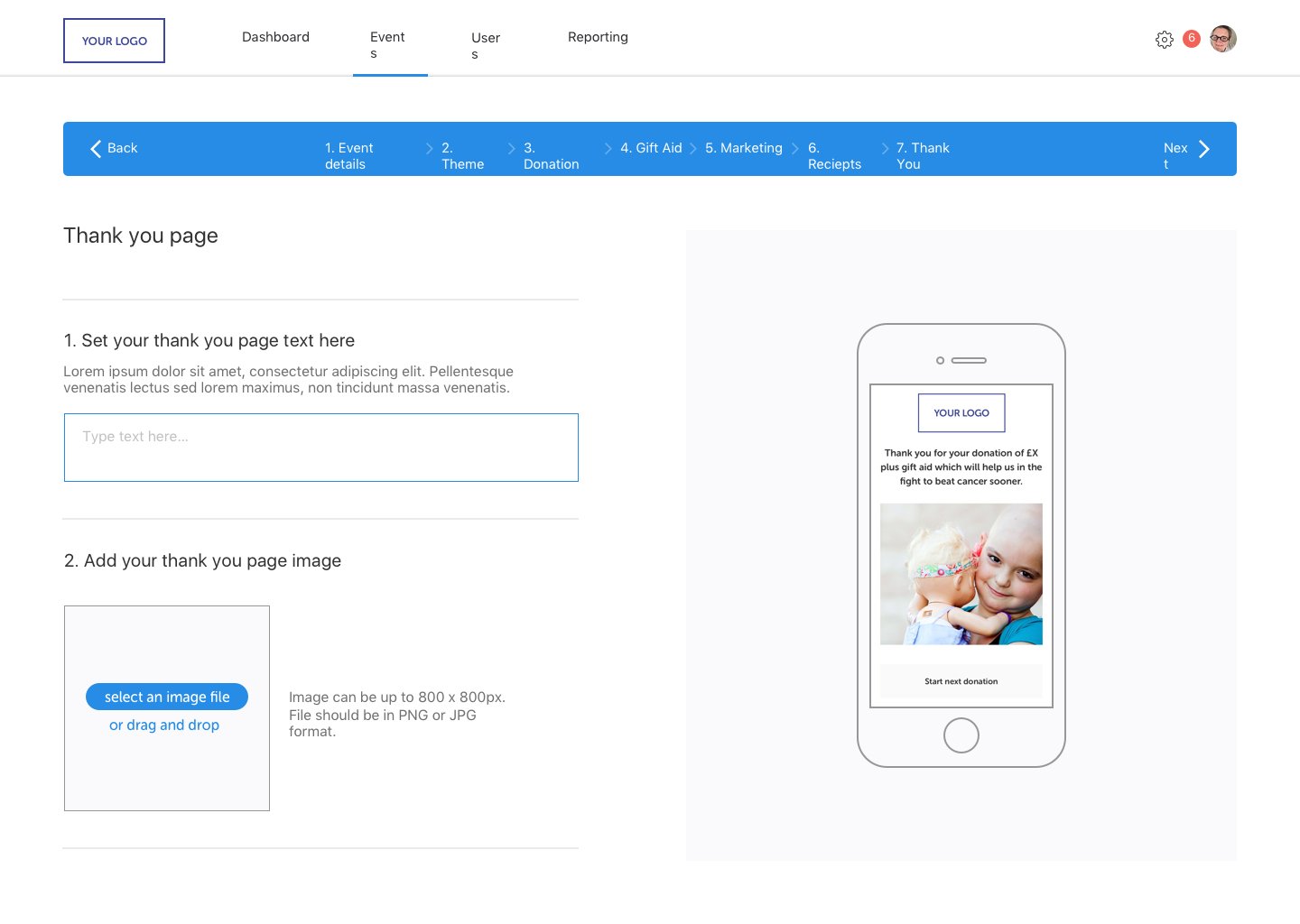
Interactive Prototype
I created an interactive prototype using Flinto. This allowed me to thoroughly assess all app routes and interactive features within the application.
Guerilla Testing: I opted for guerrilla testing. This approach helped me identify usability issues and gather valuable insights in a shorter timeframe and then make changes.
Charity Donation Flow: Specifically, I focused on testing the charity donation flow within the PayPal app.
Insights: By involving potential users, I gained more realistic insights into how they interacted with the donation process. This helped me uncover any friction points, confusion, or areas for improvement.
User-Centric Design: The feedback received from guerilla testing directly influenced my design decisions. I could adapt the donation flow to ensure it aligned with users' preferences and expectations.
Front End White Label - UX & Design
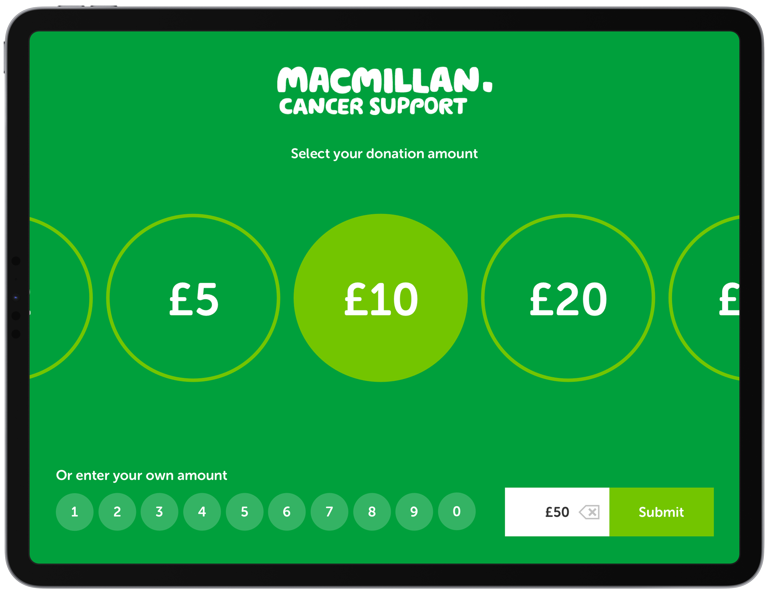


Elevating Engagement: Your Live Presence Takes Center Stage
This ingenious feature accomplished two crucial objectives: firstly, it subconsciously linked your image with the donation amount, intensifying the emotional resonance of giving.
Secondly, it infused an element of enjoyment, transforming the process into an interactive and memorable experience.

Product Arrangements
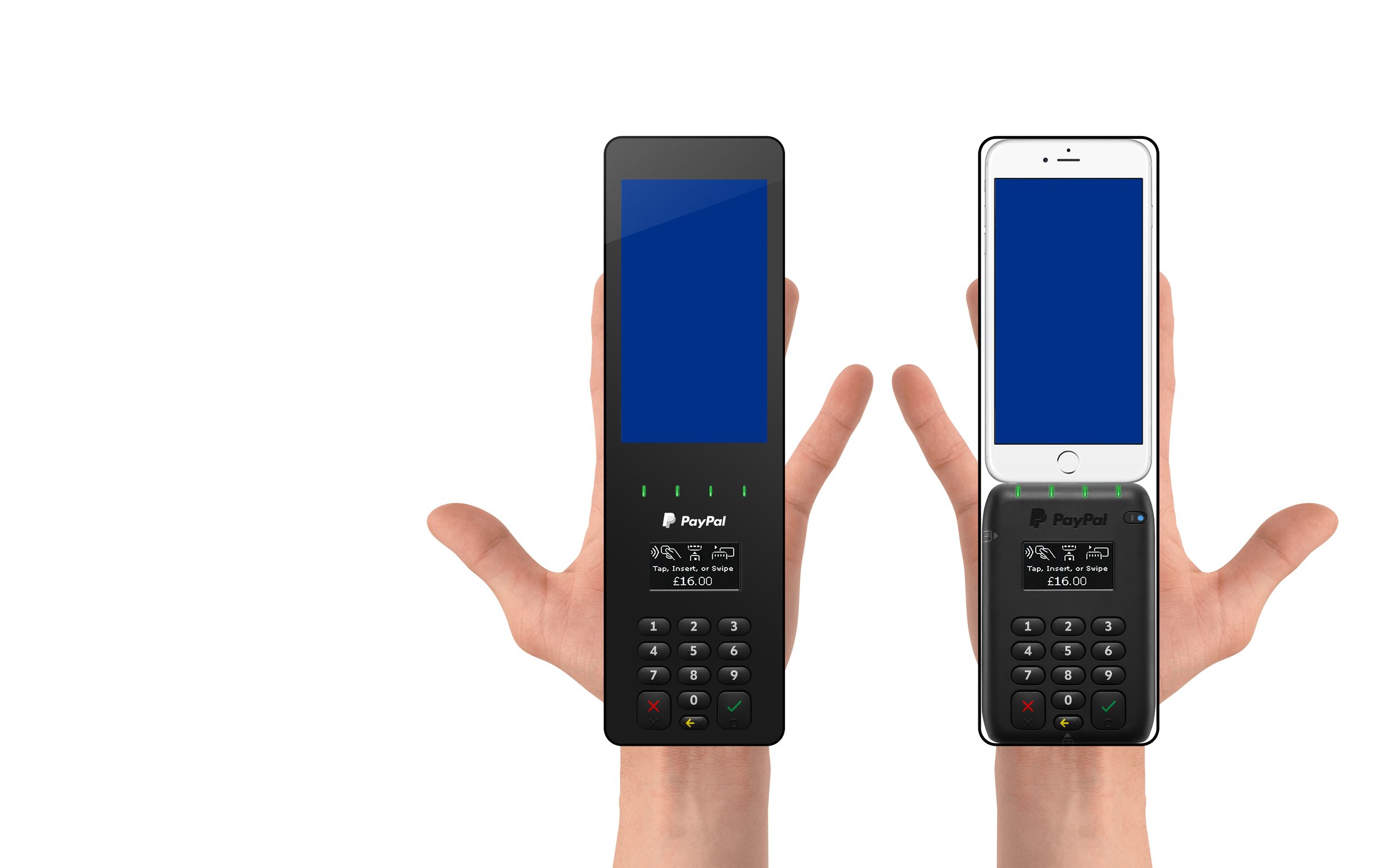
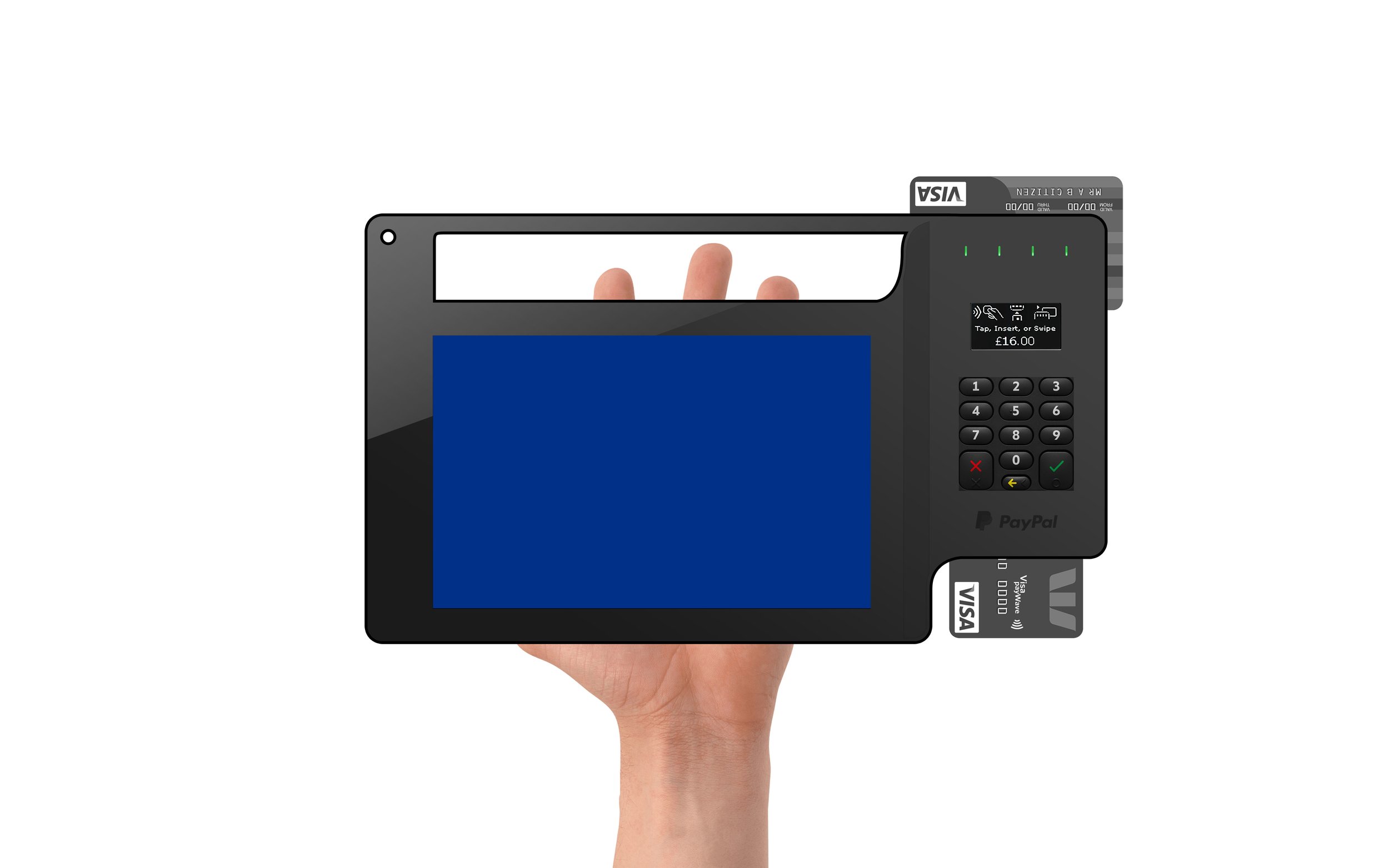
To test the arrangement of the devices within the product I mocked up scale prototypes in photoshop. This way I could quickly test the most natural looking arrangements as well as which worked best with devices.
Natural Arrangements: Building prototypes visually allowed me to experiment with different arrangements and discover the most natural and intuitive placements for mobile devices. This greatly enhanced the user experience and made interactions feel more intuitive.
User Experience Optimisation: Trying out various arrangements helped me pinpoint the layout that delivered the optimal user experience. This involved factors such as ease of use, accessibility, and user engagement.
Device Compatibility: As I was focusing on testing with mobile devices, it was crucial to assess how the arrangement performed across various screen sizes and orientations. By creating prototypes, I could evaluate the design's compatibility with different devices.
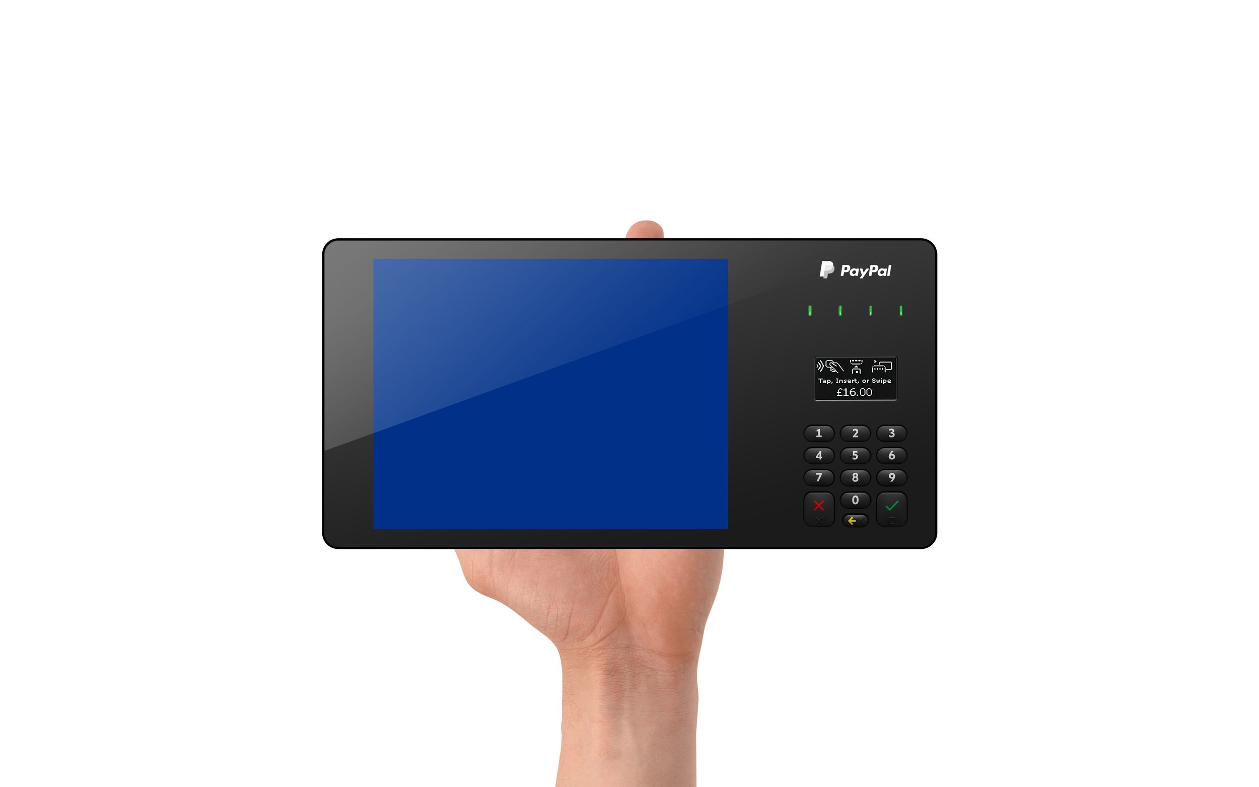


Real World Product Maquettes
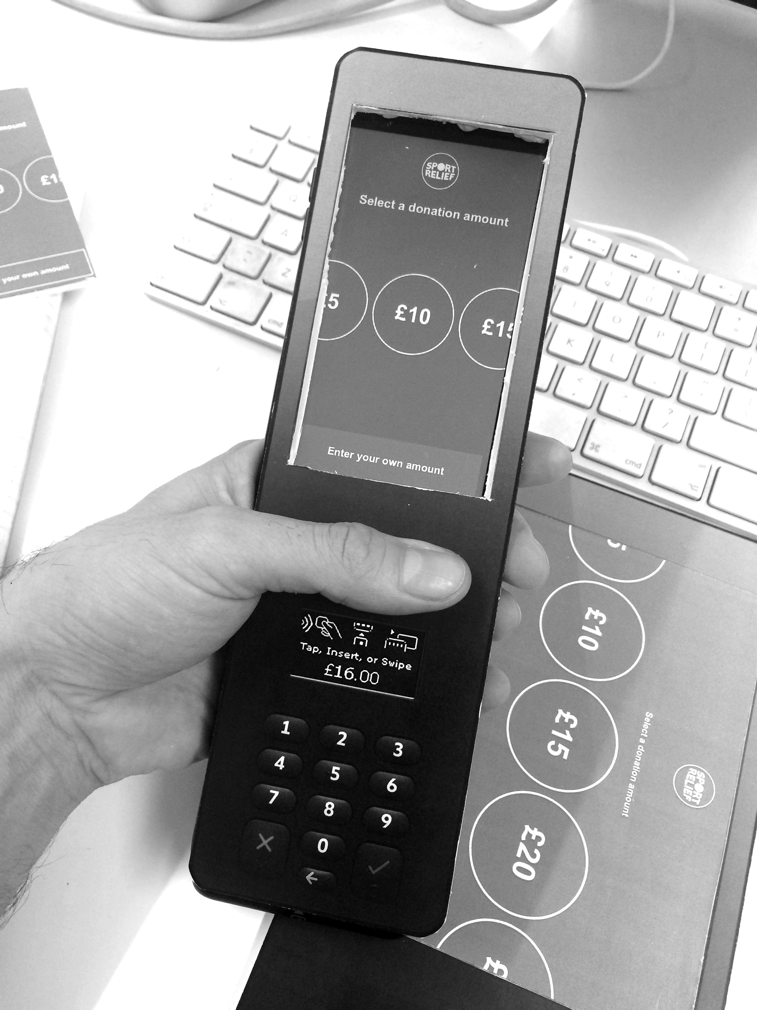
I constructed a cardboard maquette to rapidly assess the product's weight distribution and balance. This was pivotal in evaluating the tactile experience for both the charity worker and the donor, enhancing our understanding of their interactions with the device.
Subsequent iterations of the maquette featured enhanced design features, providing a more authentic preview of the final product before transitioning to a 3D designer.
Tactile Evaluation: I gained a hands-on experience that went beyond digital simulations, helping me understand the physical aspects of the product.
Ergonomic Insights: I assessed how the product felt when held, emphasising ergonomic factors for user comfort.
User-Centered Design: I ensured alignment with the needs and expectations of charity workers and donors, creating a product tailored to them.
Realistic Interaction: I gained a clearer understanding of how users would interact with the device in real-life situations.
Iterative Refinement: Direct user interaction allowed me to quickly make adjustments, leading to an optimised design.
Usability Testing: I set up an informal platform to collect feedback and catch potential usability issues before full-scale production.
Physical Constraints: I detected manufacturing or assembly challenges that could arise during production.
Holistic Understanding: In addition to digital mockups, I considered tactile, ergonomic, and emotional dimensions for a comprehensive user experience assessment.


