Heinz
Sauce Lovers
My Role - Creative Direction, Design, Illustration

Brief
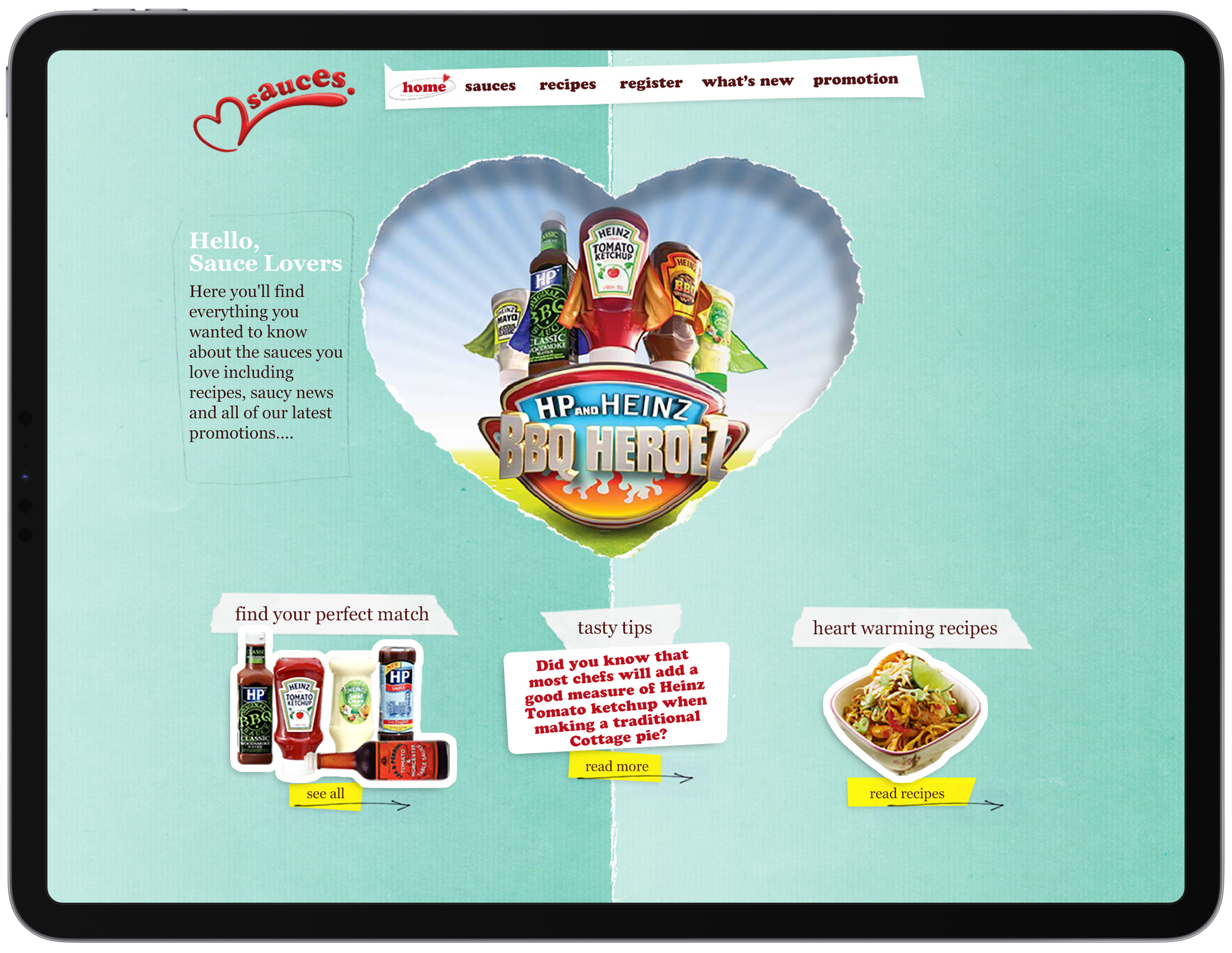
Develop the look and feel of a minimally branded microsite dedicated to the nations favourite sauce as part of the "It has to be Heinz" campaign which celebrates the way people perceive the country’s most loved food brand.
Several solutions had already been presented to the client before I came on board, but all were rejected for being too “chintzy” or “valentines” in direction.
Creative Design Solution
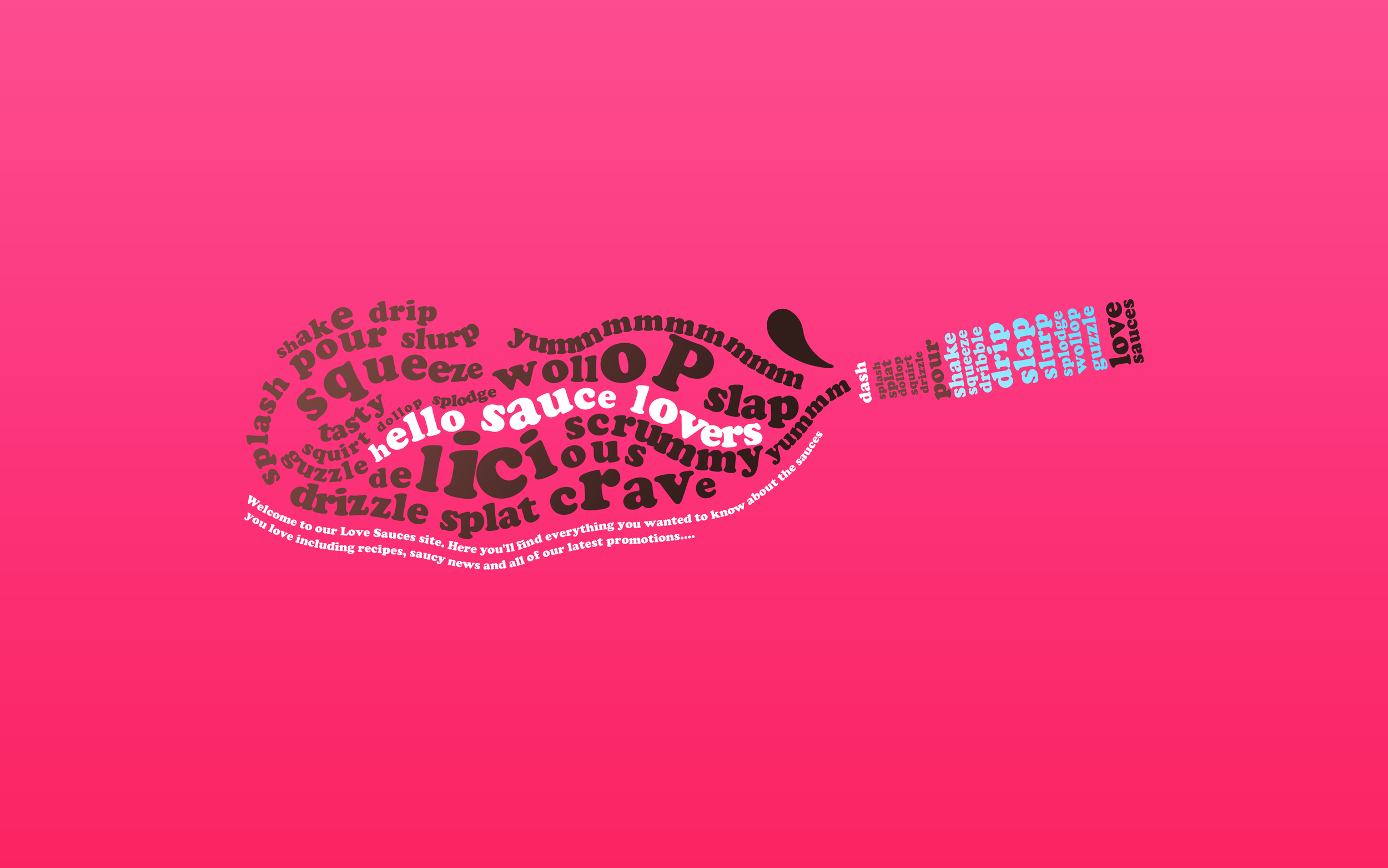
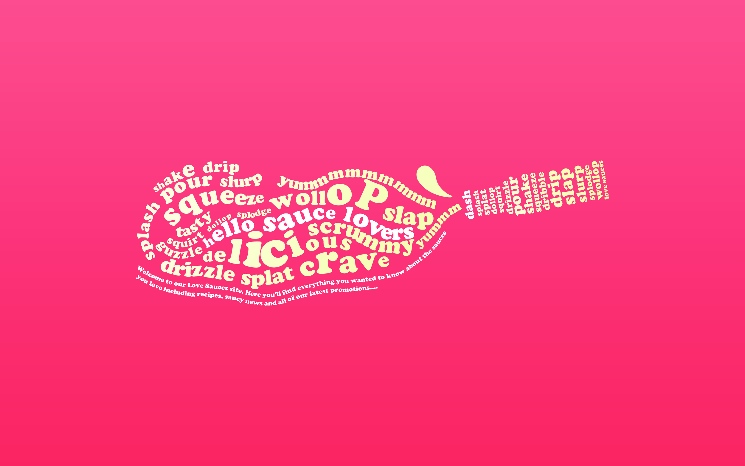
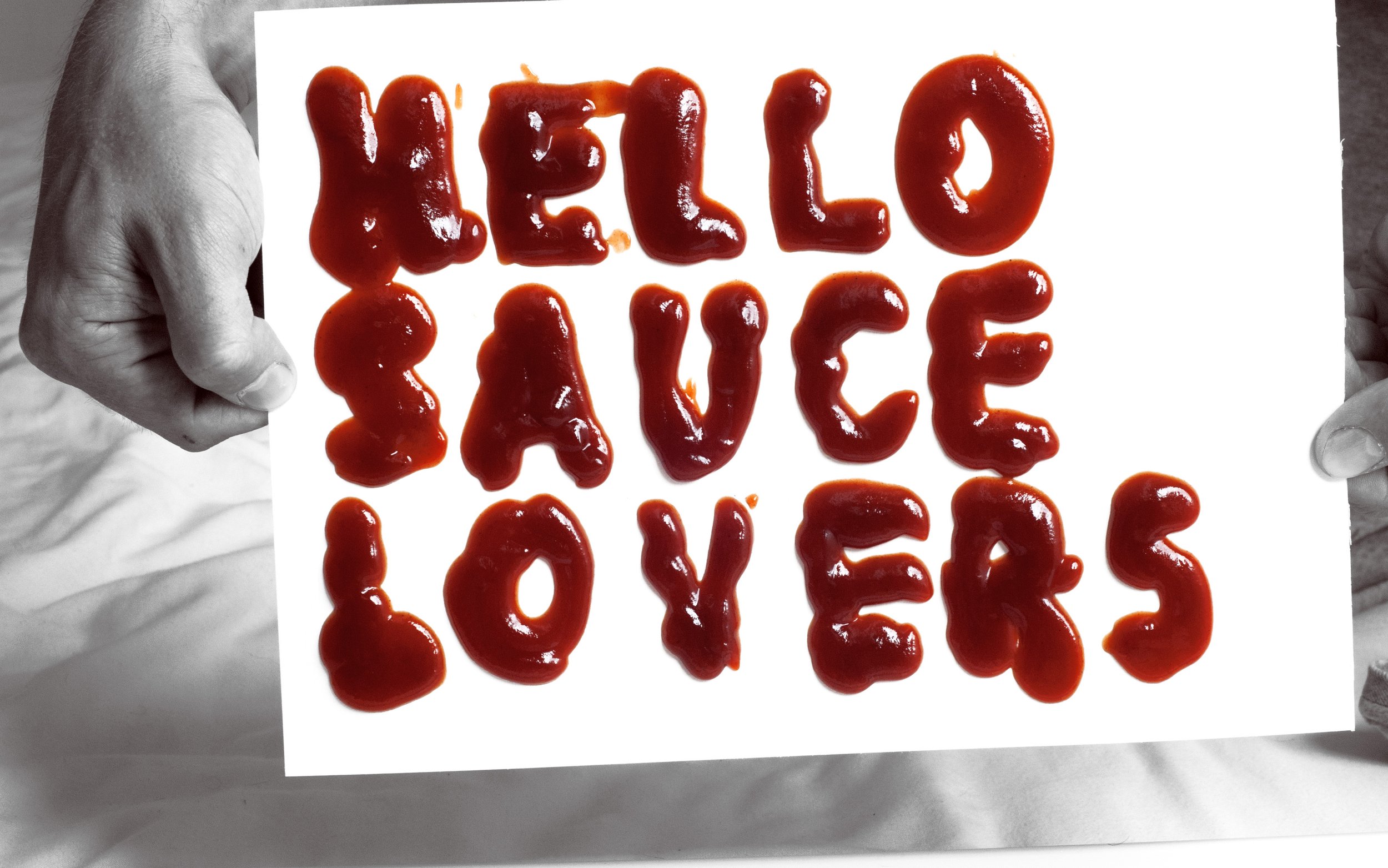
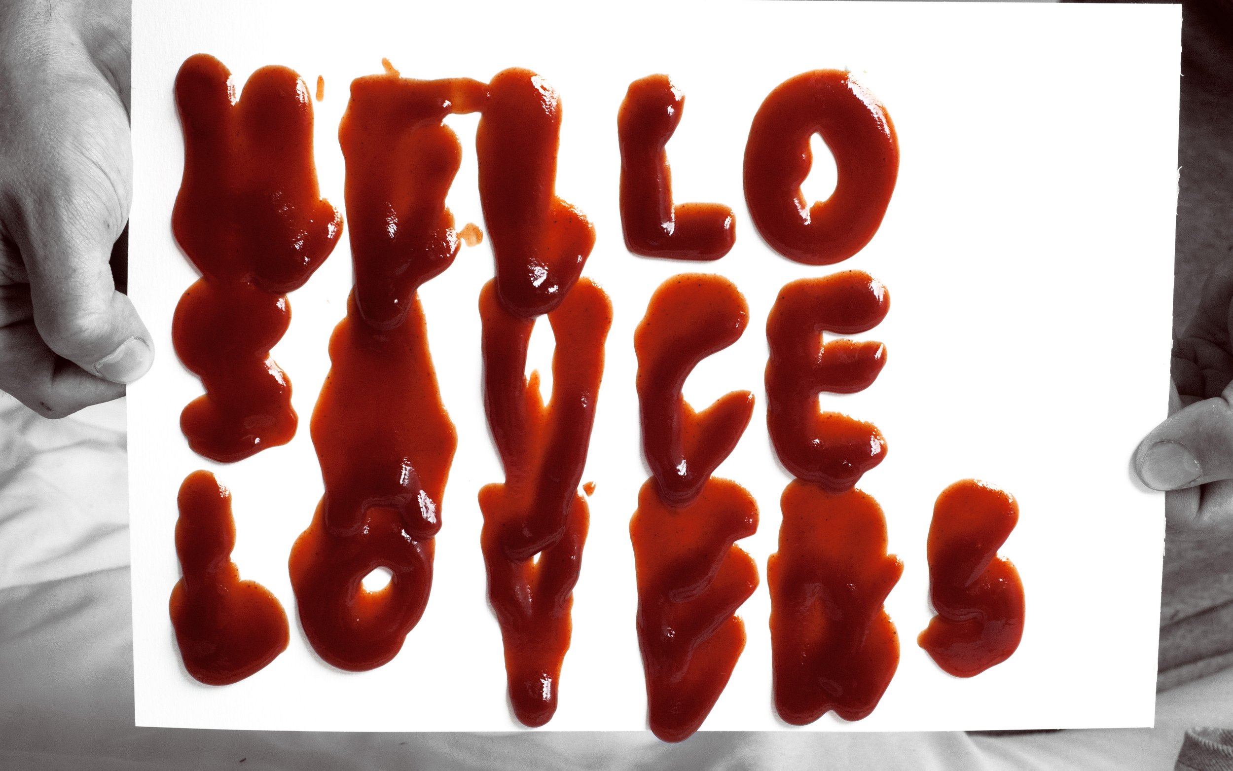
Following some initial (and slightly messy) experimentation, a visually bold and vivid coloured typographic aesthetic emerged as the undisputed champion. This aesthetic exuded a sense of freshness and vibrancy that resonated powerfully.
Remarkably, my solution received first time sign-off from Heinz. They loved the new direction.


Saucy Out Takes!
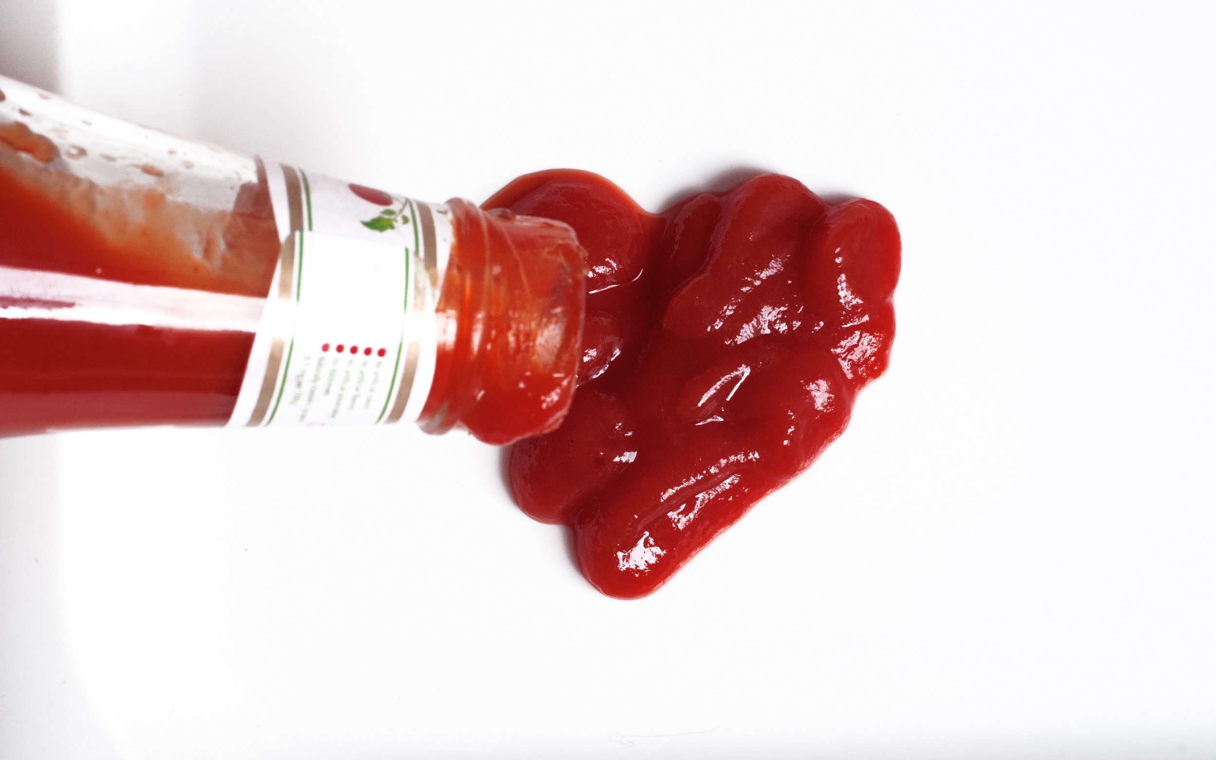
At the heart of the project lay the subject of sauces, and this naturally beckoned us to dive headfirst into a realm of creative exploration. It was impossible to circumvent the temptation to experiment with the tactile and sensory aspects that make sauces so endearing – the squelchy, squirty, and squeezy qualities that evoke a sense of nostalgia and joy.
Design Experiments
In the preliminary design stages I explored using halftones, inspired by the punk ethos of poster creation. This approach exuded a bold and striking presence, reminiscent of an era defined by its impactful visuals. Each idea carried a subtle undertone of nostalgia, evoking a sense of longing for bygone times.


