Heinz
Website
My Role - Creative Direction, Design Direction, Design

Brief
Revamp heinz.co.uk in alignment with the "It has to be Heinz" brand campaign, aiming to elevate brand awareness.
Creative Solution
We developed a brand new 300 page CMS based website for Heinz, to show off the well loved product range and allow users to engage with the brand like never before - previously the site was built for corporate use only and the UK loves Heinz products!
Heinz, a name that's etched in childhood memories, from camping trips to backyard BBQs. The "It Has To Be Heinz" campaign rode on this wave of nostalgia, and I saw a chance to capitalise on it.
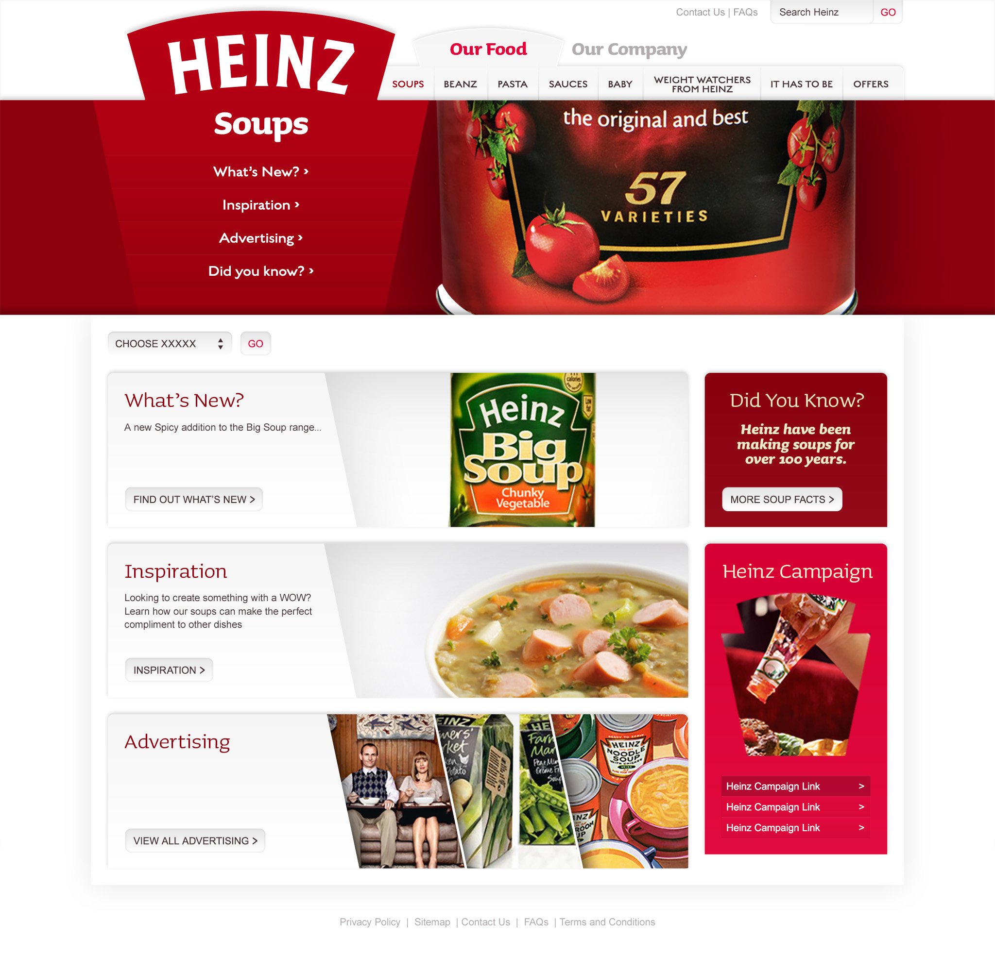
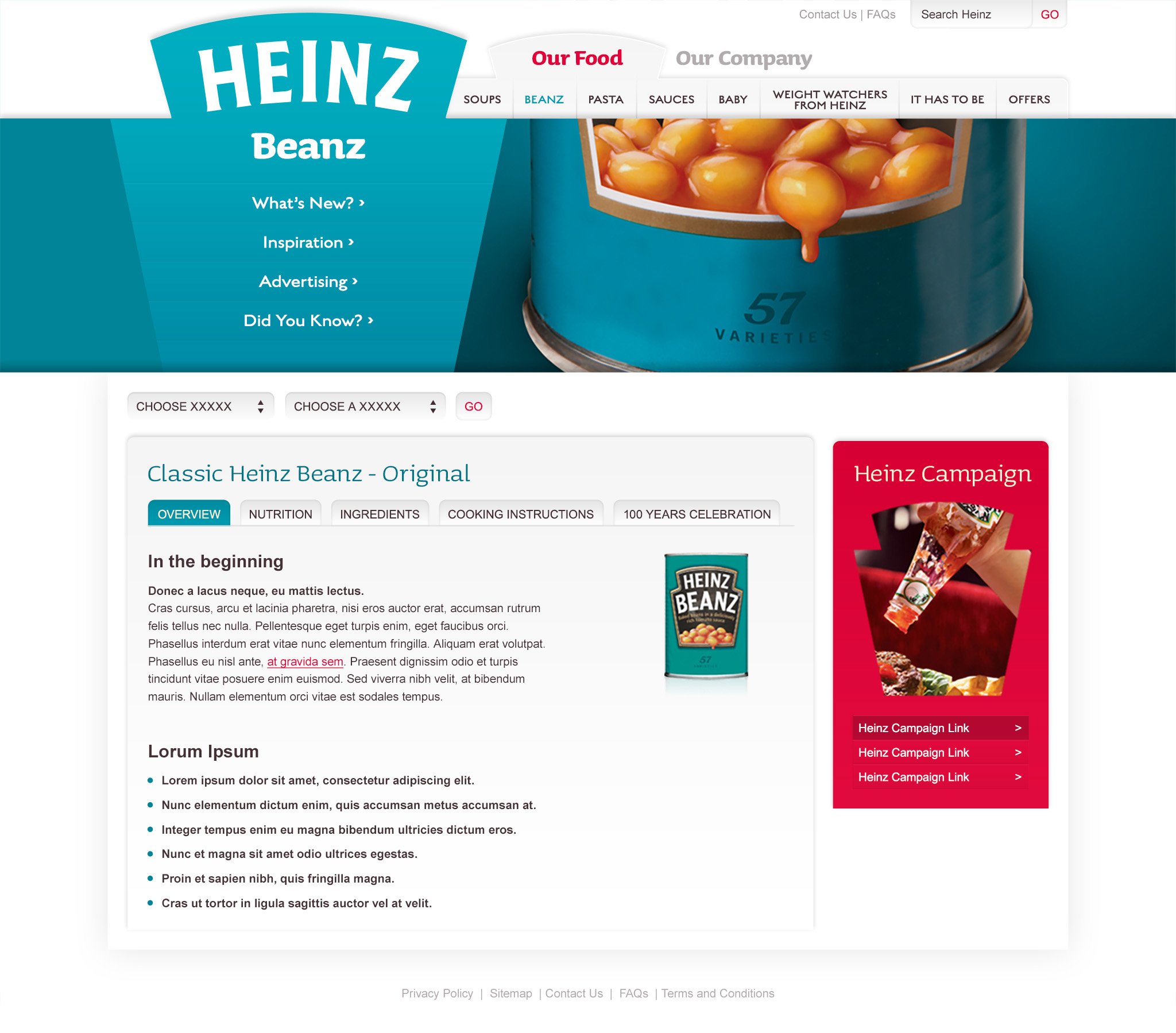
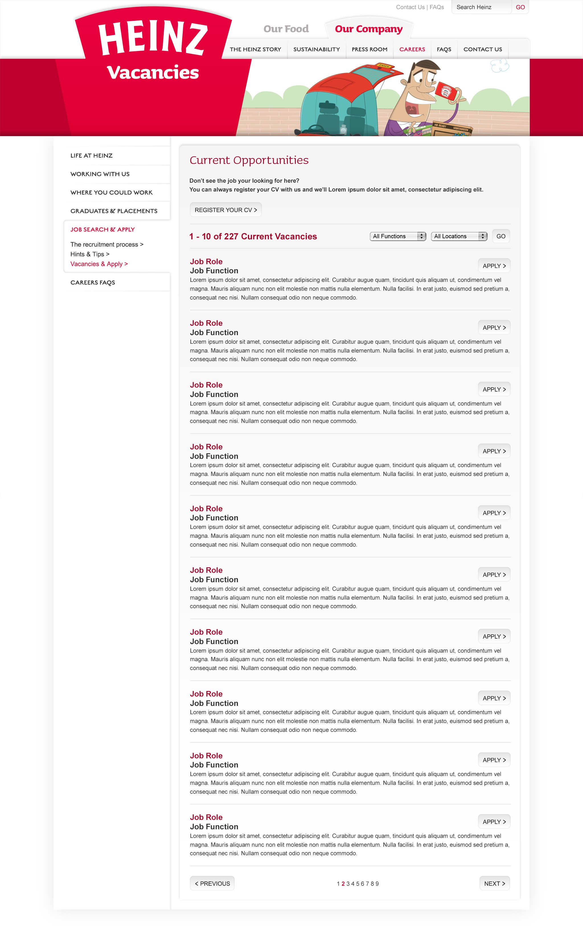
Armed with a dash of nostalgia in my design toolkit, I conjured up a look that was both familiar and modern. Think round corners and gentle gradients – like a nod to the good ol' days. But back in 2006, the design world wasn't using these as readily as they do now. These were bold moves on a company website. It was like jumping the curve and setting a new standard.
Make The Logo Bigger!
Here's where things get interesting: I proposed taking a bold step – making the logo bigger. While it might not have been on the client's initial wish list, it would have been eventually as it always is. I saw an opportunity to inject some creative energy.
The Heinz logo, an icon of recognition, practically craved more attention. By enlarging the logo, we weren't just increasing its size; we were amplifying its presence. Sometimes, the best solutions are the unexpected ones.
Visual Cohesion
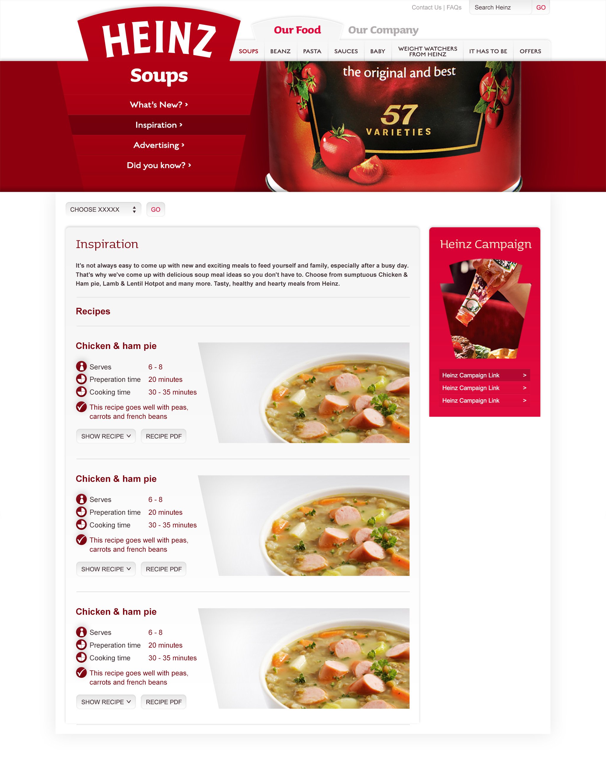
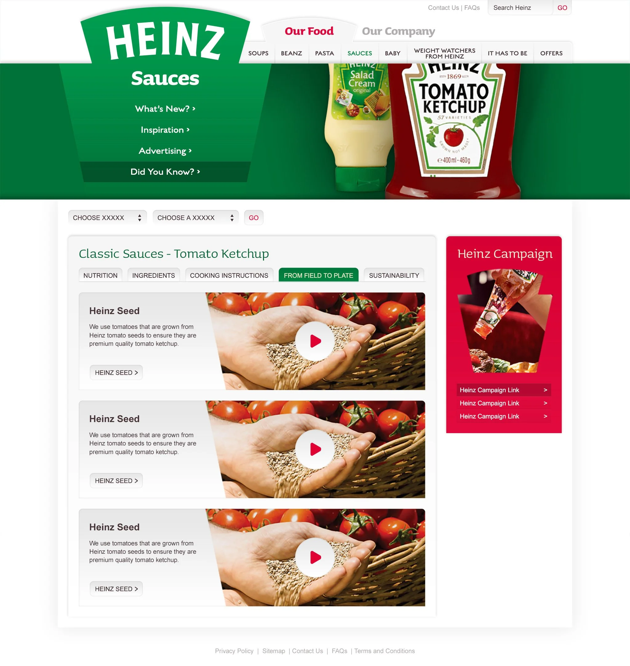
In my design approach, I aimed for a unified and seamless product photography experience. The trick was to capture every product at the same angle, under a consistent lighting setup.
The goal? Making the product stand out as the true hero. Soft, enveloping light that painted a delicate gradient across the wrapper, transitioning from light to dark. It's like stepping into a time capsule, channeling the essence of days gone by – a touch of nostalgia that feels warm and familiar.
Brand Recognition
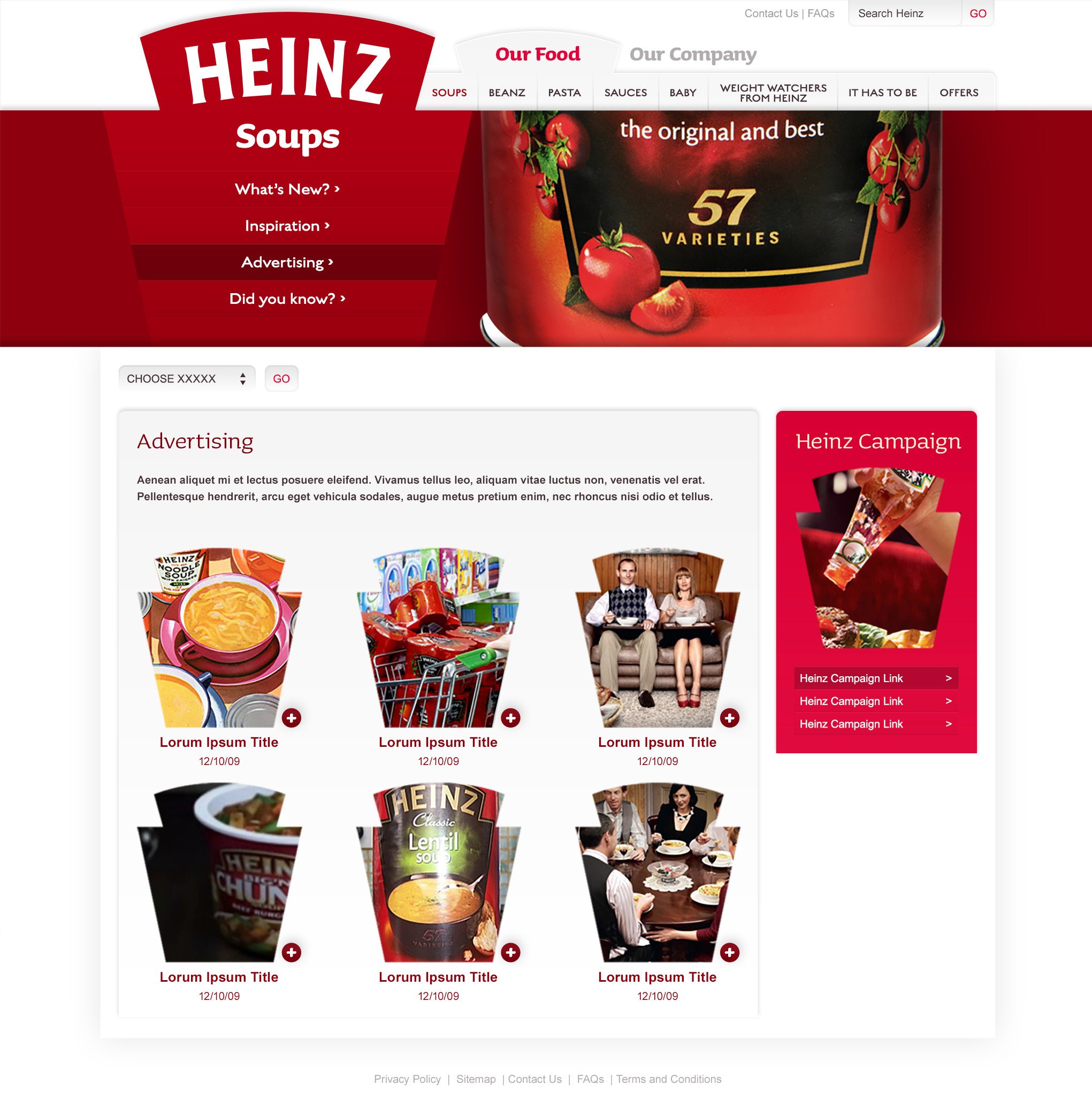
By letting that iconic Heinz shape stretch its legs a bit, we weren't just playing a branding game; we were creating a visual rhythm. Like a secret ingredient, that logo didn't just say "Heinz," it sang it.
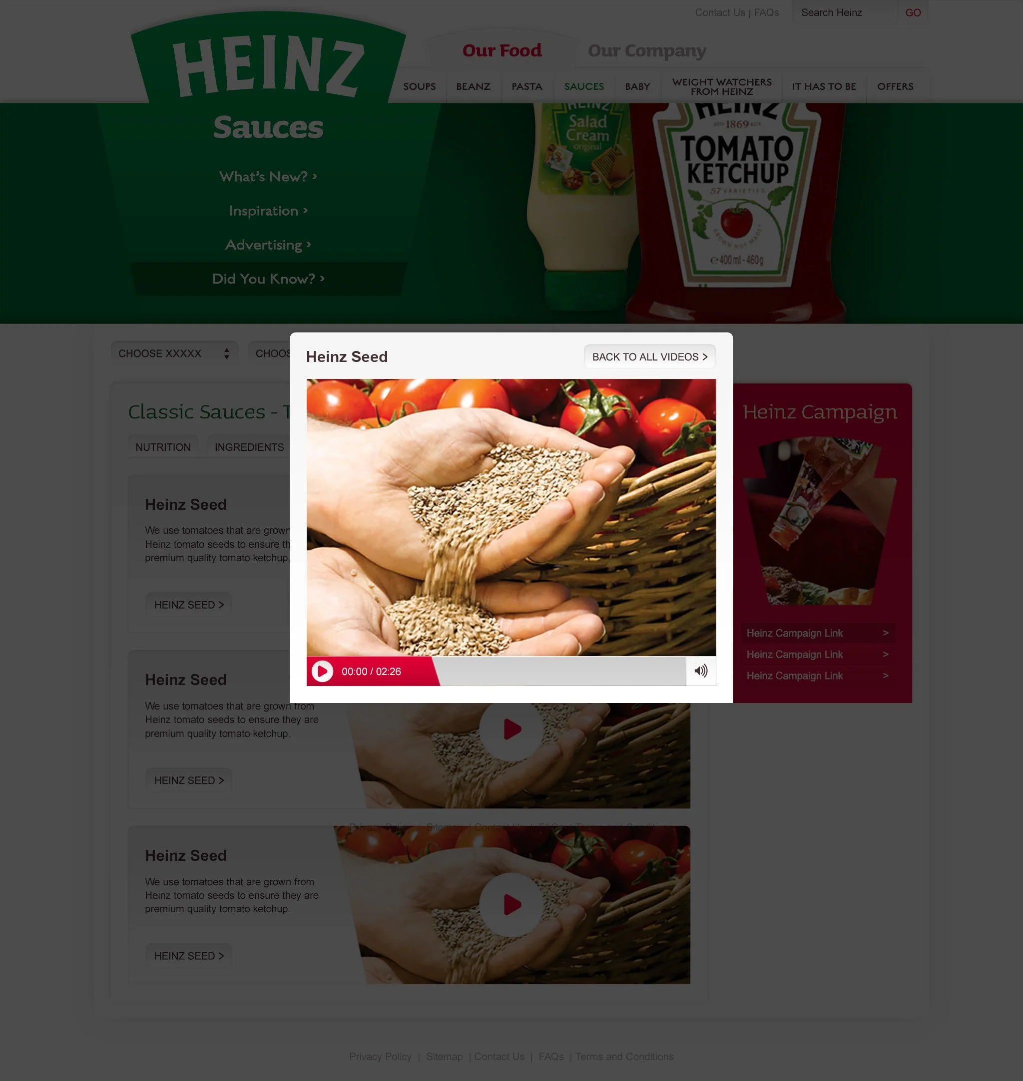
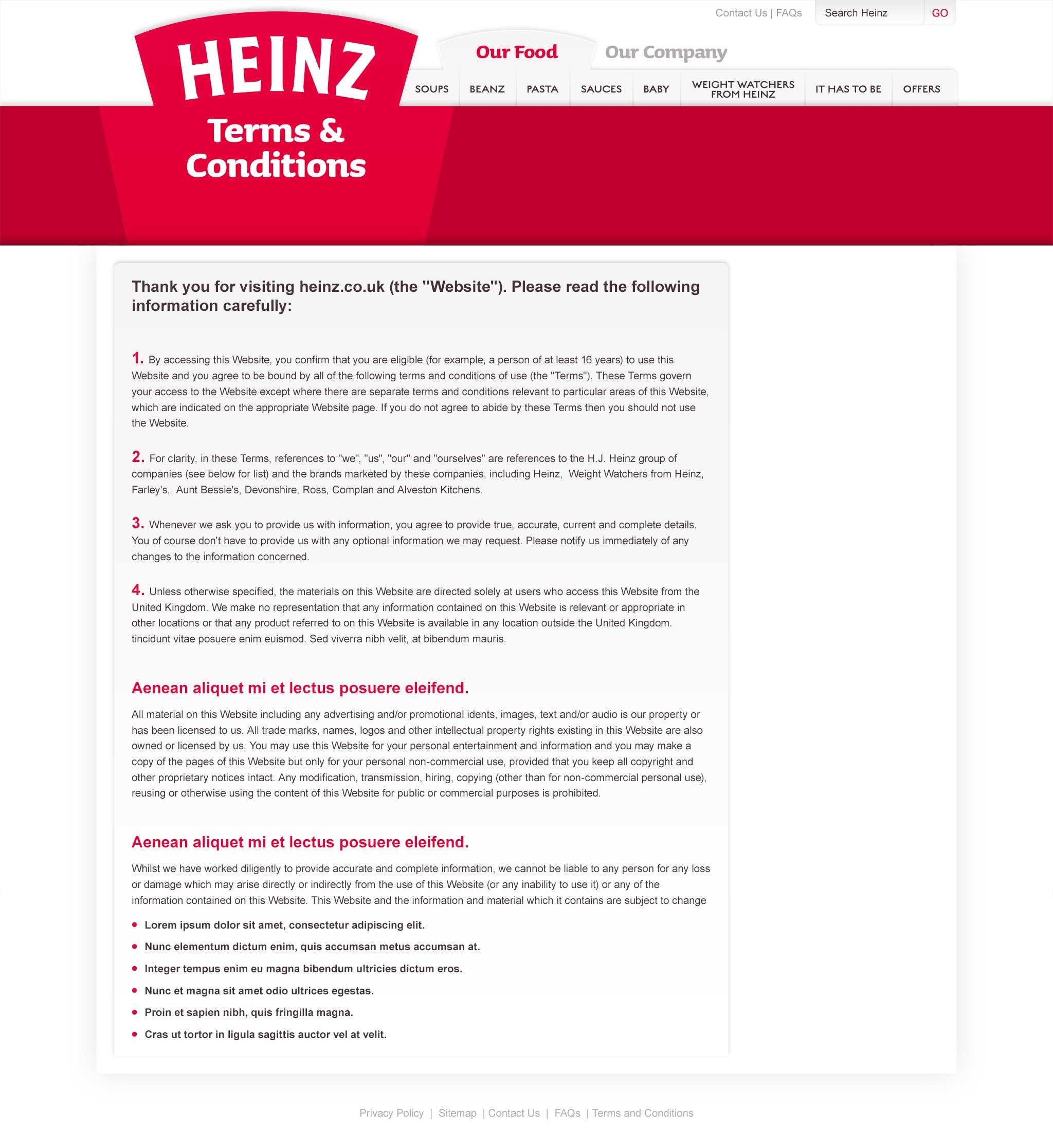
The branded colour blocks gave the design an exciting visual language, and capitalised on each brands unique colour within the Heinz Family. Even the video players had a slant on them to echo the logo.
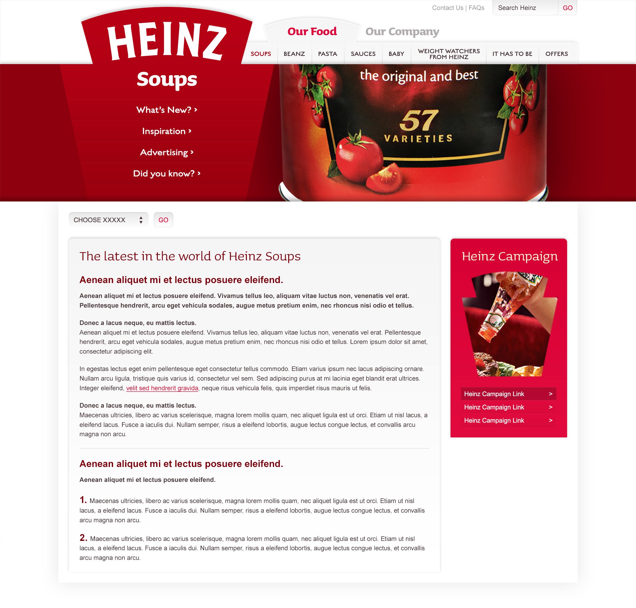
Page Templates & Component Designs
