Saudi Aramaco

Website Concepts

My Role - Creative Direction, Design Direction, Design

The No Brief, Brief…

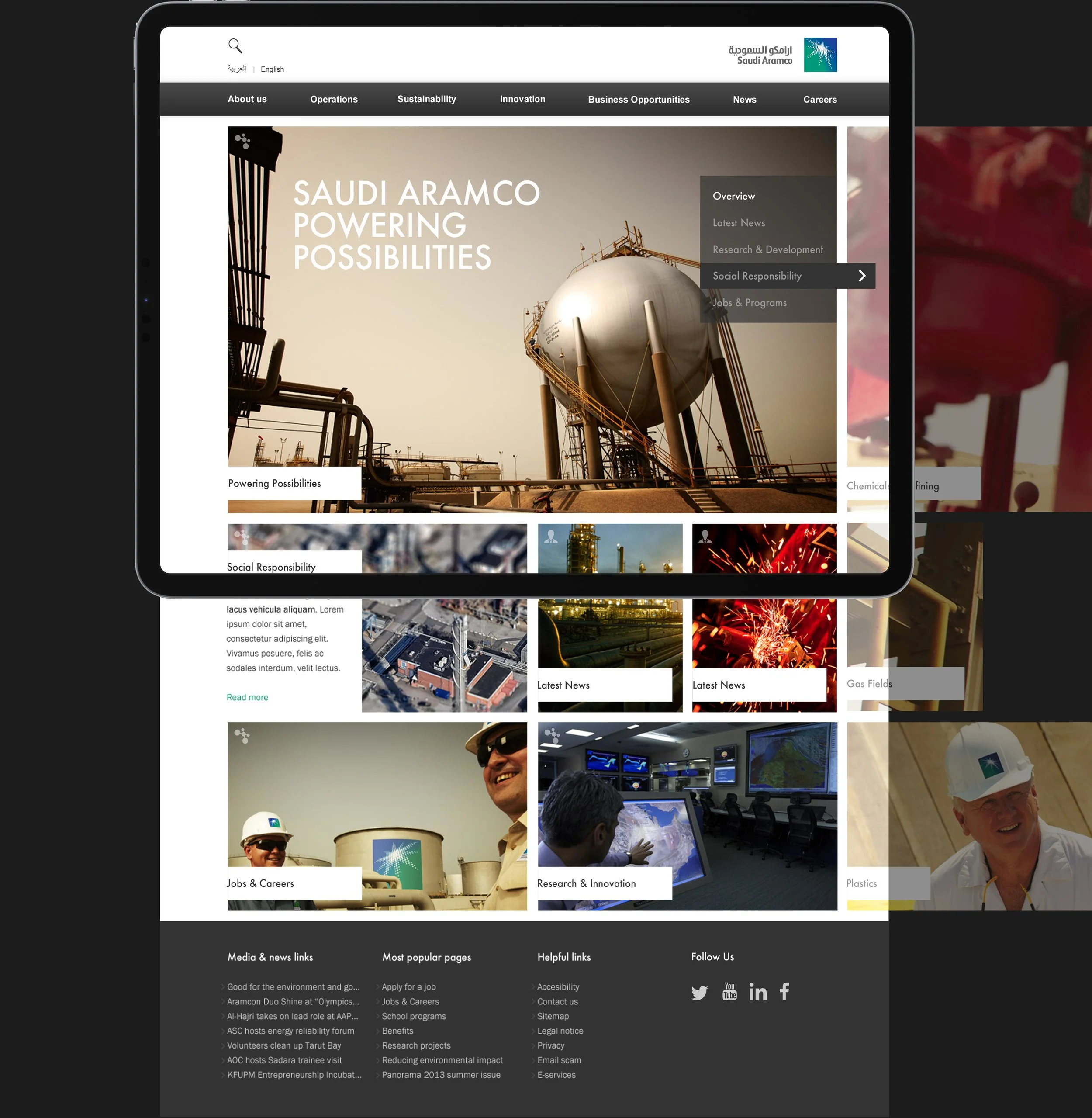
During my time at LBI, there wasn't a formal project brief or a traditional pitch for this endeavor. Instead, the focus revolved around exploring the potential directions Saudi Aramco could take with a new website.

People: Tradition + Future

This route was a standout favourite, as it amalgamated elements from various design approaches. It seamlessly blended patterns, large-scale photography, and interactive elements.

At its core, this design celebrated both the organisation's heritage and its forward-looking vision. It paid homage to tradition through the use of intricate patterns and showcased the future with striking imagery. The design also prominently highlighted employees, portraying them as integral to the organisation's identity and success.

The interactive faces served as a powerful symbol of diversity and inclusivity, allowing users to engage with the individuals who comprised the organisation's diverse workforce.

Focus: Technology

This strategy effectively harnessed the power of location photography to provide a compelling visual narrative, showcasing the technology in its authentic context. By capturing scenes in real-world settings, it not only highlighted the technology but also conveyed a richer, more immersive experience. This approach aimed to bridge the gap between the abstract concept of the technology and its tangible impact.

People: Centralised Layout

The central focus of this approach was placing people at the forefront of the design. The visual language I crafted drew inspiration from traditional Islamic art, which not only paid homage to cultural roots of Saudi Aramco but also resonated with Western audiences.

Furthermore, it was crucial to ensure that the website accommodated both left-to-right and right-to-left reading directions to cater to a diverse audience. To achieve this, I designed a layout that was centrally aligned, devoid of distinct edges. This flexibility allowed components to be easily flipped in the backend CMS, ensuring a seamless and inclusive user experience for all visitors, regardless of their reading orientation.

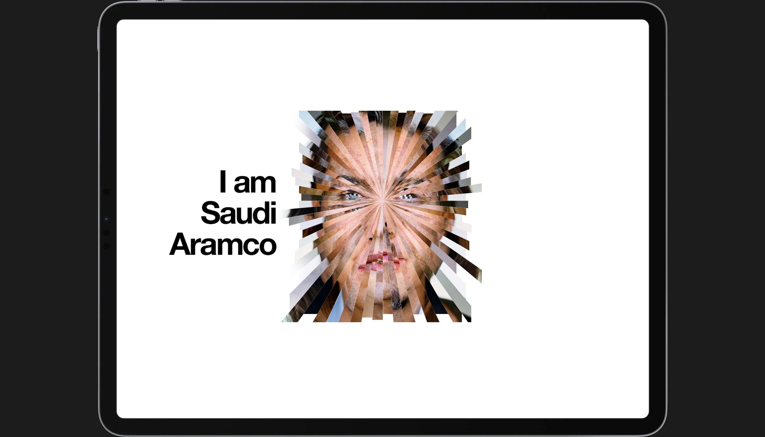
People: I am Saudi Aramco

I wanted to visually convey the diversity within Saudi Aramco, emphasising that it was a workplace comprised of numerous faces and cultures. To achieve this, I envisioned a dynamic concept where the website featured a mosaic-like composition of various faces, each representing a unique individual within the organisation.

Each "slice" of the overall face would host a short video where a person introduced themselves. Users could navigate around the screen, toggling between these individual stories, creating an engaging and immersive experience. This approach not only highlighted the organization's diversity but also celebrated the individuality of its employees, fostering a deeper connection between the company and its audience.

Focus: Technology

In this approach, the central focus was squarely on technology. I designed a minimalist and striking visual theme, characterised by bold typography that effectively highlighted the product as the primary focal point. To add an engaging dimension to the design, I incorporated dynamic interactions between the typography and the technology itself. For instance, as users scrolled or interacted with the page, elements like the Ground Drill could come to life, animating to demonstrate its functionality in real-time.

Focus: Technology

This design further extended the concept above I incorporated sleek, minimalist photography to showcase the technology. Like from the future in a movie. The idea was to place the products in a visually appealing and uncluttered environment, emphasising their elegance and functionality.

Life: News

In this approach, the design drew inspiration from conventional news websites but introduced an innovative twist, which allowed both vertical and horizontal scrolling.

Vertical scrolling was employed within a chosen category, providing a seamless way to explore content within a specific area of interest. The horizontal scrolling functionality allowed users to effortlessly swipe between different categories, offering a fluid and intuitive way to discover news when they weren't quite sure what piqued their interest. This design aimed to enhance user engagement by offering a dynamic and versatile browsing experience that catered to diverse preferences and interests.

Focus: Scroll To Learn

This approach, "Scroll To Learn," was designed to take users on a journey from the big picture to the finest details of the technology. As users scrolled down the page, the content would progressively unfold, starting with a broad overview and gradually zooming in on the minutiae of the subject matter.

Previous
Previous

Home Made /// UX Conversion Funnel

Next
Next

CMC Markets /// Campaign