Sage
Global Sites
My Role - Project Lead, Creative Direction, Design Direction, Design, UX
All data points to big WINS
Strategically enhancing both vertical and horizontal customer journeys proved instrumental in elevating user experience and satisfaction.
The successful unification of all creative, design, and UX resources, both internally and externally, fostered a collaborative environment that not only improved consistency but also resulted in huge cost savings.
Cultivating a company-wide creative culture centred around data-driven results contributed to an atmosphere of excellence. Notably, the global relaunch of sage.com, a first-of-its-kind large-scale project delivered internally, on time and achieved remarkable success.
The initiative not only met the deadline but also remained within the allocated budget, culminating in an impressive 20% increase in e-commerce transactions.

Global Rollout
The new platform created a universal approach to how sage.com is deployed across all regions, globally.
33 sites launched
6500 pages built
New master site approach
New design language system
New content
New customer journeys
New analytics for continuous optimisation
New operating model
Multi Disciplined Teams
Throughout the project's duration, I led a multi-disciplined team comprising UX, Content, Copywriters, Design, Engineering and Creative Technologists.
Regular updates were provided to stakeholders at each stage, highlighting the rapid progress made. Upon project completion, it was communicated that this collaborative approach was a first for Sage, and notably, the project was successfully delivered on budget and within the designated schedule.
This achievement underscored the effectiveness of the multi-disciplined team and their collective efforts in ensuring a timely and cost-effective outcome for Sage.

Transforming Chaos into Cohesion: Strategic Design Leadership
Upon my arrival, I observed a lack of strategy in the rollout process and a deficiency in design leadership. The situation was chaotic, with simultaneous activities such as creating new designs, updating old sites, and no cohesive plan in place. The absence of a unified approach made everything feel disjointed, and the continuous creation without cohesion was perplexing.
To address this, I formulated a strategic plan:
Audit Everything: Conduct a comprehensive audit of the existing design landscape to identify strengths, weaknesses, and areas for improvement.
Tidy Up Existing Live Content: Streamline and organise the live content using the existing brand elements to bring a sense of order. Atomic Design approach.
Create a New Look and Feel (DLS): Get compnay wide buy in and develop a Design Language System (DLS) to establish consistency and coherence across all design elements.
Skin Tidied Up Components: Enhance and optimize individual design components within the established DLS framework for a polished appearance.
Global Rollout: Implement the new design system across all relevant channels and platforms globally.
Refinement and Testing: Continuously refine and test the design elements to ensure ongoing optimization and responsiveness to user feedback.
This strategic plan aimed to bring clarity and coherence to the design process, fostering a unified and efficient approach. The emphasis on creating a Design Language System allowed for consistency while the iterative refinement process ensured adaptability and ongoing improvement.

Audit
Sage previous website's UX was riddled with issues, making it a prime example of the challenges faced on the former site:
Tab Troubles: Navigational tabs exhibit inconsistent functionality, often failing to work, and their titles lack clarity.
Misleading Links: Links that resemble tabs redirect users to different pages, contributing to navigation confusion.
Content Disarray: A lack of content division results in a cluttered layout featuring a mix of 1, 2, 3, and 4 column arrangements on a single page.
Layout Inconsistency: Although the predominant use of 1 or 2 column layouts offers visual cohesion, it seems disconnected from content relevance.
Textual Disparity: Text inconsistency, with varying widths and positioning, adds to the overall visual discord.
These issues are compounded by challenges in legibility, as white text against complex imagery compromises readability. The excessive use of stock-like photography and staged, artificial smiles detracts from brand uniqueness and authenticity. Moreover, the absence of a unifying style, the lack of brand palette accents, and outdated icon styles contribute to a disjointed user experience. The meaningfulness of icons without accompanying text also prompts a critical evaluation of their value in enhancing user interaction.


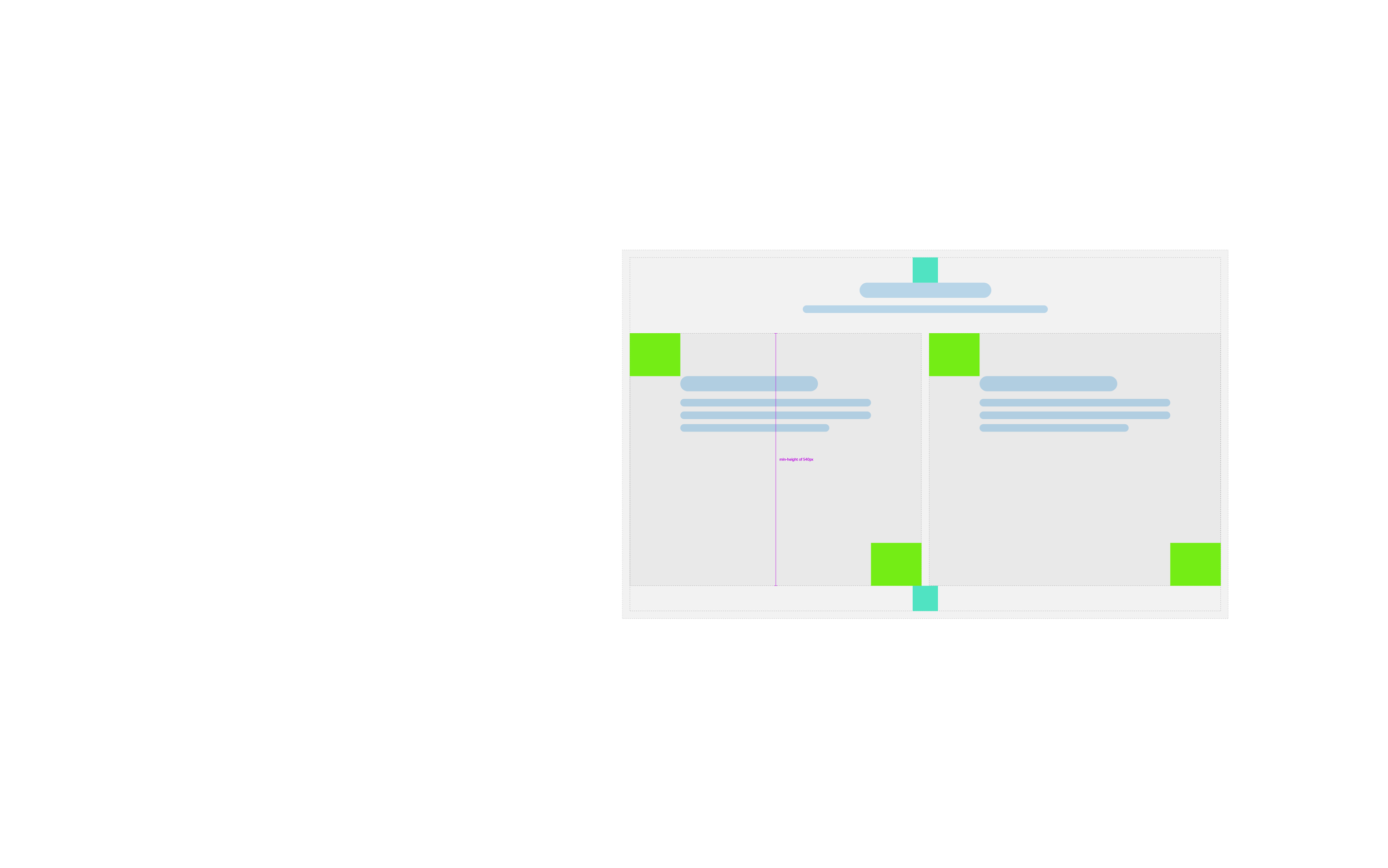
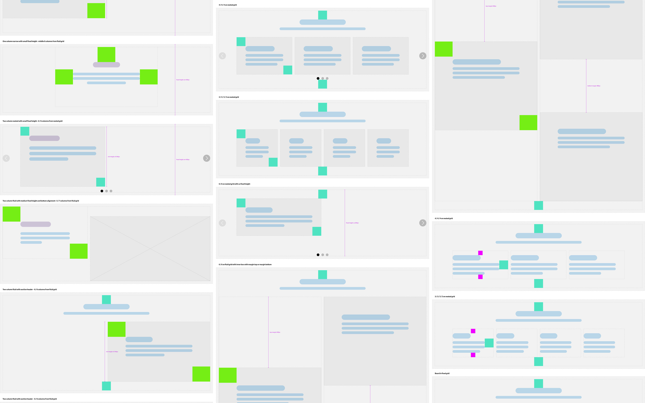
Implementing Atomic Design for Coherent & Responsive Components
Addressing a significant flaw in the previous site, the absence of structure in both content organisation at the page and component levels posed a challenge. A pivotal step in the redesign process involved the implementation of atomic design principles.
This approach entailed creating a flexible and responsive component framework, akin to building blocks, ensuring seamless cohesion regardless of the combinations stacked on top of each other.
By adopting the atomic design methodology, the redesigned components functioned like Lego blocks, providing a structured and cohesive foundation for the overall page layout.
Clean Up
During the "Clean Up" phase of the project, the focus was on enhancing the user experience on sage.com through a cleaner design. Despite the site being built on Sitecore, its implementation had introduced several limitations, necessitating a careful consideration of what was and wasn't possible.
Balancing these constraints, the goal was to achieve a design that was both aesthetically pleasing and functionally efficient. This effort aimed to provide an improved user experience while concurrently paving the way for the development of the Design Language System (DLS).
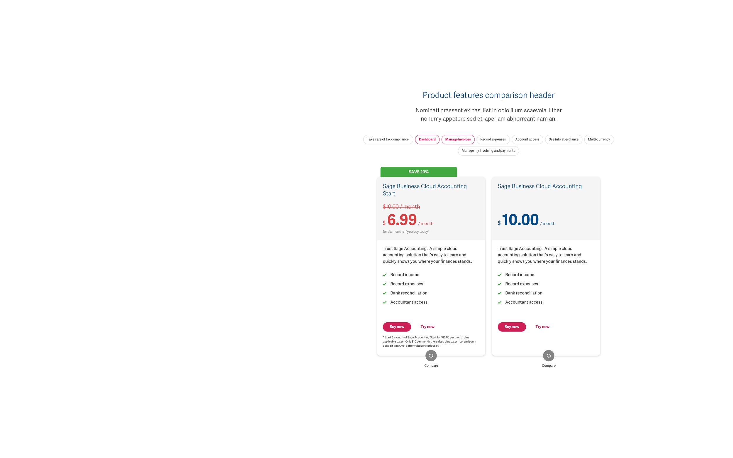
Data Driven Optimisation
To keep improving the performance of sage.com whilst working on the DLS we created both small and large test cases. Some tests would be whole pages, whilst others would be a few lines of text or the radius of a button.
For example the home page design A improved conversion from on the home page by 16.17%.
Bounce rate also fell from 34.47% to 29.68%. The design transitioned from a one-stop-shop approach to incorporating personalisation so customers felt they were in the right place.
Collaborating with various team members, including product owners, the Chief Marketing Officer (CMO), copywriters, and brand representatives, we conducted tests to evaluate design changes.

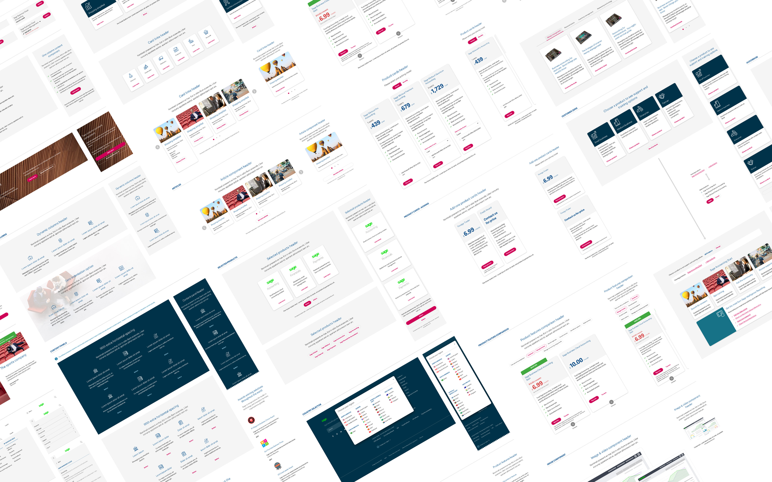
New DLS Components
The Design Language System (DLS) represented a comprehensive company-wide initiative that I co-led with my counterpart in product development. Following the approval of the DLS, the initial rollout took place on sage.com.
This system encompassed various design elements, including typography, spacing, button styles, forms, color themes, product icons, and tables. The implementation involved delivering over 150 templated master portfolios with branch templates for all 28 markets.
Additionally, the pattern library and frontend framework were established. This strategic move not only enhanced design consistency but also significantly reduced the cost and time associated with design launches. By eliminating the necessity for engineering sprints to address or create new experiences, the DLS streamlined the design process and fostered a more efficient and cohesive design ecosystem.

Site Migration
In tackling the challenge of migrating 6500 pages, streamlining the content delivery process was essential.
To facilitate this, I implemented a strategic approach involving the use of blueprints. These blueprints served as stripped-back wireframes, providing the necessary information for the team tasked with building the pages in the USA.
The aim was to ensure clarity on the components to be used, simplifying the page creation process and maintaining consistency across the extensive volume of content to be migrated. This strategy proved crucial in efficiently managing the complex task of site migration.