CMC Markets
Website
My Role - Creative Direction, Design Direction, Design, UX

Brief
Redesign CMC Markets retail web offerings as well as moving forward our brand proposition.
Audit Old Site
Conducting a thorough audit of the old site revealed a significant issue of content duplication, driven by improper SEO considerations.
In response, I meticulously reviewed all pages and the content. Subsequently, I provided recommendations on what content should be culled, combined, or repositioned, guided by an understanding of user journeys.
This audit aimed not only to streamline and declutter the website but also to enhance the overall user experience by aligning content with more intuitive navigation paths.
New Site Map
The new site map was designed to be more straightforward, taking into account the distinct journeys for different types of users—those who are new to trading, those looking to switch, and users seeking common information.
This approach aimed to tailor the navigation experience to better serve the needs of each user group, providing a more intuitive and user-friendly structure on the website.

CMC Markets Home
The home page served as a storefront, prominently featuring the top instruments and showcasing the latest campaigns. This approach aimed to provide visitors with a snapshot of key offerings and current promotions right at the forefront, creating a dynamic and engaging entry point to the website.

Product
The CMC Markets product tour underwent a significant transformation. Originally, it consisted of static images with extensive text, a design choice justified under the guise of SEO benefits, which I believed was a simplistic approach. To address this, while retaining the text for SEO, I strategically positioned it below "The Fold."
At the top, I introduced interactive video content showcasing the product features on various devices. This adjustment not only modernized the page but also made the entire tour more engaging and visually appealing for users

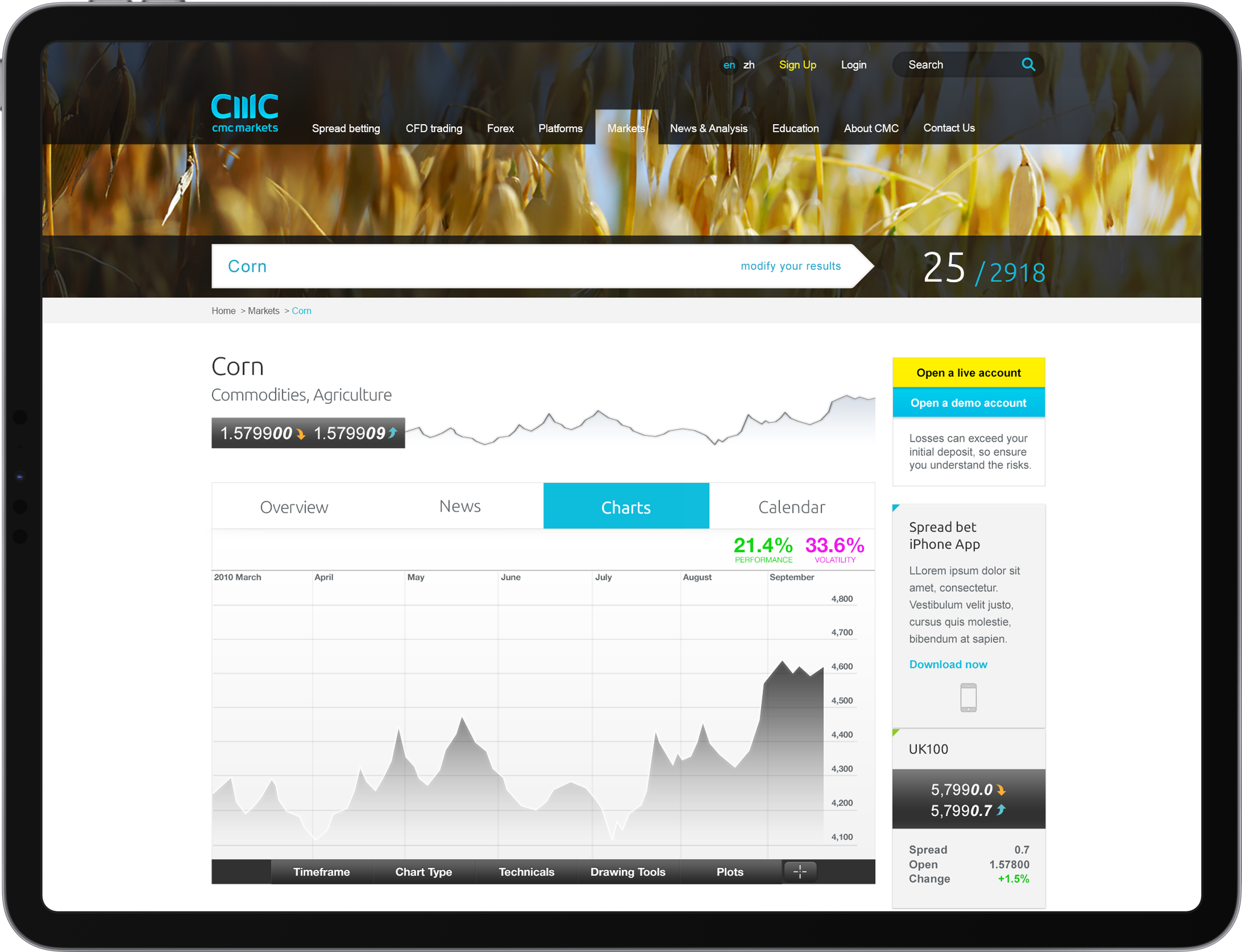
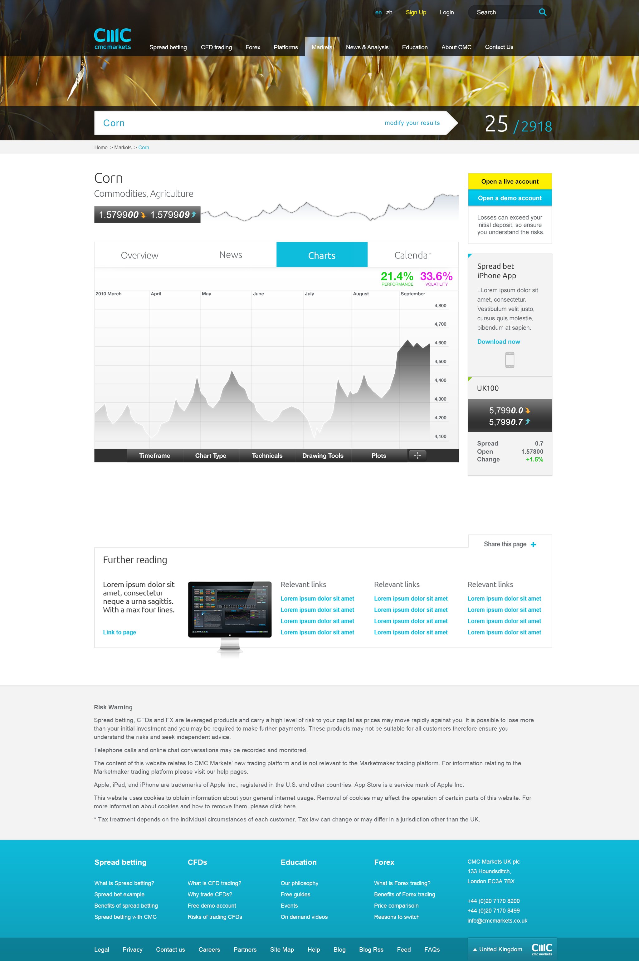
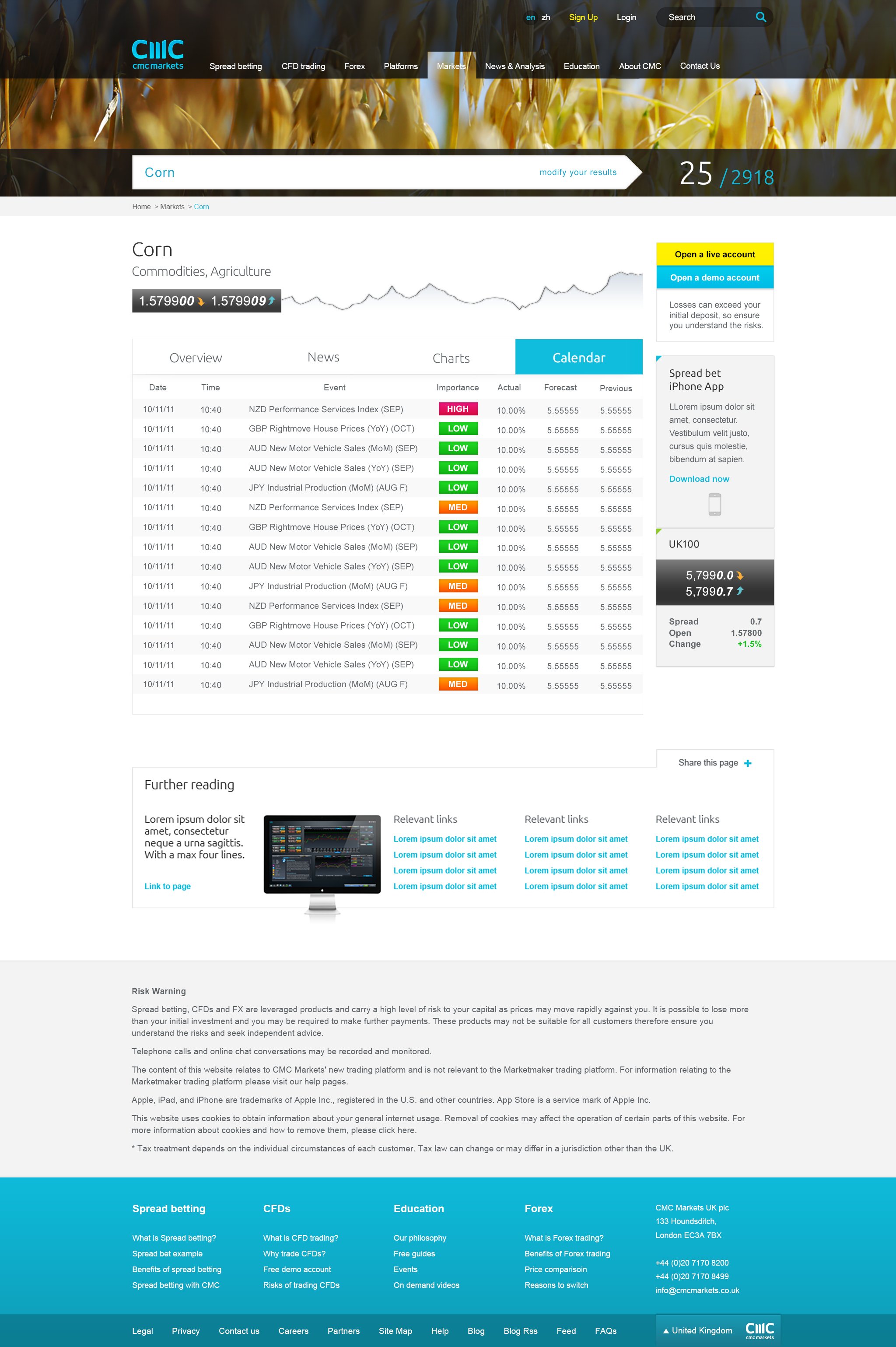
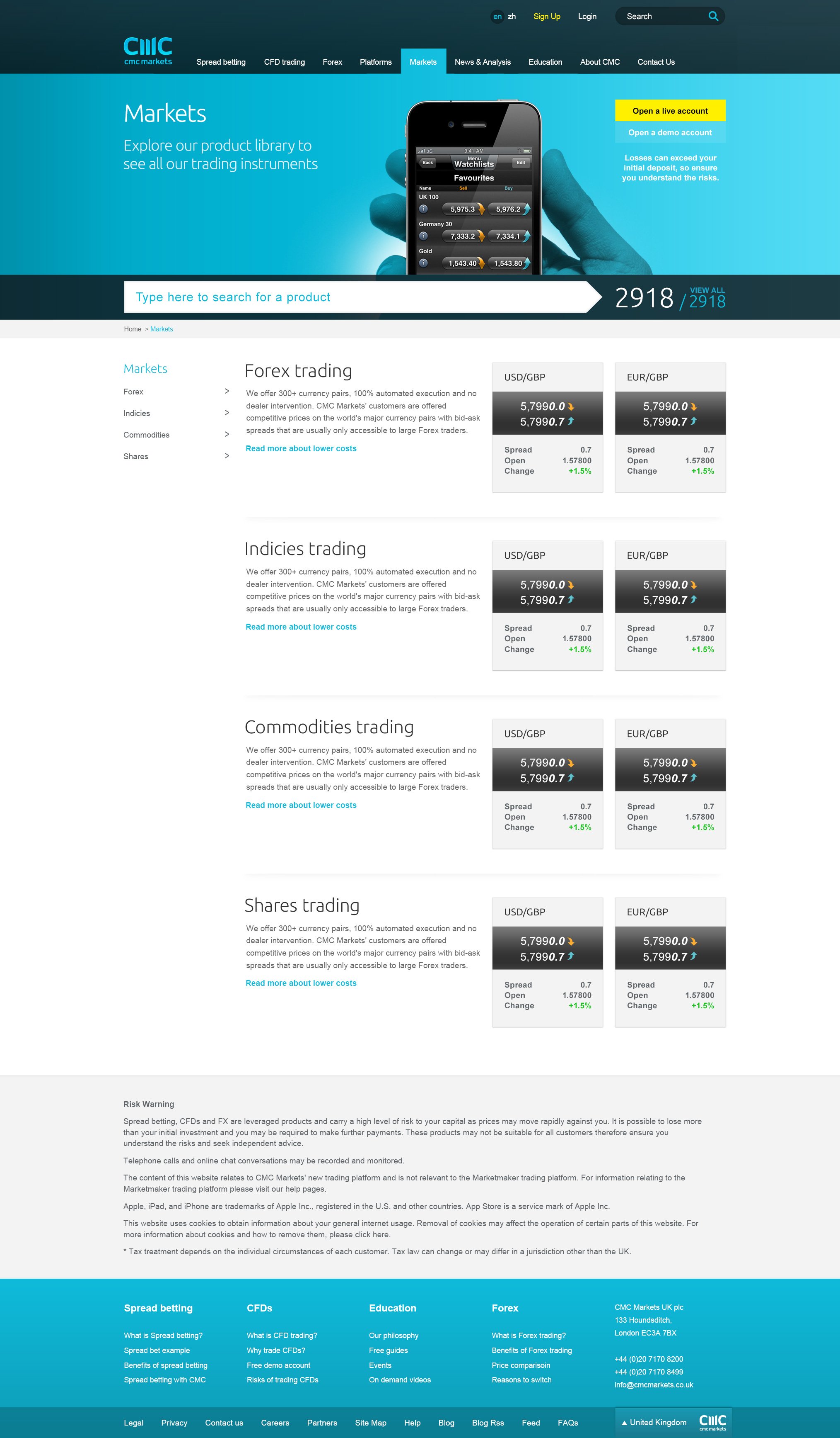
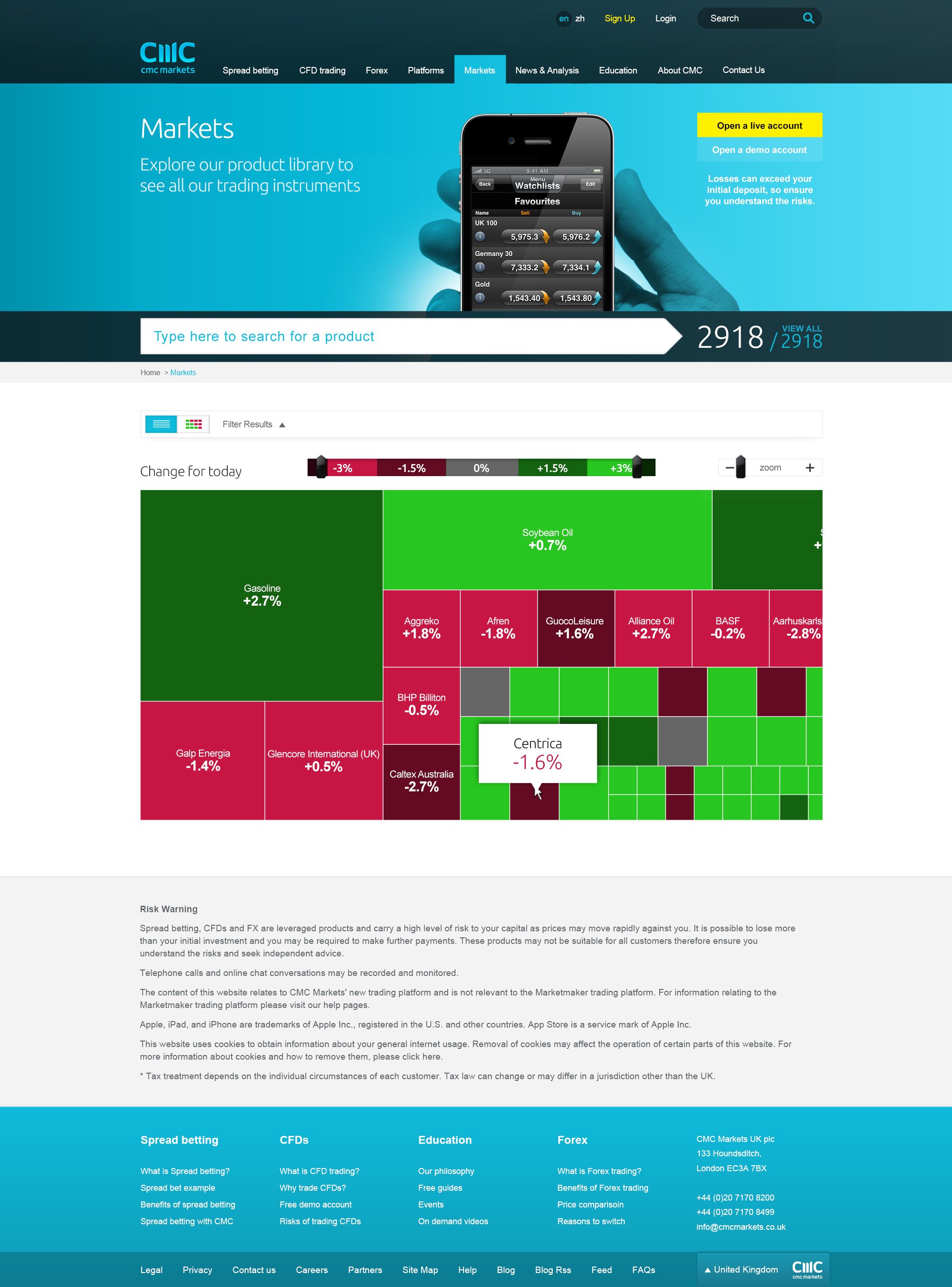
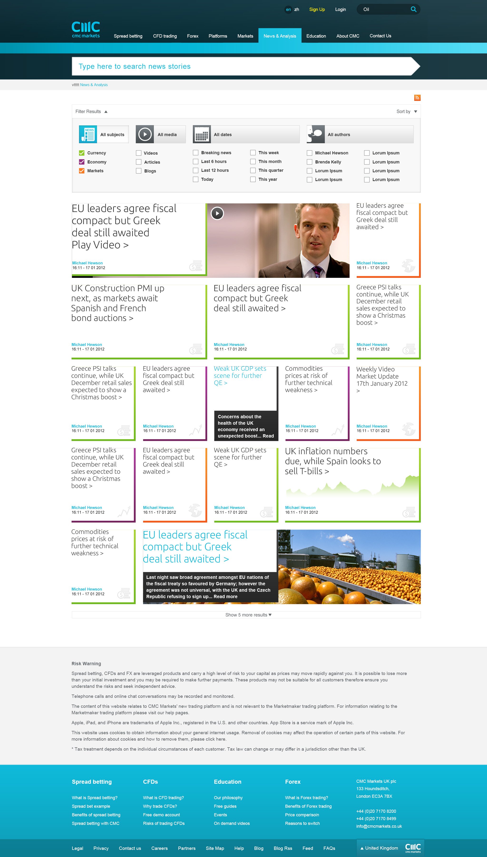
Markets & Data
The design process for "Markets & Data" proved to be intriguing as it involved presenting data in diverse and meaningful ways, balancing detail with clarity.
The CMC product team found the designs so impressive that they incorporated them into the product, a testament to the success to the design.




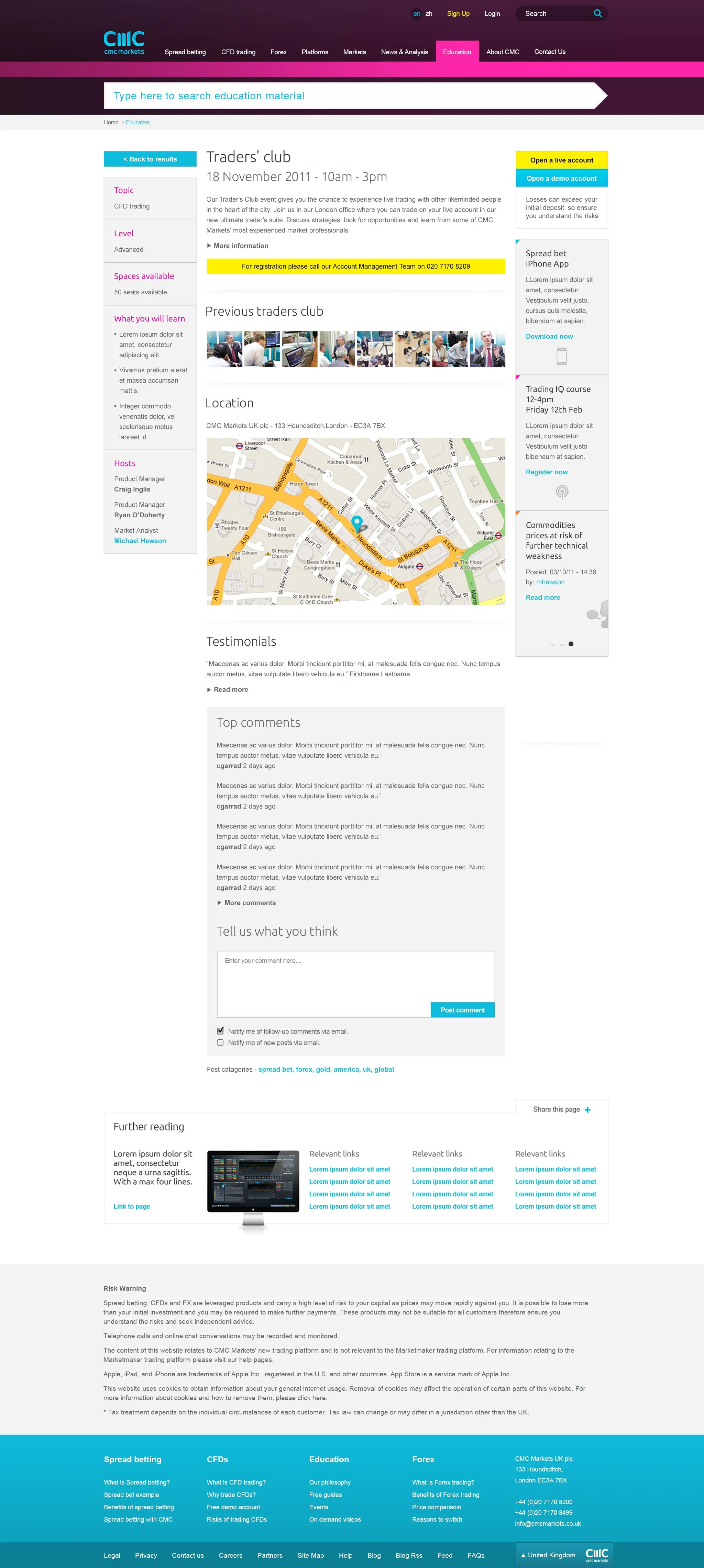
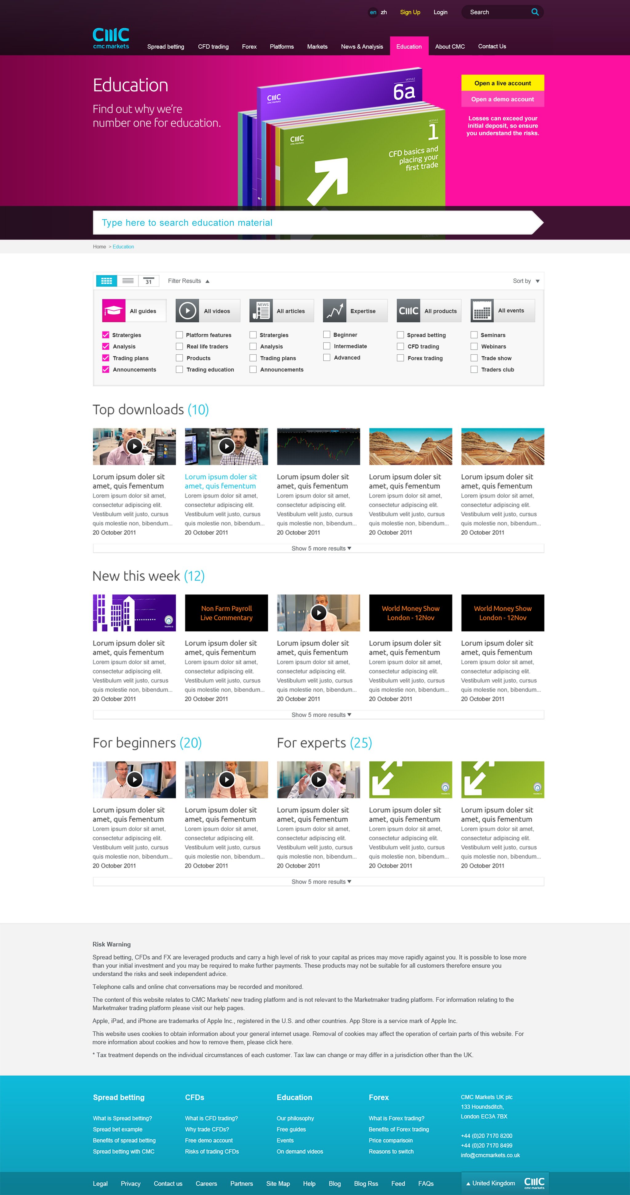
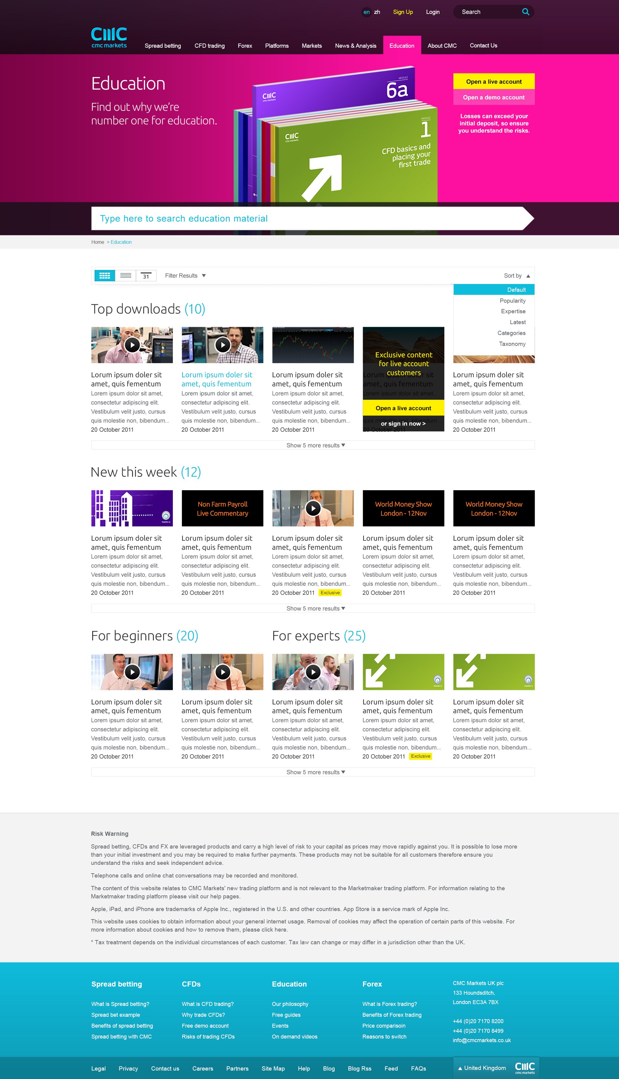
Content Pages
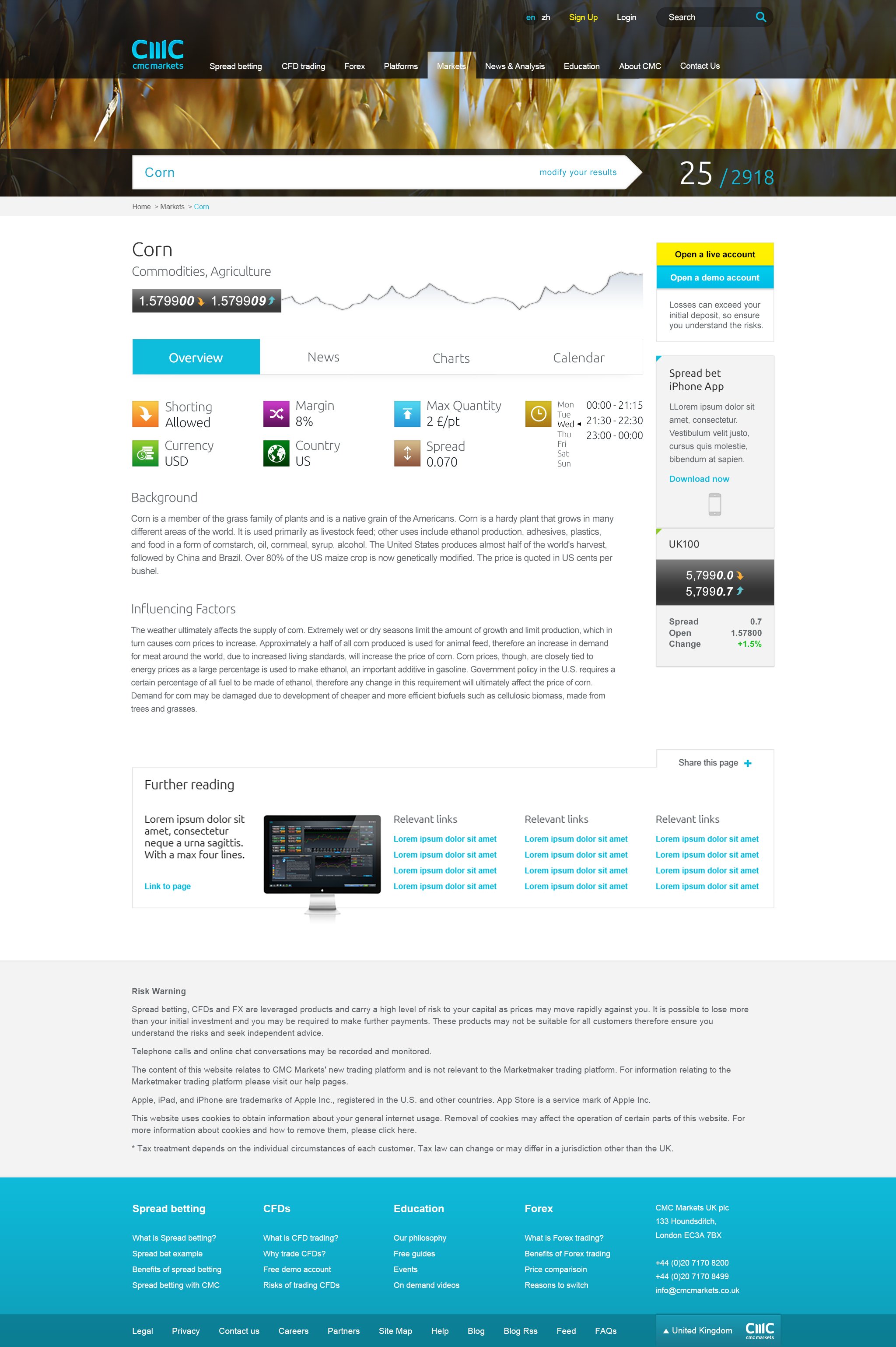
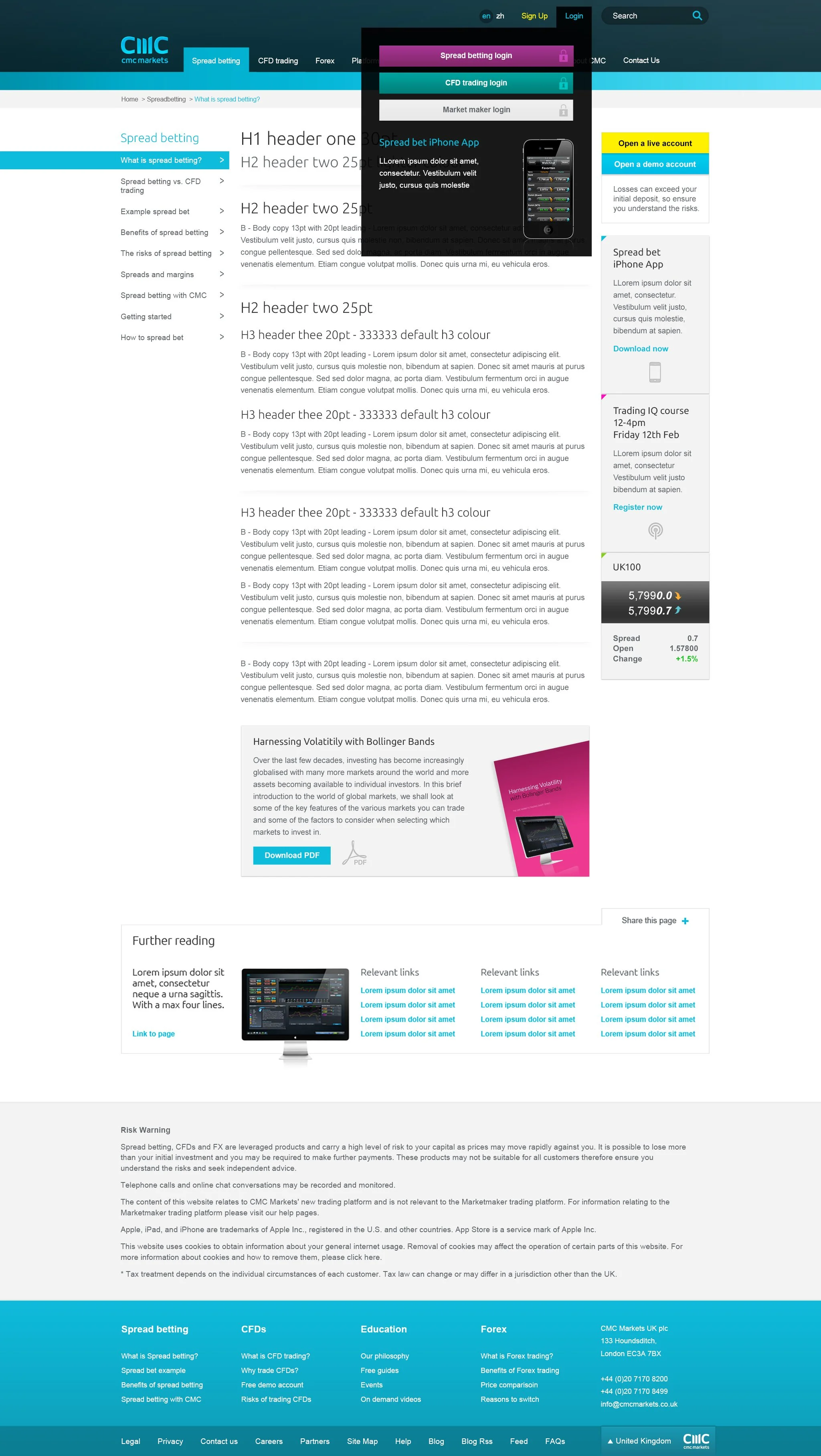
The content pages underwent a significant cleanup, introducing clear signposting to replace the previous scattered arrangement.
The revamped structure featured a streamlined layout: column 1 dedicated to navigation, column 2 focused on content, and column 3 utilised for effective signposting and cross-selling.
This reorganisation aimed to enhance user experience by providing a more intuitive and organised presentation of information, improving navigation and promoting cross-content engagement.



Iconography
Inspired by Noma Bar's campaign utilising flat design, I created hundreds of icons to enhance visual communication. The emphasis on flat design allowed for a clean and minimalist aesthetic, contributing to a cohesive and modern visual language across various aspects of the project.

Photography & Video
A concern of mine when I started at CMC was the presence of inauthentic and somewhat cheesy photography that lacked believability. It oscillated between being overly polished or insufficiently sophisticated.
Inspired by a scene from the film "Imagine That," where a character trades by a window in a manner that felt both inspiring and authentic, I decided to redefine how we portray our traders.
Retaining that realistic inspiration, I refined the presentation with a touch of polish to align it with the new CMC look and feel. This adjustment aimed to infuse a genuine and relatable visual appeal into the website's photography, departing from the contrived imagery of the past.


